
campusM Customization Accessibility Guidelines
Introduction
Around the globe, most campusM institutions are required by local law to ensure that their app meets the WCAG 2.2 AA accessibility standard. campusM generally meets this standard by default and out-of-the-box (see campusM’s Accessibility Statement for more information), but some configuration by campusM administrators is necessary to ensure accessibility is maintained across all features and platforms. The purpose of this document is to guide campusM Admins on how to best configure and customize campusM to their institutional and user needs, while maintaining the highest level of accessibility for all features.
These recommendations will continue to be developed and refined with additional examples and best practices. If you have comments or recommendations for further material to include in this document, send an email to the Clarivate Accessibility team or to the campusM Product team.
This document was last updated on 20 Aug 2026.
Accessibility Testing Resources
As you make changes to your campusM configuration, we recommend using the following resources when evaluating campusM Accessibility. These links are included as practical references, not as an exhaustive conformance checklist.
If you have found an accessibility issue that you cannot find a way to resolve through configuration, please report it by opening a Support case. Make sure to review our recommendations for submitting accessibility feedback prior to opening the case to ensure that it can be reviewed effectively.
Customizing Colors
There are many colors that are configurable throughout campusM’s user interface. In many cases across the app, colors are altered as needed in order to preserve accessibility, such as the Main Color configuration in most product integrations. In other cases, which are listed below, colors are shown exactly as configured, which may cause text or other UI components to have insufficient contrast with their background. There are many free online tools to check the contrast of colors, and institutions should make sure that the contrasts listed in the following subsections are preserved.
Home Page
All the following are configured in App Builder. Note that in cases where certain features are not in use, or when images are used instead of colors, some of these configurations may not be relevant. In any case, institutions should still ensure that contrasts for text and other UI components are maintained with their respective backgrounds within the resulting home page.
For full documentation on how to configure colors on the home page see Configuring Services.
| Color A | Color B | Minimal Contrast |
|---|---|---|
| Web Header Foreground Color | Web Header Background Color | 4.5:1 |
| App Config > Background Color | Tile Style/Config > Background/Border Color | 3:1 |
| Tile Style/Config > Hover Background Color | Tile Style/Config > Text Color | 4.5:1 |
| Tile Config > Background Color | Tile Style/Config > Hover Text Color | 4.5:1 |
| Portal Config > Background Color | Portal Config > Text Color | 4.5:1 |
| Portal Config > Item Hover Background Color | Portal Config > Item Hover Text Color | 4.5:1 |
| Tile Container > Background Color | Tile Container > Subtile Text Color | 4.5:1 |
| Tile Container > Background Color | Tile Container > Pagination Dot Selected/Unselected Colors / Subtile Icons / Subtile Border Colors | 3:1 |
| Tile Container > Pagination Dot Selected Color | Tile Container > Pagination Dot Unselected Color | 3:1 |
Live Tiles
Some Live Tiles feature several icons inside one tile, which are usually images with a transparent background. These icons should be colored in such a way that a minimal contrast of 3:1 is maintained with the tile’s background color.
Live tiles for various product integrations and for the Quick Polls features may show a badge with a counter, indicating the user has new updates in that area of the app. The configuration page for these features includes a Live Tile section, where a badge tile color can be configured. This badge color should have a 3:1 contrast with the tile itself.
Adding Alternative Text
Alternative text (or alt-text) helps screen reader users understand the content of images or visual components that they may have difficulty seeing, and is sometimes displayed when images or components fail to load. This text should be descriptive of the image or component and allow the user to get the same information that a sighted user would get, so that they may navigate the app as expected.
While alt-text is included for most components and buttons by default, the components listed below require direct admin configuration for their alt-text.
Home Page
All the following are configured in App Builder:
-
The Web Header Image Alt-Text should be configured in App/Profile Config>Config section. This would usually be the institution’s name, or the app’s name.
-
Tile Names are read out by screen readers. This is especially important to keep in mind if the tile label is hidden and an image is used exclusively to identify the tile to sighted users, as the name of the tile as configured App Builder should match the text in the image.
-
Tile Descriptions are used in Search and other places in the app. They should be added when the name of the tile does not provide enough information on its own as to its functionality.
-
Banner Items in Banner Tiles utilize a description field for their respective alt-text. Admins should always fill out the Banner Item description field with the same text that appears in the Banner Item image.
Miscellaneous
Static Content
In Creative Studio admins can create entire webpages using HTML and CSS. Because Creative Studio is a freeform tool, Admins will need to confirm that content created in these static pages is accessible. If possible, we highly recommend working with a skilled web developer to create fully functional and accessible web pages. Some built-in tools to note:
-
Colors can be managed via a CSS file, which can be applied to multiple pages at once, or manually managed for each page.
-
When adding images or other components, admins should configure alt-text by either using the built in “Alt” option in Creative Studio under Component Settings, or in the HTML directly.
For more information see Working with Creative Studio.
Banner and RSS Feeds Tiles
User Controls
RSS Feed Tiles (configured in App Builder) have Play/Pause Controls and Users Controls that are both disabled by default. We recommend turning these on, as Feeds Tiles are not considered accessible without these as users should be able to pause/stop animated content.
Banner Tiles (also configured in App Builder) have Play/Pause Controls and User Controls enabled by default for accessibility. Removing these will make the Banner Tile inaccessible for screen reader users and those who use keyboard navigation, and is therefore not recommended.
Designing Banner Images
Images used for each banner item should be designed in such a way that any text included in them is not hidden behind the user controls. Assuming all controls are enabled:
-
Web – User Controls will appear in both right corners, and one of the left corners (which one depends on the configuration of the Banner Tile).
-
Mobile – User controls will always appear in the middle bottom part of the image, and one of the right corners (which one depends on the configuration of the Banner Tile).
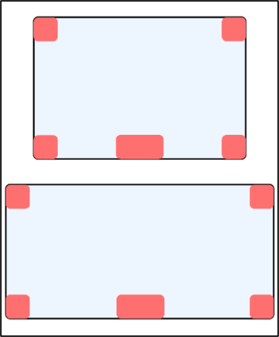
The diagram above shows all areas to avoid for all platforms and configurations in red. The exact size of these controls is scaled depending on each user’s screen size, and their proportion to the image depends on tile size configuration (in the diagram: 3x2 on the top, 2x1 on the bottom). See Do and Don’t examples below.
Additionally, per the previous section on Colors, any text displayed in the image should have sufficient contrast against its background (3:1 at least, 4.5:1 recommended).
 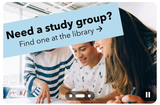 DO: Design a banner image which avoids overlapping the text user controls. |
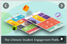
DON'T: Design a banner image in which text may be hidden behind user controls. |
These design considerations are not required for images that appear in RSS feed tiles, as the text is overlayed on the image with a contrasting background by default.
Pause Time
Banner Tiles and RSS feed tiles have configurations for how long each item appears before it automatically moves on. The default setting is 5 seconds (Banner Items) or 500 milliseconds (Feeds Tile) and while they can be set to longer periods of time, setting them any lower than these defaults would be considered inaccessible.
Other
-
The “Go to App” popup appears in mobile browsers, as not all features are fully accessible on the web app on mobile. This is shown by default for all apps to indicate the accessible option to users, but can be turned off by campusM Admins in App Manager > App Settings > App Configurations.
-
Some product integrations which render in an iFrame and any external URLs that are opened in campusM’s internal browsers are rendered as they are received from another system or 3rd party. This content should be reviewed separately from campusM to ensure its accessibility before integration and deployment to end-users.
-
Any custom components and screens made with the Application Extension Kit (AEK) are the institution’s responsibility to test and maintain. If you’re not sure how to use the AEK framework to achieve fully accessible components for end-users, we highly recommend consulting with our community Slack channel. For more information on AEK, see our AEK documentation.
-
Institutions that choose to configure their Web App to have a Side Bar (configurable in App Builder>App/Profile Config>Config>Enable Sidebar) also need to make sure that they configure it to be collapsible (App Builder>App/Profile Config>Portal Config>Collapsible Side Bar). Institutions may also not use a Side Bar for their Web App at all if they so choose.
