Accessibility in NDE Customization
Accessibility in NDE Customization
Libraries and universities can customize the NDE UI to tailor it to their institutional and user needs. The purpose of this article is to provide recommendations on common accessibility considerations that should be maintained during customization.
The base UI has been designed to accommodate accessibility prior to configuration. Refer to the Primo Accessibility Statement for more information on accessibility features and gaps in the NDE UI. Some steps are required during configuration to ensure accessibility is maintained.
These recommendations will continue to be developed and refined with additional examples and best practices. If you have recommendations for material to include, send an email to accessibility@clarivate.com.
Accessibility Considerations
Homepage Design and Logo
The primary Home Screen can be customized using your custom HTML. The May 2026 release has planned future configuration options for the Homepage (CERV #28360). More details will be available on the 2026 roadmap.
Homepage Elements Boxes
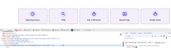
Ensure that the homepage element boxes have appropriate aria-label attributes, correct href values, and accurate visible labels.
Library Logo and Images
Clarivate provides a generic alt-text. The library should update the alt-text provided for the primary library logo.
<img alt="Library Logo" height="35" class="black-background ng-star-inserted" src="assets/images/library-logo.png"> For example, the new alt text would read University of Demo Name logo.

Adding Images
If you add additional images on the home screen or other pages in the application, ensure you provide an adequate text alternative based on the purpose of the image on the page.
Customizing Background Images
Header images can be used across various pages (such as the main header on the homepage and the header on the collection page) and have been designed to include an overlay above the image. This ensures that there is sufficient contrast between the text and the background image.
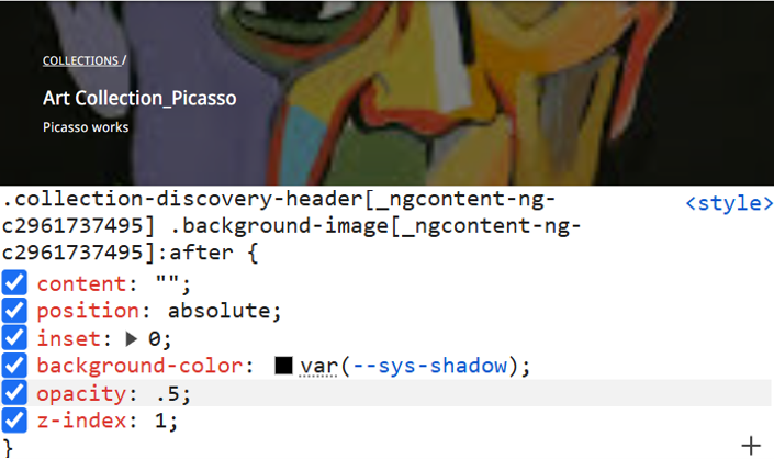
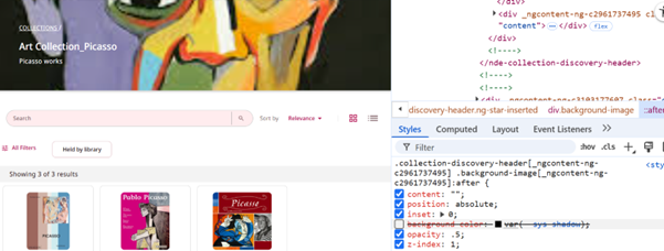
If you choose to remove the overlay, ensure you test that sufficient color contrast is maintained.
Customize a Color Theme
The NDE UI adheres to best practices in base theme design for handling color contrast. All color contrast aspects are managed through the color theme, ensuring compliance with accessibility standards. Any changes to the theme directly impact contrast levels across the interface, ensuring readability and usability for all users.

Learn more about how color themes are generated, available, and customizable.
Maintain Sufficient Contrast
The NDE UI has been tested and designed to maintain sufficient color contrast in various interactive states, including on hover, on focus, and when active/pressed. Ensure that when customizing, you maintain the color contrast requirements.
Text vs. Background: Ensure a contrast ratio of at least:
- At least 4.5:1 for normal text
- 3:1 for large text (18 pt regular or 14 pt bold)
- Interactive Components (buttons, icons, form borders, inputs, etc.) — Minimum 3:1 contrast between component and adjacent colors.
Font Weight and Size
The NDE UI incorporates practices to ensure good readability. When making customizations, consider using minimum font weights to maintain accessibility.
- Thin weights (under 300) are avoided for small text
- Sufficient difference between regular and bold weights
- Font weight does not go below 300 for any text under 18 px
- All font weights load properly and have fallbacks
- We encourage using a minimum font size of 14 px
Customizing Visible Labels
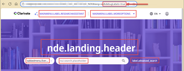
To display label codes, add &debugLabels=true to the end of the Primo page URL and press Enter to reload the page. The page displays all the configurable labels, replacing them with their corresponding codes. For additional information, see Configuring Display Labels for Primo VE. ARIA labels can be found by inspecting the element.
Changing Label Names
When changing visible label names, ensure that the corresponding ARIA label is also changed.
The aria-label should begin with the visible label. For example, if you change the Go to my library card button, adjust the aria-label to match the visible label text. See Providing Accessible Names and Descriptions | W3C.


Search Filter Names
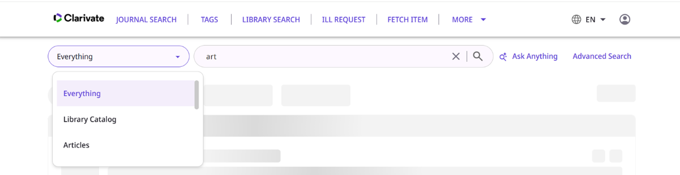
Search filters are customized by the library to reflect which collection or location is included in the search scope. When configuring the dropdown options, ensure the search labels (menu options) are clear to users.
Labels and instructions should:
- Be clear and informative
- Include any constraints such as required data formats or ranges if relevant
- Identify required fields
Removing Customizations to Test Accessibility
To test if an accessibility issue you are experiencing is part of the baseline UI, or if it was introduced by a customization, try removing local customizations by adding &noCustomization=true to the page's URL.
Adding Chat or Other Custom Elements
Libraries can add additional third-party components, such as chat features, location maps, or create their own. If adding additional components, these may have a range of accessibility built-in and should be tested independently from the NDE UI.
General Information and Resources
Page tags: article:topicproduct:primocontent:Documentationlang:english
