The Alma User Interface
The following sections present elements that appear or remain consistent in the user interface for all users throughout the Alma UX.
For an overview of the new layout that was introduced in 2022 see New Layout. For information on searching in Alma including the basic and advanced search, see Searching in Alma.
The Alma Home Page
The home page is the initial page that appears when you log in to Alma. You return to the Alma home page when you select the logo in the persistent menu or when you cancel certain actions in Alma.
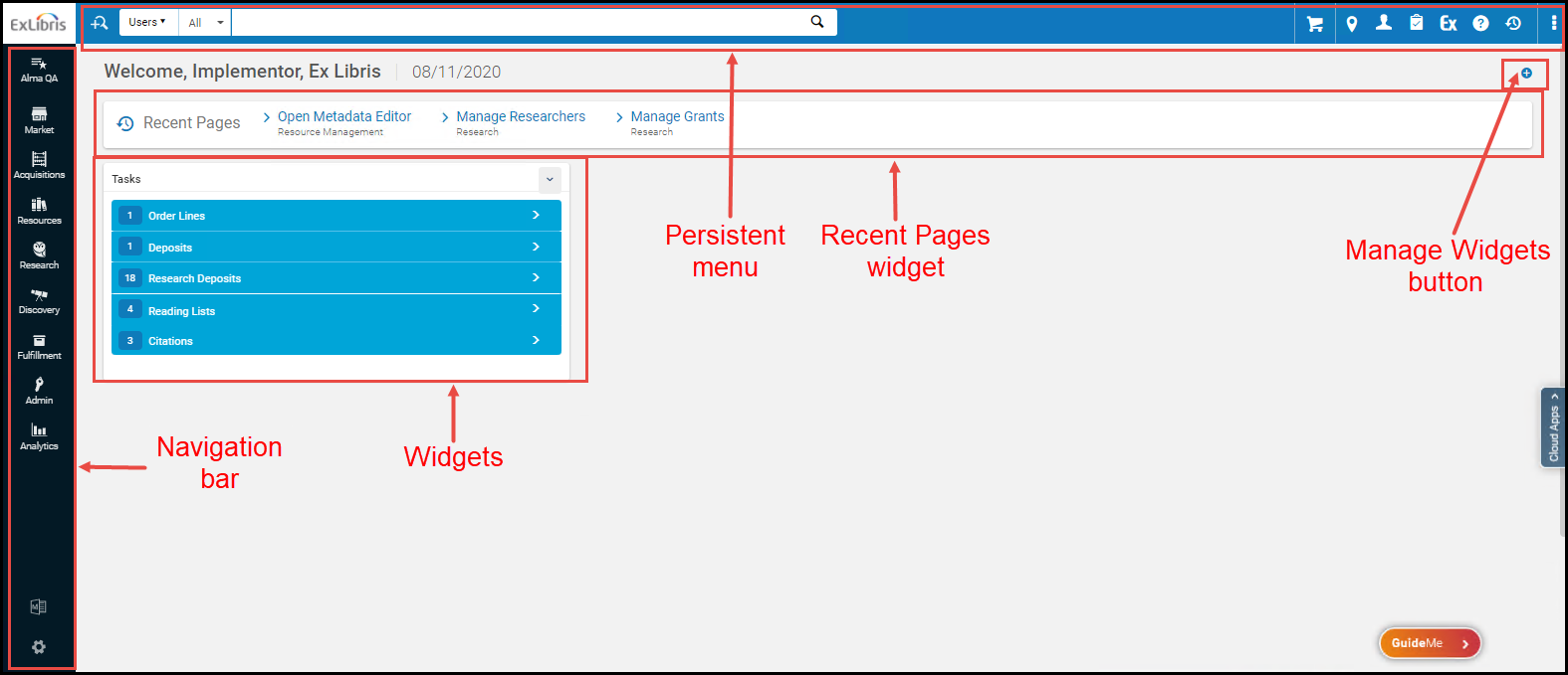
The elements on the Alma home page and items available in the menus depend on your user role and the information available at your institution. However, the home page always presents:
- Persistent Menu– For information, see The Persistent Menu.
- Navigation bar– For more information, see The Navigation Bar.
- Your user name and current date.
- Recent Pages Widget– Displays the pages you have most recently visited. Select to go directly to one of the pages.
- Widgets/Manage Widgets Button- Widgets are a small pane on information or actions that are relevant to your user role and Alma's current status. Some widgets contain links that you can select to view more information. See Managing Widgets.
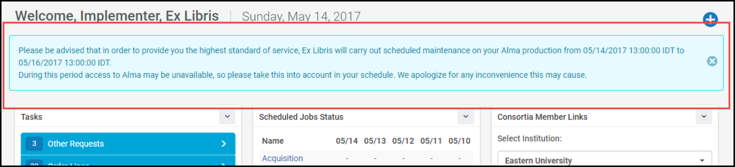
- Maintenance Message(if there is one to display) – A message about upcoming maintenance may appear under the persistent menu. Select X to dismiss the message.
Managing Widgets
Widgets are small panes of information or actions that are relevant to your user role and Alma's current status. Examples of widgets are a task list, a library calendar, the status of scheduled jobs, and outstanding student loans. Staff users can choose to display or remove widgets (except for the Recent Pages widget) from their Alma home page.
For information on how to configure notification and institution-defined widgets, see Configuring Widgets.
- Select the Manage Widgets button on the Alma home page (see the figure Alma Home Page Elements). The Manage Widgets overlay appears. For example:
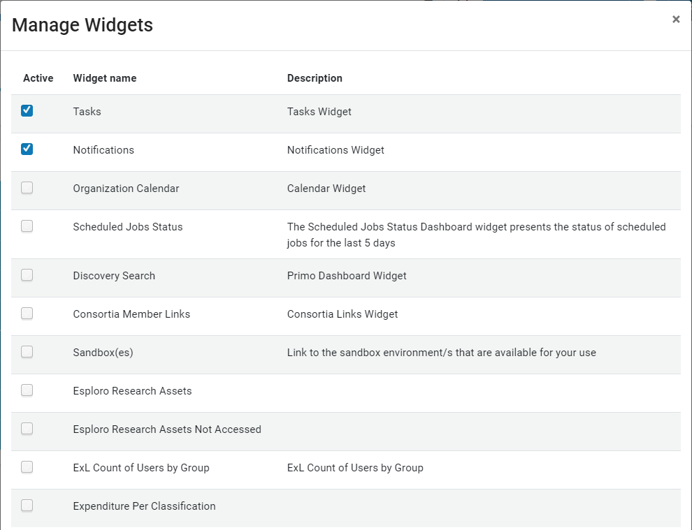
- Select the empty checkbox to the left of the widget that you want to display. Select the blue selected checkbox to the left of the widget that you want to hide.
- Select X when you are done.
You can also hide a widget by selecting Remove in the drop-down menu at the top right corner of the widget.

List of Widgets
The following widgets are available in Alma, depending on your user roles. Items in plain font are categories of widgets, rather than the actual name of a pre-defined widget.
| Widget | Screenshot | Roles | Description |
|---|---|---|---|
| Analytics |
|
As defined by the widget |
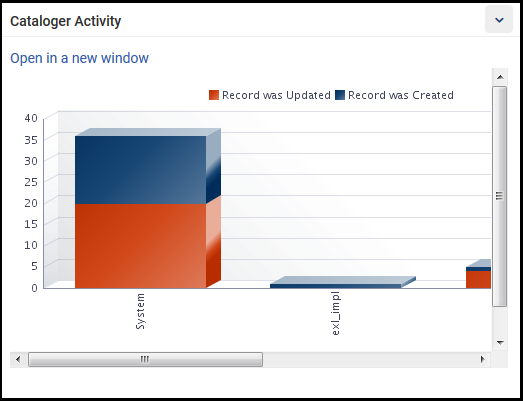
There may be multiple Analytics object widgets with various names, descriptions, and information. You must have at least one of the roles defined for the widget to be able to view it.
For more information on Analytics widgets, see Working with Analytics Objects.
|
| Tasks |
|
All |
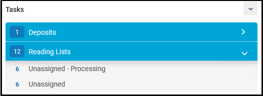
Displays tasks in the task list (see Tasks in the Task List), including a count of how many tasks. Tasks are grouped by expandable headers. Select a row to open the Alma page that enables you to deal with the task. For the Electronic Resources tasks, the counter displays the sum of the totals from each listed category (i.e., Unassigned and Past Due-Date-Unassigned). Since a single task may fall into multiple categories, the Electronic Resources tasks counter may display a higher number than there are tasks. |
| Notifications |
|
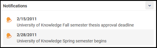
All | Notifications to all users from your administrators. For information on configuring these notifications, see Configuring the Home Page Notification Widget. |
| Organizational Calendar |
|
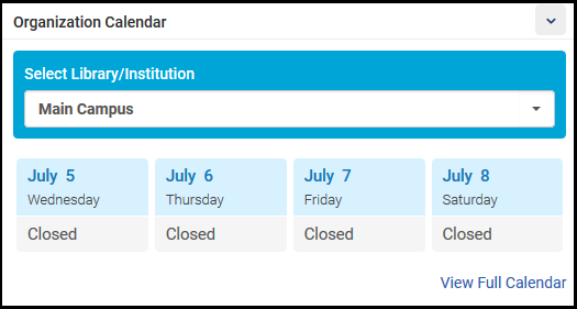
All | Information about institution and library hours and special events. A few days are shown in the widget; select View Full Calendar to open a pane with the full calendar. For information on configuring hours and events, see Managing Institution/Library Open Hours. |
| Scheduled Jobs Status |
|
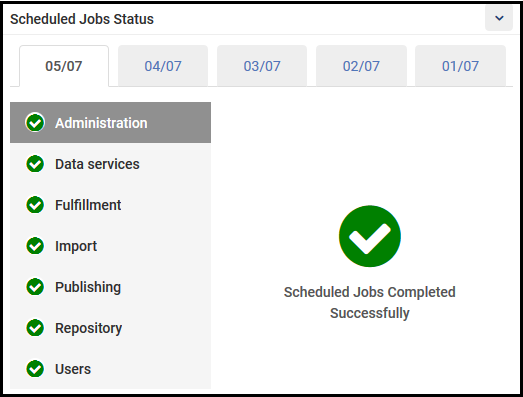
All | The status of scheduled jobs that ran in your institution, organized by type over the last five days. If there are any failed jobs, a red ! appears for that type on that date. Select the More Info link to view the Monitor Jobs page with those jobs pre-filtered to appear. See Viewing Completed Jobs. For more information about this widget, see Viewing Scheduled Job Summary Status. |
| Discovery Search |
|
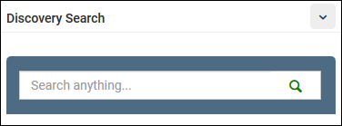
All | For Primo VE environments only, this widget allows staff users to search for items using Primo VE's search interface, which uses the default view defined on the View Configuration page. To configure this widget, see Configuring the Discovery Search Widget. |
| Primo Dashboard |
|
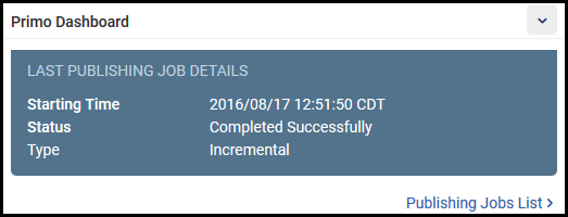
All | For Alma-Primo environments only, this widget displays the status of the last publishing job to Primo. Select Publishing Jobs List to view the Monitor Jobs page with that job pre-filtered to appear. See Viewing Completed Jobs. |
| Consortia Member Links |
|
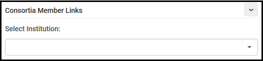
All | This widget is available for all institutions, but it only has meaning for institutions that are members of a collaborative network implementing a Network Zone (see Managing Multiple Institutions Using a Network Zone). Select a member institution to open a new tab, enabling you to log in to that institution. |
| Administrator-created |
|
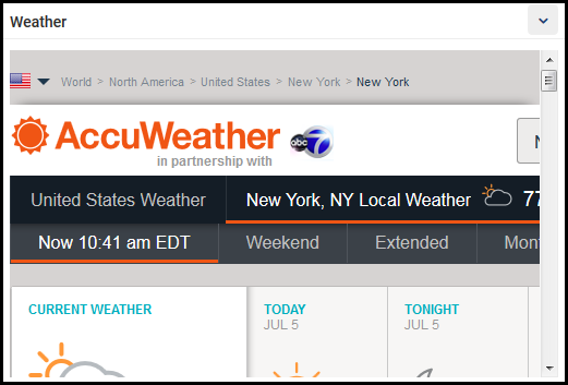
As defined by the widget | Administrators can create widgets linked to information on any website. For more information, see Configuring Widgets. |
The Navigation Bar
The main menu used to navigate in Alma. Throughout this document, any reference to this menu uses a path of menu and sub-menu elements as follows:main section > sub-section > specific option, for example Fulfillment > Checkout/Checkin > Manage Patron Services. If the resulting page is also a menu of options, these options may appear in the documentation as additional elements to the path.
The new Alma UX has a toggle button in the navigation panel that presents a streamlined menu containing only the most widely and commonly used menu entries, selected based on statistical analysis. For more information, see New Layout.
The Navigation bar can be collapsed to provide more room on the page while still remaining visible. It can be expanded again at any moment.
From the Navigation Bar you can easily search for specific menu option and set the menu options that you use frequently as Quick Links, so that the Alma interface is personalized to your workflow and you don't have to go through the sub-menus every time.
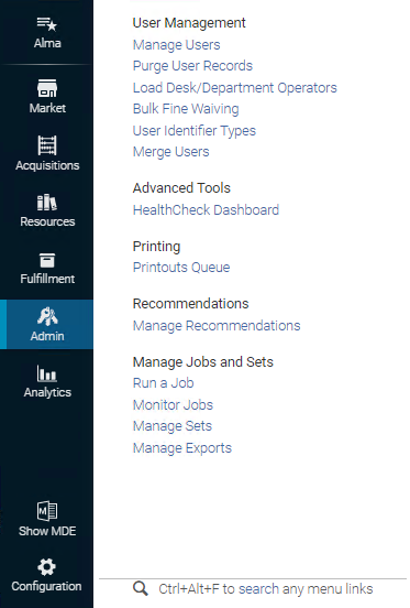
The options in the Alma main menu depend on several factors, in particular the library/location to which you are logged in (see the table below) and your user role (see Managing User Roles). For the roles that are required to see each option, see User Roles – Descriptions and Accessible Components.
Select an option to navigate to the relevant page and close the menu. The main areas are described in the following areas of the documentation:
- Acquisitions- Purchasing physical and electronic materials, as well as managing invoices, vendors, and licenses.
- Resources- Cataloging and managing inventory, as well as importing and publishing inventory information.
- Fulfillment- Managing patron services, as well as courses and reading lists, resource sharing with other libraries, and other patron requests.
- Admin- Administration activities, including managing users and jobs. Also see the Configuration Menu in Configuring Alma.
- Analytics- Creating, running, and viewing reports about Alma usage. Some pre-packaged reports are available from this menu.
Select on the Navigation Menu and select an option from the My Homepage drop-down list. The dashboard you select is displayed as the Alma home page.
To view the full dashboard, select the View Full Workbook in Analytics link at the bottom of the page. The options displayed here are configured on the Analytics Object List. For more information, see Displaying a Report Preview.
- Select on the Navigation Menu or type Alt-Ctrl-F. Alternatively, at the bottom of any menu area, select the search link.
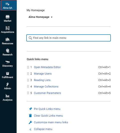
- Enter your search term. Matching options in the Navigation Bar, as well as in the Configuration Menu, appear.In some cases, Alma prompts you with potential matches under the "Maybe you are looking for" heading.
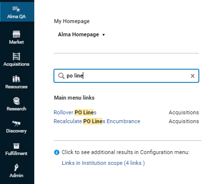
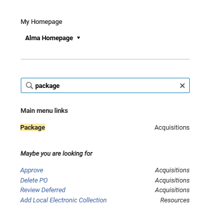
- Select the relevant option.
There are two methods to create Quick Links that you can use, depending on where in the Alma menu you are:
|
From the Navigation Panel |
From the sub-menu |
|---|---|
|
|
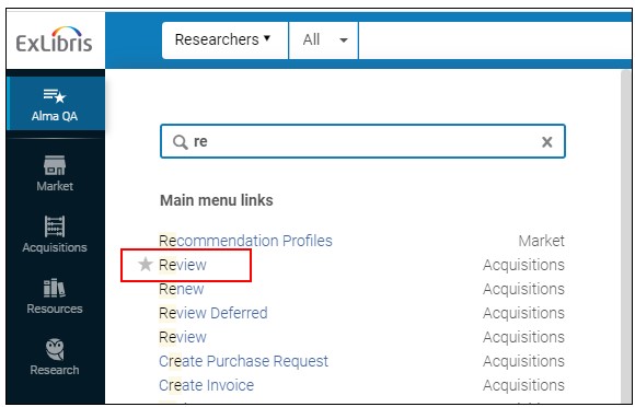
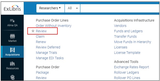
Once created, you can do the following with the Quick Links:
- To view your Quick Links, selectto open the Quick Links panel and select your link.
- Use the hotkey automatically designated for each link to open the tools more quickly.
- Select Pin Quick Links menu to pin all the Quick Links to your page, as an additional menu below the Persistent search box, always available on all pages. To remove this menu, select Unpin Quick Links menu.
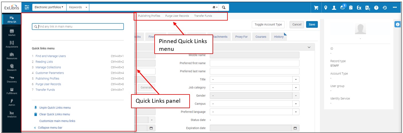
Do that if your screen is small and some of the links on the Navigation bar are located under the "..." button.
- In the Navigation bar, select the top option "Alma QA".
- In the panel that opens, select the "Customize main menu links" option.
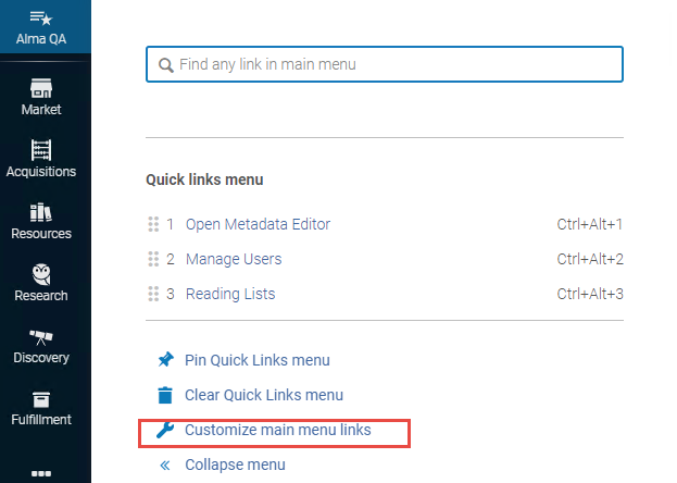
- In the Display Menu panel that opens, drag and drop the options that you don't need to the Hide Menu section below. This will free the real estate on the Navigation bar for the options that you do use. At any moment you can revert back or un-hide some of the options that you hid.
The Persistent Menu
Every page in Alma has the same header, which is called the persistent menu.

The persistent menu contains the following elements:
- Logo — The logo of your consortia or institution. Select the logo on any page to return to the Alma home page.
- Persistent Search Box — For more information, see Searching in Alma.
- Persistent Menu Icons– Icons include (from left to right):
Icon Description 
Library/desk selector (I am physically at:) — Alma presents you with the features and options that are relevant to your user role and your logged in desk or department. You can switch locations using this menu: select the new location in the drop-down menu. If your institution is working with a Network Zone and you are permitted to switch between member institutions (you have a user account in multiple institutions), you can also switch between institutions. For more information, see Switching Between Institutions.
The current location does not appear in the persistent menu by default. To display the current location in the persistent menu, select Always show current location in the library/desk selector menu.
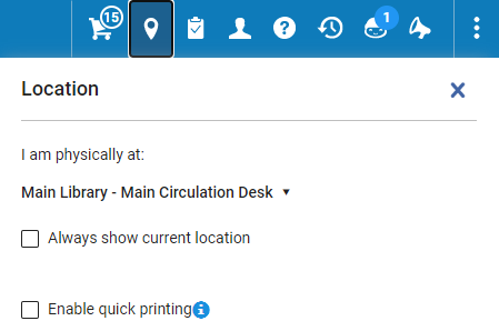 Library/Desk Selector Menu
Current Location in Persistent Menu Enable Quick Printing— Select this option to set that all printouts that are created as part of a workflow via the user interface and going to a specific printer should print automatically, overriding the Print dialog. When using quick printing, the printing window immediately displays when the letter is generated.
 (not shown)
Institution selector (appears only when enabled and for a user who has credentials in multiple member institutions working with the same Network Zone). For more information, see Switching Between Institutions.  (not shown)
RFID connection icon (appears only when an RFID integration profile is defined). For more information, see RFID Support. 
User Menu — Your user name and photo (when available) appears as a link. Select the link to open the user menu. The options in this menu are as follows: - Change User Interface Language— In some institutions, the first item in the menu is a language selector that you can use to change the language used in the UI. To change your language, select a new language from the drop-down list. The user interface changes to the selected language. Currencies and numbers in the UX and exported Excel files change to match the standard defined by the language (with commas, periods, and spaces in the appropriate locations). See Configuring Institution Languages.
- Change Password— Change your password. This option only appears for internally managed users (see Account Type). To change your password, enter your existing password and your new password twice and select Save. Your new password is saved.
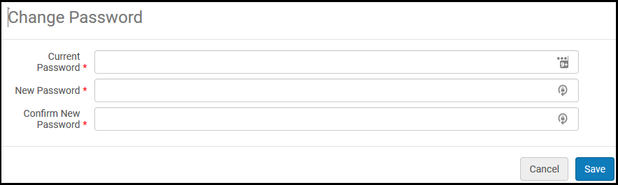 Change Password Dialog BoxDepending on your institution’s setup, you may be required to use passwords of a certain length, to include certain characters in your password, or to change your password at certain times.
 - User Details— Display user details on the User Details page. For more information, see Editing Users.
- Detach from social account— If the user account has been associated with a social account and you want to disassociate the two, select this option to do so. This appears only if the user account is associated with a social account.
- Sign in to Another Product— Enables users with access to multiple products (for example Alma, Esploro, Rapido, etc.) to switch between them without needing to log in again.
- Show what's new—Enable users to view/hide feature promotions that display on the home page or in relevant contexts, to bring new functionality to their awareness. This is enabled by default. Note that these notifications only work if the user has Cookie Settings enabled in the User Menu (see above) and the institution has Digital Adoption enabled (see Configuring Digital Adoption).
- Feature Rollout Preferences — Open the Feature Rollout Configuration page, in which you can choose which optional new features to activate. See Opting In or Out of a New Feature.
- Cookie Settings— See Cookies and Cookie Policy for more information.
- UI Preferences
- Display Density — Set the font size (Small/Medium/Big).
- Responsive Screen Mode — View content in low resolution screens and disable split screen mode. (Applies only to pages with the new layout - see New Layout).
- "Did you mean" search suggestions — When enabled, the interface displays an alternative suggested term in supported simple searches in cases where a search returns no results or few results. This setting only appears if the did_you_mean_search_suggestion parameter is enabled in the Institution level (Configuration Menu > General > General Configuration > Other Settings). For more information, see Searching in Alma..
- System Sounds On — When enabled, system sounds for alerts and pop-ups are turned on for the user. This setting only appears if Allow users to manage their sound settings is enabled in the Institution Sound Configuration page (see Institution Sound Configuration).
- Advanced Sound Configuration — This option only appears if Allow users to manage their sound settings is enabled in the Institution Sound Configuration page (see Institution Sound Configuration). On this page, at the user level, the user can do the following:
- Turn system sounds on/off at the user level.
- Reset all sounds to default. This controls the sounds (not the toggles). The default at the user level is the institution's current choices (see Institution Sound Configuration).
- Customize notification message sounds at the user level.
- Shortcuts Customization - See Global Alma Hot Keys.
- Session Timeout —Update Alma's timeout duration. This option is only visible if the Allow users to override the default session timeout checkbox is selected (see Session Timeout Configuration).
- Sign Out— Log out. See Logging Into and Out of the User Interface.

Tasks list — A list of task types that may require your attention. Each line indicates the task type and the number of tasks of that type. Select a line to open the page that enables you to manage these task types. For more information see Tasks in the Task List and Assigned to Me, Unassigned, Assigned to Others Tabs.  (not shown)
Chat with Support link. Opens the Ex Libris Support page, which allows staff users who have chat permissions to start a chat session with our Support team regarding the following types of issues: - Simple how-to questions and configurations
- Behavior and general inquiries
This functionality is disabled by default. Only staff users who have been assigned the Chat with Support role are permitted to open a Chat session with our Support team. For more configuration information, see Managing User Roles.
For more details, see Online Chat Support and Chat Support Availability.
Chat is provided for Alma, Alma Community Zone (Alma Data Services), Primo VE, CDI (through Alma), Leganto, Summon-360, RefWorks, Pivot-RP, and Rialto.

Help link — A menu of help options. Select one of: - Alma Knowledge Portal— (New for November 2026) Open the Alma Knowledge Portal.
- Help For This Page— Open the Online Help page that is relevant to the current UX page that you are on.
- What’s New Videos— View a page with links to the most recent video tutorials.
- Alma Release Schedule— Display a pop-up with the last several, and next several, Alma sandbox, production release, and release update dates.
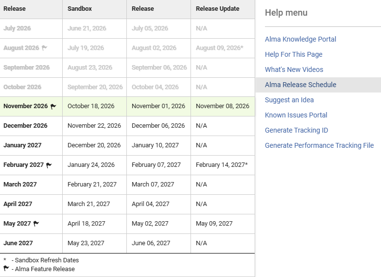 Release Dates Pop-up
The current release version and build number appear at the bottom of the Help menu. For premium sandbox customers, when working in the sandbox, the build information indicates the date that this build was cloned from production. An asterisk in the Release Update column indicates the date of the next scheduled refresh.
- Suggest an Idea— Suggest an idea to Ex Libris. Select to open the Ex Libris Idea Exchange page in a new window.
 Ex Libris Idea ExchangeYour administrator may have removed this link. See Configuring Other Settings.
 - Known Issues Portal— Access the Known Issues Portal (see Known Issues Portal for more information).
- Generate Tracking ID— Generate a tracking ID for your Salesforce case to assist Ex Libris in debugging a problem. Use this when an error occurs but the error message does not contain a tracking ID. You should generate the ID as soon as possible after the error.
 Generate Tracking IDThe tracking ID is not enough to resolve your issue. You must still provide as many details of the problem as possible, such as the steps in the workflow that led to the error, which entities were involved (user identifier, item barcode, and so forth.), and any other information that might be relevant.
For more information about the Tracking ID generation, see How to generate a tracking ID in Alma.
- Start Performance Tracking Session— Generate a performance tracking file if Alma displays performance issues, such as long search times. Open a support issue and attach the file to the issue. The information in the file can help the support team resolve the issue. For frequently asked questions about Performance Tracking files, see here. For information on How to Report Alma Performance Issues, see here.Generate the tracking file immediately after experiencing the performance issue, before doing any other action.The tracking ID is not enough to resolve your issue. You must still provide as many details of the problem as possible, such as the steps in the workflow that led to the error, which entities were involved (user identifier, item barcode, and so forth.), and any other information that might be relevant.
- The Performance Tracking File is not enough to resolve your issue. You must still provide as many details of the problem as possible, such as the steps in the workflow that led to the error, which entities were involved (user identifier, item barcode, and so forth), and any other information that might be relevant, such as a screencast recording and more.
- Instance Name— Displays the name of the environment currently in use.
- Instance Location— Displays the location of the data center for this instance.
- Premium Sandbox— Connect to your Alma premium sandbox, if you have one. For detailed information on sandbox environments, see Alma Sandbox Environments. If the Institution has at least one SAML\CAS profile, hover over the link to open a sub-menu with links to Premium Sandbox using different profiles. If the institution has no SAML\CAS profiles, then there is a single link to log in to the Premium Sandbox.
- Standard Sandbox— Connect to your Alma standard sandbox, if you have one. For detailed information on sandbox environments, see Alma Sandbox Environments. If you want to customize the link to your Alma standard Sandbox, for instance, for using a SAML link, this can be configured in Configuring Other Settings > standard_sandbox_override_link.
- Status of Last Full Indexing— (New for November 2026) By default, the status and date of the last full (semi-annual full inventory) indexing appears. If the status_of_last_full_indexing parameter (Configuration > Network Zone > Support Services > General > Other Settings) is set to false (true by default), then the date of the last indexing job that was run (initiated by the system or by customer support) appears, regardless of whether it was a full indexing or not. In this case, the text will not contain the word "full". The semi-annual reindexing is full reindexing of the Alma repository is done twice a year (generally in May and November). For a more detailed explanation, see here. While semi-annual indexing runs, it appears under Running Jobs tab (Admin > Monitor Jobs). If you want to run a full reindexing at other points in time, contact Ex Libris Support. If you are a Depositing Administrator, General System Administrator, or Repository Administrator, the date that appears here is a link. Select the link to view the indexing job report.
- A link to the most recent Alma release notes.
- In your sandbox environment, the date of the last clone from production.
- Last Updated from Community Zone— This is the latest update the Community Zone has with respect to one of the institution's linked records. Thus, when there is an update in the Community Zone from this date related to the institution's inventory, it will be synced to the institution as soon as possible in the subsequent "Synchronize Changes from CZ" job, usually within 24 hours.
Example of "Last Updated from Community Zone":- The institution has ten records in its Alma.
- Five of them are linked to the Community Zone.
- Alma identifies that today, e.g. Sept 09, 2022, there was an update on the five records which are linked to the Community Zone.
- The update was on the Community Zone record and was not yet applied to the record in the user’s institution.
- Alma presents the date of Sept 09, 2022, so the user will understand that there are some Community Zone records in their institution which will be updated in the next Community Zone update.
- This date is just an indication that there was an update on the Community Zone side (relating to one of the records that are linked to the Community Zone from your institution).
- To see if these records were updated in the Institution Zone, the user can go to monitor jobs and verify the Synchronize changes from CZ job ran.

DARA (Data Analysis Recommendation Assistant) link — Displays the number of DARA recommendations that are available, and provides a shortcut to the Manage Recommendations page (Admin > Recommendations > Manage Recommendations). This link displays only when there are available recommendations.
For more details, see DARA – Data Analysis Recommendation Assistant.

My Activity Center pane — enables you to view and access your recent activity, including the Recent Entities list that lists all the entities you have added, updated, and deleted within the last 7 days. You can scroll through the list and select an entity to resume your work, or you can view the entity in view-only mode. The Recent Entities list is a helpful way to find the records you have recently accessed, even if you do not remember their names. It also allows you to easily view your recent changes to your records. At any moment, you can open and close the Recent Entities list, and then resume your ongoing work without interrupting its context. For more details, see Recent Entities List.

Alma Announcements pane — enables Ex Libris to update users on important issues, unusual occurrences, or major feature rollouts, as well as provide ad-hoc updates and announcements.
For more details, see Alma Announcements List.

Real-Time Notifications is an opt-in, system-level interface that displays items requiring your attention. Staff can elect to receive notifications centered on Alma manual jobs (not scheduled jobs) and Rialto orders and workflows. Users who opt-in can receive a pop-up and/or email when:
- Alma Upon completion of a job initiated from the UI, a popup notification appears. All such notifications are accessible through the notification icon () on the top menu bar.
- Rialto Orders are cancelled, rejected, or require intervention, etc. Users also see the message (with actionable links) in the Real-Time Notifications panel. For a walk through on viewing and managing user notifications, watch User Notifications(2:00 min).
For more information, see Real-Time Notifications.

More options displays the other persistent menu icons that are not displayed in the main persistent menu because the screen size was not large enough or because they were hidden by the user. To hide a persistent menu icon, select Customize under More options, drag the icon from Display icons to Hide icons, and then select Save. 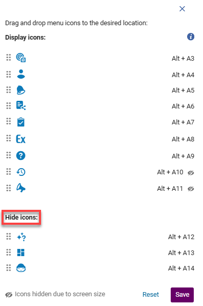
Page Header and Summary Panel
A page header appears below the persistent search box.
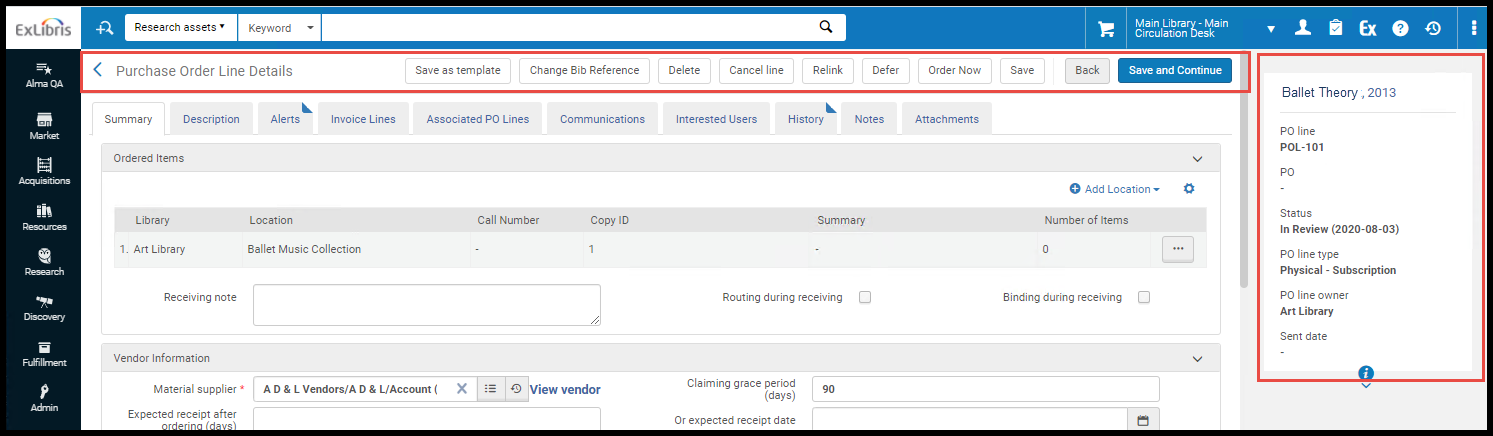
The page header contains:
- A back icon
 , if this page was opened from a list or as part of a larger procedure.
 - The page title.
- Any relevant actions (as buttons) to perform page-level actions on the page.
- The default action (typically Save) is highlighted in blue.
- If there are too many actions to display, additional actions are available in the or ... menu to the right of the displayed actions.
On many pages, a summary panel appears to the right of the page (if the screen size is small, it might appear below the page header). The summary panel provides information about the page's contents (for example, information about an inventory item, PO line, or user). The summary header typically includes the entity's identifying number, status, and an info icon. Select the Info icon at the bottom of the panel to see who created the entity, when, and when it was last updated.
Tasks and Task Lists
Many pages in Alma contain information about tasks that may be assigned to you or others. These tasks may also appear in tasks lists that can be accessed from the persistent menu. The following types of tasks can appear in task lists. Note that task lists are also available as home-page widgets (see Managing Widgets). For more information, see Assigned to Me, Unassigned, Assigned to Others Tabs.
- Approve Deposits - Assigned to Me
- Approve Deposits - Unassigned
- Approve Deposits - Assigned to Others For information about approving deposits, see Approving Deposits.
- Due Reminders - Last 7 Days
For more information, see Viewing Due Reminders. - Borrowing requests - New - with no partner - assigned to you
- Borrowing requests - New - with no partner - unassigned
- Overdue borrowing requests - assigned to you
- Overdue borrowing requests - unassigned
- Borrowing requests cancelled by partner - assigned to you
- Borrowing requests cancelled by partner - unassigned
- Borrowing requests recalled - assigned to you
- Borrowing requests recalled - unassigned
- Borrowing requests conditional - assigned to you
- Borrowing requests conditional - unassigned
- Borrowing requests ready to be sent - assigned to you
- Borrowing requests ready to be sent - unassigned
- Borrowing requests returned by patron - assigned to you
- Borrowing requests returned by patron - unassigned
- Borrowing requests with active general messages - assigned to you
- Borrowing requests with active general messages - unassigned
- Borrowing requests completed with active general message - assigned to you
- Borrowing requests completed with active general message - unassigned
- Borrowing requests with active notes - assigned to you
- Borrowing requests with active notes - unassigned For information about managing borrowing requests, see Managing Resource Sharing Borrowing Requests.
- Electronic resources - activation - assigned to you
- Electronic resources - activation - passed due date - assigned to you
- Electronic resources - activation - passed due date - unassigned
- Electronic resources - activation - unassigned For information about activating electronic resources, see Managing Electronic Resource Activation.
- EOD import match issues
- EOD import validation issues
- Import match issues
- Import validation issues For information about resolving import issues, see Resolving Import Issues.
- Invoices - approval - assigned to you
- Invoices - approval - without assignment
- Invoices - review - assigned to you
- Invoices - review - without assignment For information about reviewing and approving invoices, see Reviewing Invoices and Approving Invoices.
- Items - deposit
- Items - digitization
- Items - document delivery
- Digitization requests - approval These tasks appear only when you are at a digitization department. For information about managing digitization requests, see Digitization Processing.
- Items - in department
- Items - in department - requested by patron
- Requests - pickup from shelf For information about managing items, see Managing Requests and Work Orders and Pickup at Shelf.
- Lending requests - New - assigned to you
- Lending requests - New - unassigned
- Lending requests - Overdue - assigned to you
- Lending requests - Overdue - unassigned
- Lending requests - Recalled - assigned to you
- Lending requests - Recalled - unassigned
- Lending requests - Conditional - assigned to you
- Lending requests - Conditional - unassigned
- Lending requests failed locate - assigned to you
- Lending requests failed locate - unassigned
- Lending requests with active general messages - assigned to you
- Lending requests with active general messages - unassigned
- Lending requests - completed with active general message - assigned to you
- Lending requests - completed with active general message - unassigned
- Lending requests with active notes - assigned to you
- Lending requests with active notes - unassigned For information about managing lending requests, see Managing Resource Sharing Lending Requests.
- Order Lines - deferred - assigned to you
- Order Lines - packaging
- Order Lines - review - assigned to you
- Order Lines - review - unassigned
- Order Lines - waiting for renewal
- Order Lines with claims
- Orders - approval
- Orders - review For information about managing PO lines, POs (orders), renewals, deferrals, and evaluations, see Reviewing PO Lines,Reviewing POs,Processing Renewals,Reviewing Deferred PO Lines, and Managing Trials.
- Purchase requests - In Review - assigned to you
- Purchase requests - In Review - unassigned For information about managing purchase requests, see Managing Purchase Requests.
- Reading List - Unassigned
- Reading List - Unassigned - complete
- Reading List - Unassigned - processing
- Reading List - Unassigned - reading for processing
- Reading List - Assigned to Me - reading for processing
- Reading List - Assigned to Me - List with new note
- Reading List - Unassigned - List with new note For information about managing reading lists, see Managing Reading Lists and Removing Alerts from Citations.
- Trials in evaluation - analysis
- Trials in evaluation - draft
- Trials in evaluation - requested
- Citation has a New File
- Citations - Being prepared
- Citations - Copyright waiting for approval
- Citations - In Process
- (Leganto customers only) Citations - Marked as broken
- Citations - Ready for processing
- (Leganto customers only) Citations - Assigned to Me - have new notes
- (Leganto customers only) Citations - Unassigned - have new notes For information about managing citations, see Managing Citations.
- (Esploro customers only) Research Deposits - Assigned to Me - Draft
- (Esploro customers only) Research Deposits - Assigned to Me - Resubmitted
- (Esploro customers only) Research Deposits - Assigned to Me - Submitted
- (Esploro customers only) Research Deposits - Assigned to Me - Under Review
- (Esploro customers only) Research Deposits - Assigned to Me - Returned
- (Esploro customers only) Research Deposits - Assigned to Me - All
- (Esploro customers only) Research Deposits - Unassigned - Draft
- (Esploro customers only) Research Deposits - Unassigned - Resubmitted
- (Esploro customers only) Research Deposits - Unassigned - Submitted
- (Esploro customers only) Research Deposits - Unassigned - Returned
- (Esploro customers only) Research Deposits - Unassigned - All For information about managing research deposits, see Managing Research Deposits.
- DARA Recommendations - Recommendations - Active For more information, see DARA – Data Analysis Recommendation Assistant.
Configuring Alma
- Select the settings
 icon. The following changes take place:
- The Alma Main Menu changes to the Alma Configuration Menu. To distinguish it from the Alma menu, the bar color changes to the default primary color in the user interface, and its icons feature a cog wheel to distinguish them from the regular Alma icons.
- The persistent search bar disappears, and the dropdown of units to configure appears instead.
- Instead of the main Alma window, a dedicated screen opens.
- Select the unit to configure in the dropdown at the top of the page next to Configuring.
- Select the functional area to configure, such as Acquisitions, and find the specific configuration tool you need.
- To close Alma Configuration and to return to the task you left in Alma, select the
 icon.
icon.
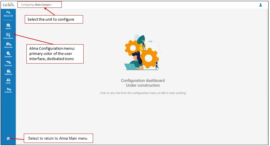
Throughout this document, any reference to the configuration menu uses a path of menu and sub-menu elements as follows:Configuration Menu > main section > sub-section > specific option, for example,Configuration Menu > Fulfillment > Location > Remote Storage. If the resulting page is also a menu of options, these options may appear in the documentation as additional elements to the path.
Select Back to Alma to return to Alma. For information on configuration, see the following sections.
- Configuring Acquisitions
- Configuring Fulfillment
- Configuring Resource Management
- Configuring User Management
- Configuring General Alma Functions
- If you are managing multiple institutions working with a Network Zone, see Administering a Network Zone
Global Alma Hot Keys
A long list of global keyboard shortcuts (shortcut keys) is available in Alma. You can view the full list on the Shortcut Customization page (User menu > UI preferences > Shortcut Customization).
For any action that begins with pressing the Alt key, the action letter or number appears on the page when you press the Alt key. On a page that has tabs, enter the tab number (even if it contains multiple digits) while pressing the Alt key to open that tab. When you release the Alt key, Alma opens the tab corresponding to the number you entered.

You can disable some global Alma keyboard shortcuts. You may want to do that in cases when your language requires the usage of the same keyboard keys for typing accents or diacritics. For users who work with Alma's Alt+Number shortcuts, we recommend using the Numbers Row in the keyboard (and not Numpad), as Numpad is used by some external programs' keyboard shortcuts. To do that, disable the slider by that shortcut. Note that you can only disable an Alma shortcut, but cannot define a different Alma shortcut for the same action.
Additional shortcuts are available on the Patron Services (see Managing Patron Services) and Manage Item Returns (see Returning Items) pages.
For information on the keyboard shortcuts available in the MD Editor, see Metadata Editor Menu and Toolbar Options.
Copy Option When Selecting Text
When selecting text in Alma, a small pop-up menu with the option to copy the text appears. Select the option to copy the text; a confirmation check mark briefly appears.
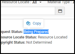
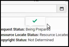
Icons
This section presents icons that appear in various places in Alma. Also see Search Result Icons.
Info Icon
You can see additional information about certain items by selecting the Info icon on some pages in Alma, for example the Purchase Order Lines Details page. When you select the Info icon, a pop-up appears with information about the item on the page: created by, last updated by user/job, and (where applicable) modified by information.
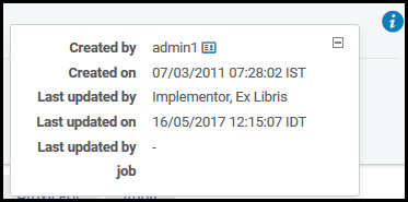
User Information Icon
You can display user information by selecting the User Information icon beside a user name on various pages and pop-up windows, such as the User Details page.
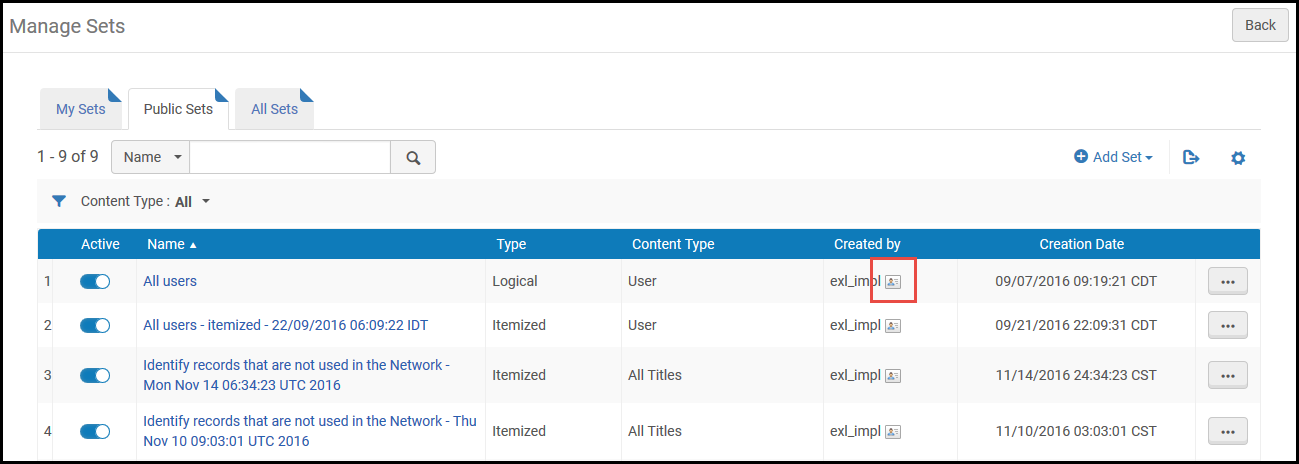
Select the icon to display user information:
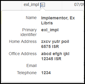
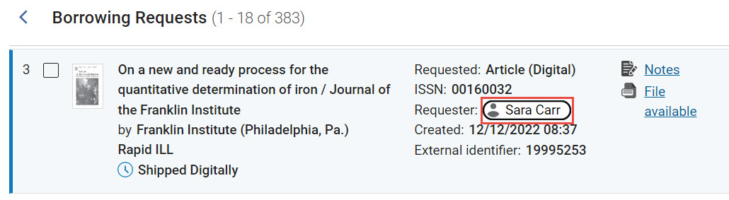
In the New Layout of task lists (see New Layout 2022), which was gradually introduced beginning in August 2022, the User Information icon has been replaced with a user button.
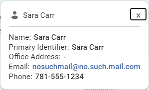
An administrator can define which user-information fields are displayed in this pop-up box. See Configuring User Information for Pop-ups.
Translate Information Icon
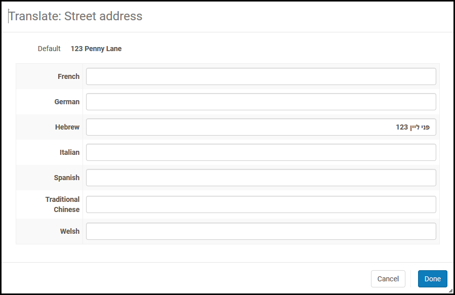
If your institution supports multiple languages, Alma translates system-defined UX elements, such as messages and field names into the language selected by the user. You may also want to enable the user to view certain entered information in the user's selected language. See Configuring Institution Languages.
A limited number of fields in Alma support this ability. When multiple languages are enabled, these fields appear with a Translate Information icon . For example:
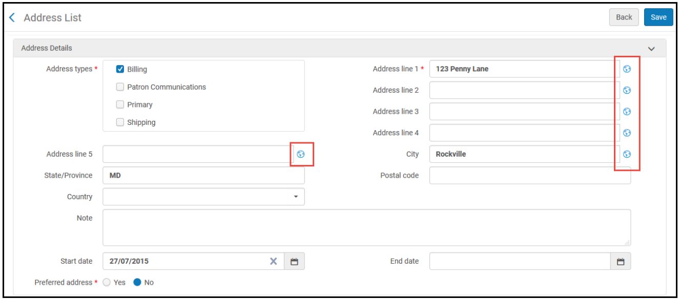
Select the icon to open a dialog box that enables you to enter the field's information in the other enabled languages.
Messages
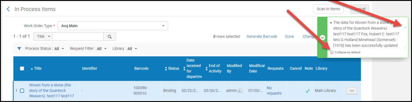
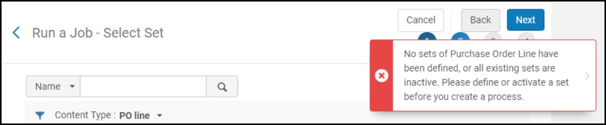
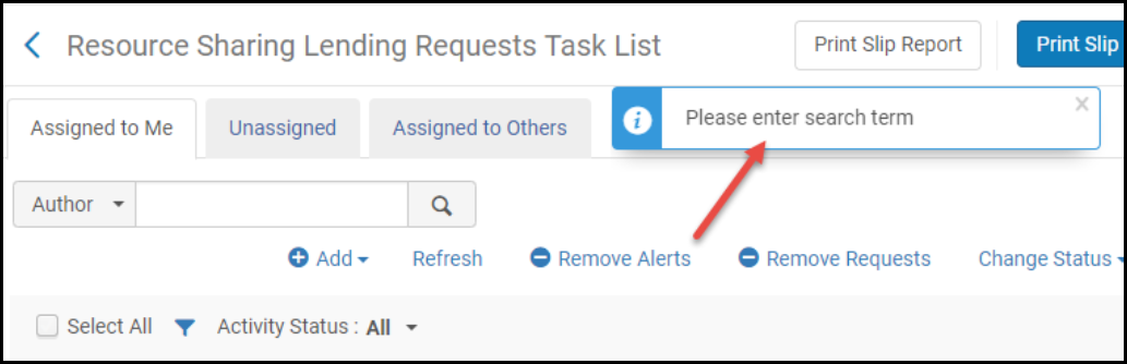
Alma returns messages on many pages based on your actions or missing or required information. Messages appear in a notification bar on the side of the page. The notification bar displays message types of Information, Error, and Success, each with different icons and colors. In confirmation dialog boxes and other smaller panes, the messages appear on the page (not floating). If you ignore a message but continue to work on the page, the message is minimized to its icon and remains on the page.
- Success – An action you performed succeeded. In the case of an action that initiates a job, success only means that the job was submitted successfully, not that the results of the job were successful. After successfully submitting a job, you can select the job number in the message to open the Manage Jobs page (see Viewing Running Jobs).
Select X to remove the message or > to minimize the message. When enabled by Ex Libris, you can select Collapse by default to make all success messages on this page appear initially collapsed.
- Error – Your action could not be performed, or it failed. The message indicates the reason for failure, when available (see also Generate Tracking ID in The Persistent Menu). Select > to minimize the message.
- Information – An indication of a normal event about which you should take notice. Select X to remove the message.
Tabs
Many pages contain too much information to fit on one page, or information that is better grouped together on subpages. These pages contain tabs at the top of the information. On some pages, the name of the page and some information at the top of the page (above the tabs) remains as you navigate between tabs. On other pages, navigating to a new tab may change the page name and remove or replace the top information.
In addition, many pages contains tabs with similar functionality. For more information, see Common Alma Tabs.
"Has Content" Indication
When a page contains multiple tabs, a blue icon indicates that the tab has a table or list with user—configured or system—generated content.
For example:
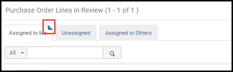
Below is more detailed information on when the Has Content indication appears for the various tabs in specific entities:
Electronic Collection
-
General— License fields
-
Description— No Has Content indication
-
Additional— There are services for the collection
-
Notes— A note/s exists for the collection (whether functional or general)
-
Group Settings— Group settings are configured for the collection
-
History— There are saved changes in the history table for the collection
-
CDI— Collection is in CDI
Electronic Portfolio
-
General— Has no content indication
-
Linking— No Has Content indication
-
Coverage— Global/local/ perpetual coverage
-
ACQ— No Has Content indication
-
Notes— A note/s exists for the portfolio (whether functional or general)
-
Group Settings— There are group settings configured for the portfolio
-
Related portfolios— Other portfolios are associated with the portfolio's bib
-
CDI — No Has Content indication
License
-
Summary— No Has Content indication
-
License Terms— No Has Content indication
-
Inventory— One of the lists contains a value
-
PO Lines— License is linked to a PO Line
-
Amendments— License has one or more amendments
-
Group Settings— License has one or more group settings
-
Administrators— License has one or more administrator/s
-
History— There are saved changes in the history table for the license
-
Notes— A note/s exists for the license (whether functional or general)
-
Attachments— Attachments exist for the portfolio
Users
-
Contact Information — At least one contact entry (such as address, phone number, or email) exists in the user record
-
Identifiers — One or more identifiers (e.g., barcode, staff ID, external ID) are present in the Identifiers section.
-
Notes — At least one note (staff note or fulfillment note) has been added to the user record.
-
Blocks — Any block—manual or automated (such as due to fines, overdue items, demerits, or consortium rules)—is currently applied to the user
-
Fines/Fees — User has active fines or fees recorded in their account
-
Demerits — User has accumulated demerit points, which may result in automatic blocking
-
Statistics — Statistical data (such as circulation history, usage, or analytics) exists for the user
-
Attachments — There are attached documents or files linked to the user record
-
Proxy for — User is set up as a proxy for one or more other users
-
Courses — User is associated with one or more course records (as an instructor, student, or in course reserves)
-
History — There is historical data for the user, such as record merges, edits, or prior activities
Vendors
-
Summary — Does not have the Has Content indication
-
Contact Information — One or more addresses, phone numbers, email addresses, or URLs are entered for the vendor
-
Contact People — Individual staff contact records (name, job description, etc.) are added under the vendor account
-
EDI Information — The Has Content indication appears when an EDI code is configured for the institution (in the Per Organization Unit EDI section).
-
Usage Data — The Has Content indication appears when creating one or more SUSHI accounts
-
System Integration — Does not have the Has Content indication
-
Invoices — One or more invoices (EDI or manually created) are linked to the vendor account
-
PO Lines — Purchase order lines (one-time or continuous) are associated with the vendor
-
Communications — Communications such as emails or messages have been sent to or received from the vendor and logged
-
Attachments — Files or documents (e.g., EDI files or vendor documents) are attached to the vendor record
-
Notes — Internal library notes or comments about the vendor are added
-
Analytics — Does not have the Has Content indication
Common Alma Tabs
Many pages in Alma contain tabs with similar functionality.
Assigned to Me, Unassigned, Assigned to Others Tabs
Several pages in Alma contain tasks that may be assigned to you or others. Tasks are items or requests that are waiting for attention from an operator. Most pages with tasks are divided into three tabs, as follows.
- Assigned to Me— These items are assigned to you. This tab provides the most options, typically including the option to unassign the item or assign the item to another operator.
- Unassigned— These items are not assigned to any operator. You may be able to perform most actions on this page, but not as many as you can perform on the Assigned to Me tab. If you have the relevant permissions, this tab also enables you to unassign the item or assign the item to yourself or to another operator.
- Assigned to Others— These items are assigned to another operator. This tab provides the fewest actions to perform. If you have the relevant permissions, this tab allows you to unassign the item or assign the item to yourself or to another operator.
When you select the option to change the assignment, a dialog box appears. You can enter the target operator and an optional note, and whether to send the operator an email about the assignment.
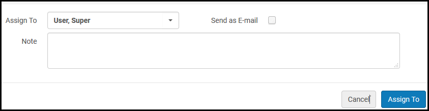
In the New Layout of task lists, which was gradually introduced beginning in August 2022, the assigned to tabs have been converted into facets. For additional information, see New Layout 2022.
Notes Tab
The Notes tab enables you to view, add, or remove notes that are relevant to the page. It appears on many Alma pages, such as:
- The PO Line Summary page when editing a PO line
- The Physical Item Editor page when editing item records
- The License Terms Details page when editing license details
- The Vendor Details page when editing vendor information
For information about working with Notes in New Layout task lists, see New Layout 2022 and Active and Inactive Notes (below).
Managing Notes in the Notes Tab
To add a note, select Add Note. To edit a note, select Edit from the row actions menu.
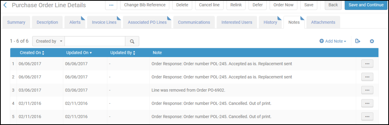

To delete a note, select Delete from the row actions menu, and then select Confirm in the confirmation dialog box.
Active and Inactive Notes
In Resource Sharing task lists (Borrowing Requests and Lending Requests), the notes can either be active or inactive. Active notes are notes that require processing, while inactive notes add information to a request, but do not call for any action to be performed. These are settings that are applied to all of the notes attached to a task. That is, the notes are either active or not, as a group. When the notes attached to a task are active, a Notes link appears in the task's row in the task list. Select the link to open the Notes section of the task in the Details pane. When the notes are not active, no Notes link appears in the task's row, but you can still see and manage any notes that are attached to the task in the Notes section of the Details pane. For additional information about the Details pane and its sections, see New Layout 2022.
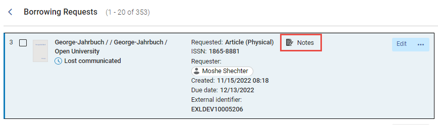
By default, the notes attached to a task are inactive. Adding or deleting notes does not affect this setting. When at least one note is attached to a Resource Sharing task, an Update Notes menu is added to the Notes tab of the task.
- In the task list, in the task's row, or in the Details pane when the task is selected, select Edit. The full form of the task opens in a sliding panel.
- In the Notes tab, in the Update Notes menu, select one of the following:
- Activate Notes to activate the notes
- Dismiss Notes to deactivate the notes
A confirmation message appears.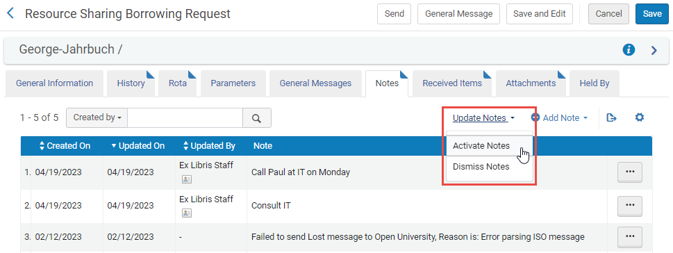
- Close the sliding panel.
- Select
 to refresh the task list. The Notes link is added to or removed from the task's row, depending on the option you chose.
Attachments Tab
The Attachments tab enables you to view, attach, and remove attachments relevant to the page. It appears on many Alma pages, such as:
- The Trial Details tab when editing trial information
- The Invoice Details page when editing invoices
- The Resource Sharing Borrowing request page when editing a borrowing request.

- To add an attachment, select Add Attachment. Browse for a file, add a URL and/or note, if required, and select AddAttachment.
- To edit an attachment, select Edit in the row actions menu.
- To delete an attachment, select Delete in the row actions menu and select Confirm in the confirmation dialog box.
- To download a file, select Download in the row actions menu, browse to the download folder, and select OK.
The maximum attachment size is 25 MB. Emails sent to a user or regarding a PO line page appear in this tab.
History Tab
The History tab displays the history of changes to the record fields (PO line, item record, etc.) displayed on the page. Whenever the existing value of a field is modified or removed, the change appears in the history. Values entered into fields when the record is being created, before it is saved, are not listed in the history. Once a record is created, adding a value to a previously blank field is considered a change and appears in the history. Notes and attachments added to a record are not listed in the history.
In some cases (due to a resolved issue in User Address history in the February 2025 Release), a one-time creation of an unnecessary history entry may occur.
The History tab appears on many Alma pages, such as:
- The PO Line Summary page when editing a PO line
- The Physical Item Editor page when editing item records
- The License Terms Details page when editing license details
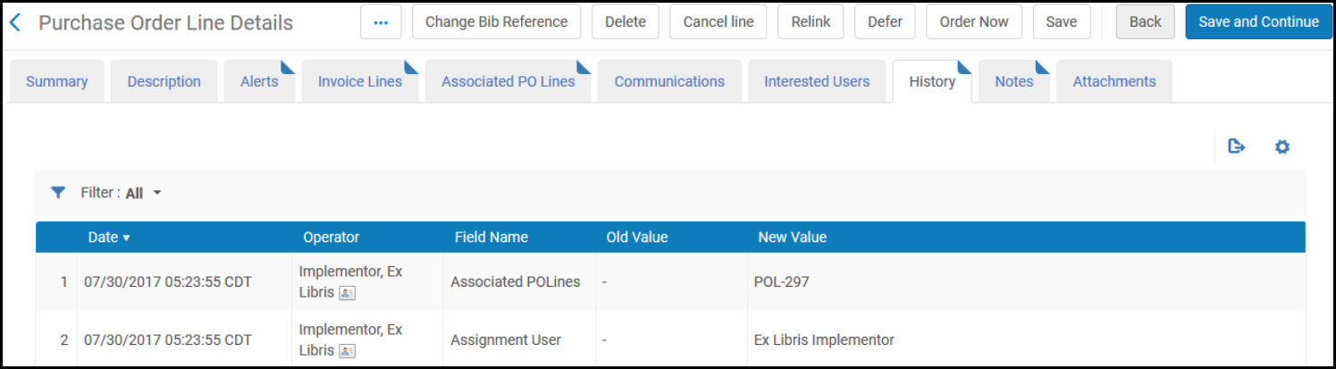
In some instances, the History tab contains radio buttons that allow you to change the types of changes appearing in the list. For example:
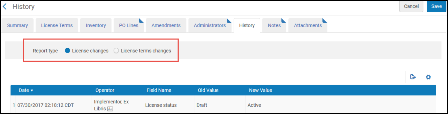
- The History tab of the Monitoring Jobs page has a different functionality. For more information, see Viewing Running Jobs.
- The Operator column appears only for managers and administrators. See Configuring Users' Ability to View Operator Details.
Drop-Down and Quick Pick Lists
In the various drop-down lists, you can enter part of the field name and then select it from the list of matching terms that appears.
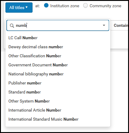
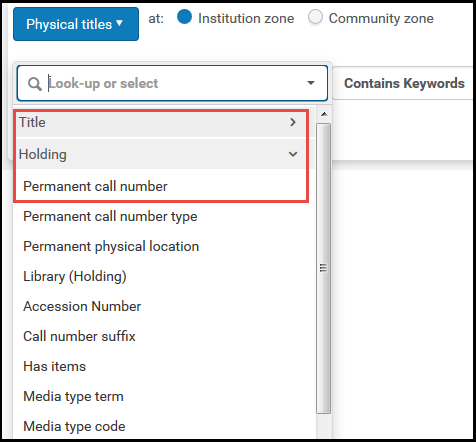
For some drop-down lists, terms are grouped into expandable/collapsible sub-menus.
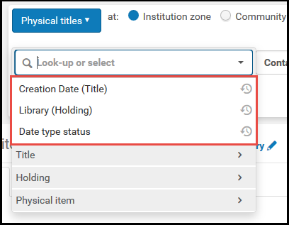
Recent terms that you selected appear at the top of the list.
Recent terms are not limited to time. It always shows the last 5 entities used.
Quick pick lists also enables you to select an item from a list, but provide more information and context for the selection. A quick pick list can be identified by the icon in the field.
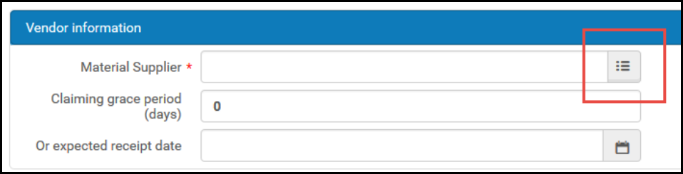
When selecting an item from a quick pick list (vendors, funds, users, and so forth), the list appears in an overlay pane, rather than on a new page. Select an item by selecting the item's row. If you have previously selected items of this type, select the Recent icon in the selection field to select any recently selected item.
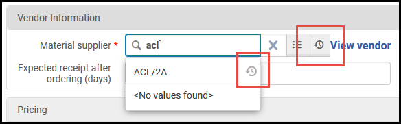
Recently selected items may be disabled on certain pages due to privacy concerns.
Lists and Tables in Alma
This section presents information to help you work with the lists and tables that appear various locations in Alma.
Common Table/List Types
The sections below show common types of lists and tables in Alma.
Record Lists
Pages with record lists display one or more Alma records vertically down the page, such as search results (see Searching in Alma), borrowing requests (see Managing Resource Sharing Borrowing Requests), reading list citations, vendors, and so forth.
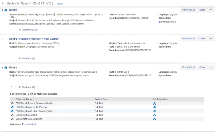
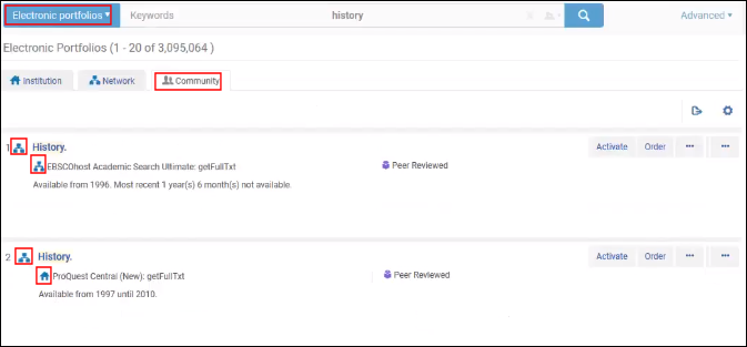
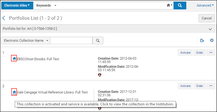
Lists appear with:
- Where relevant,Assigned to You,Unassigned, and Assigned to Others tabs. See Assigned to Me, Unassigned, Assigned to Others Tabs.
- A table actions list, if any. See List, Table, and Row Actions.
- The second to last link
 is an option to export the displayed elements in the table to Excel (see Export to Excel).
 - The last link
 enables you to customize how the results appear in the list; see Customize View.
- The second to last link
- Pagination options, when required (see Pagination)
- Facets for filtering the items on the list (see Facets, Filters, and Secondary Search)
Each item in the list appears with:
- Its number in the list
- A checkbox, if there is a page-level action that can be performed on multiple items in the list
- The item's name, typically linked to a page where you can view more information about the item
- Various other information fields about the item
- A row actions list that enables you to perform actions on the item. See List, Table, and Row Actions
- If you are returning to this page after having viewed or edited an item in the list, that item is highlighted (see Last Item Edited Indicator).
- On some pages, additional information appears in tabs at the bottom of each list item. For example:
- Inventory in search results (see Viewing Inventory/Other Details) and citation details in reading lists (see Managing Citations) may appear. Select one of the tabs to expand or collapse this information. If an Expand table action is present, you can use it to pre-select that all tabs, or all tabs of a certain type, are expanded by default.
- Electronic collection and portfolio details may be expanded for a particular title in the Community tab with icons indicating activation and/or availability. See the icon tooltips for additional information.
Record List Fields with Multiple Values
Some fields in the repository search results may have multiple values. For example, in the All titles,Physical titles,Electronic titles, and Digital titles repository search results, multiple values can appear for the Record number field when there are multiple 035 $a entries in the cataloging record. When a field has multiple values, the search results appear with the multiple values icon ( ). Select the multiple values icon to display all the values for the field. In the case of the Record number field, the multiple 035 $a values appear listed in the same order as presented in the MD Editor.
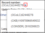
The values that appear can be copied for copy/paste actions and can be exported using the Export list icon. When multiple values are exported to Excel, they are concatenated and delimited by a semi-colon.

Record List from Single Record Search
When viewing a record list as a result of searching for a single record to select (such as when selecting Change Bib Record for a PO line), you can select the record by selecting anywhere in the record row.
Configure Record List Appearance
You can configure the fields, columns, and actions that appear on record lists. Select the Manage Column Display iconin the table actions list to open a configuration pane.
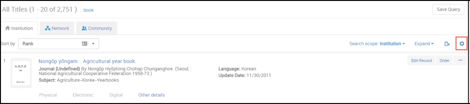
The pane may not appear fully expanded. Select Show all to expand the pane.
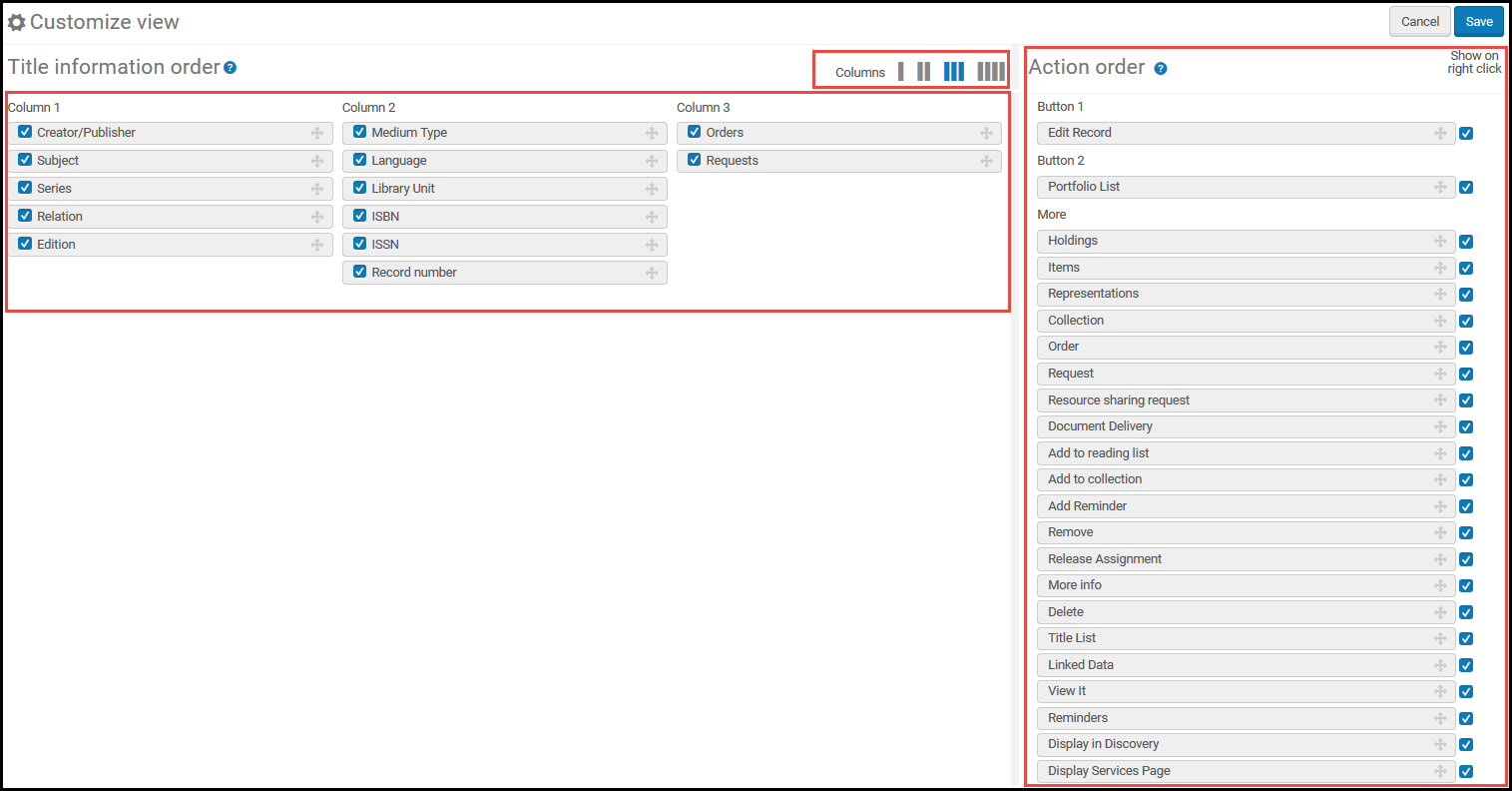
You can configure the fields that appear for each item in the record list. Select a column layout to change the number of columns. Drag and drop fields between columns. Hide a field by clearing the field's checkbox.
You can drag and drop actions to configure which ones appear as the two action buttons. You can also clear an action so that it does not appear when you right-click the repository item (note that the action continues to appear when you select the ... menu).
- For an entry in the list, if the entry does not contain a value for a field, the field does not appear.
- Currently, when configuring the available row actions on a page, the list of row actions displays all actions that can be performed on the kinds of entries that populate the list, even if these actions do not appear on the page (this is most noticeable on pages where the entries are PO lines). Regardless of the row actions that you select to appear while configuring, if the action is not relevant for the page or the entry, it does not appear in the row actions.
After you customize the columns on this page, the Manage Column Display icon displays a small green dot in the lower right corner . When you select the icon again, the Restore list defaults option appears. Select to restore the fields and actions to their out-of-the-box settings.
List Tables
List tables display one or more elements vertically down the page in a table format. for example, the Reading Lists Task List page. They are often used to present tasks to the user: the list of resources, tasks, orders, or users that require operator attention (see Tasks in the Task List and Assigned to Me, Unassigned, Assigned to Others Tabs).
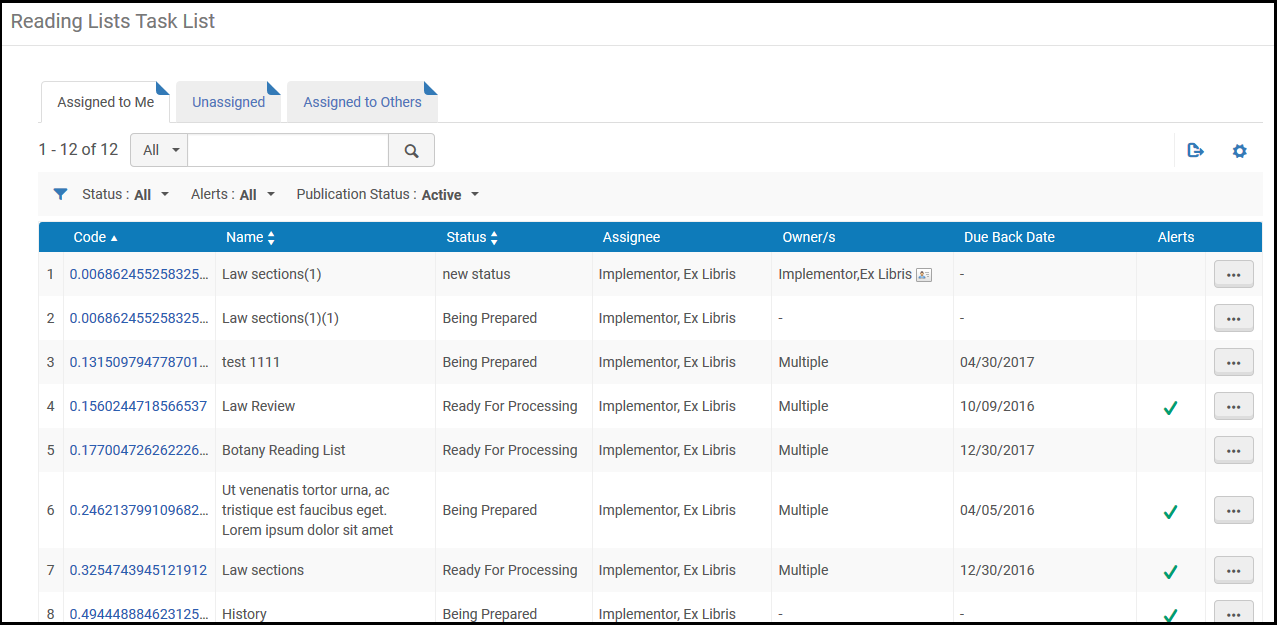
List tables appear with:
- When presenting a list of tasks, the table usually contains Assigned to You,Unassigned, and Assigned to Others tabs. See Assigned to Me, Unassigned, Assigned to Others Tabs.
- A table actions list, if any. See List, Table, and Row Actions.
- The second to last linkis an option to export the displayed elements in the table to Excel (see Export to Excel).
- The last linkenables you to customize the columns that appear. Select or unselect columns to appear in the table, and then select Done. For more information, see Working with Table Columns.
- The second to last link
- In some cases, you may have options to sort the list. You may be able to move an item down or up the list by selecting the up or down arrows in the Move Up and Move Down columns. Or you may be able to drag and drop items by selecting and dragging the drag and drop icon
 . The selected row is highlighted, and, as you drag the row up and down the table, a blank bar appears below or above other rows, indicating to where the selected item will be dropped.
 - Pagination options, when required (see Pagination)
- Facets for filtering the items on the list (see Facets, Filters, and Secondary Search)
Each item in the list table appears with:
- Its number in the list
- Various information fields about the item
- A row actions list that enables you to perform actions on the item. See List, Table, and Row Actions.
- If you are returning to this page after having viewed or edited an item in the list, that item is highlighted (see Last Item Edited Indicator).
Code Tables
Code tables are typically available only to administrators. They display a list of options that may be available as a drop-down list in some other area of Alma.
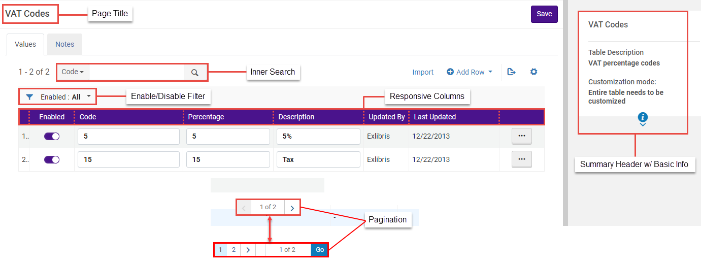
Code tables appear with:
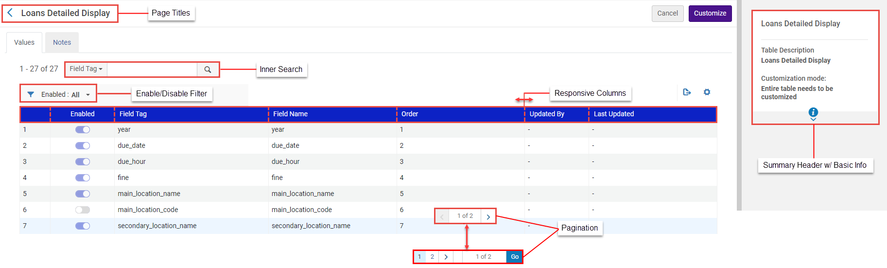
- Page Titles: Page titles are incorporated as headers for code tables, providing clearer context and easier identification of code table content.
- A summary header with basic information about the table.
When Customization Mode is set to Specific rows can be customized, the informational fields are updated only when system changes are made to the entire table (not when specific rows are updated by staff).
- Inner Search: An inner search functionality enables searches within the code table context to quickly locate specific entries.
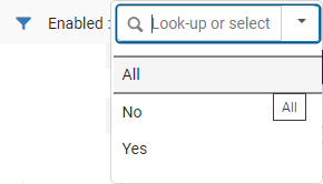
- Enabled/Disabled Filter- Only displayed in relevant code tables with enable/disable functionality. This filter enables users to display All, Enabled (Yes) or Disabled (No) values. When filtering a table list, only lines within the relevant scope will be displayed. For instance, If the list is currently filtered by 'Disabled' and the user enables a line, the list will refresh to remove the recently enabled line. The same applies vice-versa if the list is filtered by 'Enabled'.
- Responsive Columns: Users can expand/reduce the width of the columns and change the columns' order (using drag and drop).
- Responsive Columns with Text: Code table columns display text instead of fields.
- Pagination: The pagination feature enables users to effectively manage large code tables. Users can navigate through mapping table entries using page numbers.
- A table actions list, if any. See List, Table, and Row Actions.
- The first option enables you to import information to the table (see Importing Code Table Information).
- Another option enables translation for multi-language institutions (see Code Table Label Translation).
- Add Row enables you to add a new row, when available (see Adding Lines to Tables).
- The last linkis an option to export the displayed elements in the table to Excel (see Export to Excel).
- The option to Cancel your changes or Save/Customize to save your changes
Each item in the list appears with:
- Its number in the list
- The option to enable/disable the element by toggling a slider; a blue slider
 indicates that the element is enabled; a gray slider
 indicates that the element is disabled. These sliders are not functional on all code tables. If the slider colors are muted (
 /
/ ), you must first enable the line using the Customize row action before you can change their values.
 - The options to move an item Up or Down the list is achieved by selecting the Move Up and Move Down options in the More Actions (
 ) drop menu.
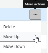 Reporting Codes - More Actions drop menu - Move Up Move Down options
 - The code and description of the item. These can often be changed, either directly or after selecting Customize in the item's row actions list. Select Save after making any changes to the table.
- The option to select one of the items as the default value. Only one value can be selected. For some tables, this value may be disabled or may have no relevance.
- The user who last changed the element and the date of the last change
- A row actions list, typically containing at least the option Customize if you have not yet customized the list, or Restore if you have. Select Restore resets the row to its original value. After selecting a row action, select Save at the top of the page to save your changes. When available, select Delete to remove the row.
Mapping Tables
Mapping tables are typically available only to administrators. They display configurable elements that control other areas of Alma.
Mapping tables appear with:
- Page Titles: Page titles are incorporated as headers for mapping tables, providing clearer context and easier identification of mapping table content.
- A summary header with basic information about the table.
- Inner Search: An inner search functionality enables searches within the mapping table context to quickly locate specific entries.
- Enabled/Disabled Filter- Only displayed in relevant mapping tables with enable/disable functionality. This filter enables users to display All, Enabled (Yes) or Disabled (No) values. When filtering a table list, only lines within the relevant scope will be displayed. For instance, If the list is currently filtered by 'Disabled' and the user enables a line, the list will refresh to remove the recently enabled line. The same applies vice-versa if the list is filtered by 'Enabled'.
.png)
- Responsive Columns: Users can expand/reduce the width of the columns and change the columns' order (using drag and drop).
- Responsive Columns with Text: Mapping table columns display text instead of fields.
- Pagination: The pagination feature enables users to effectively manage large mapping tables. Users can navigate through mapping table entries using page numbers.
- A table actions list, if any. See List, Table, and Row Actions.
- Add Row enables you to add a new row, when available (see Adding Lines to Tables).
- The last linkis an option to export the displayed elements in the table to Excel (see Export to Excel).
- The option to Cancel your changes or Save to save your changes
Each item in the list appears with:
- Its number in the list
- The option to enable/disable the element by toggling a slider; a blue sliderindicates that the element is enabled; a gray sliderindicates that the element is disabled. These sliders are not functional on all mapping tables. If the slider colors are muted (/), you must first enable the line using the Customize row action before you can change their values.
- The key (code) and other information for the item. These values, other than the key, can often be changed, either directly or after selecting Customize in the item's row actions list. Select Save after making any changes to the table.
- The user who last changed the element and the date of the last change
- A row actions list, typically containing at least the option Customize if you have not yet customized the list, or Restore if you have. Select Restore resets the row to its original value. After selecting a row action, select Save at the top of the page to save your changes. When available, select Delete to remove the row.
Rules Tables
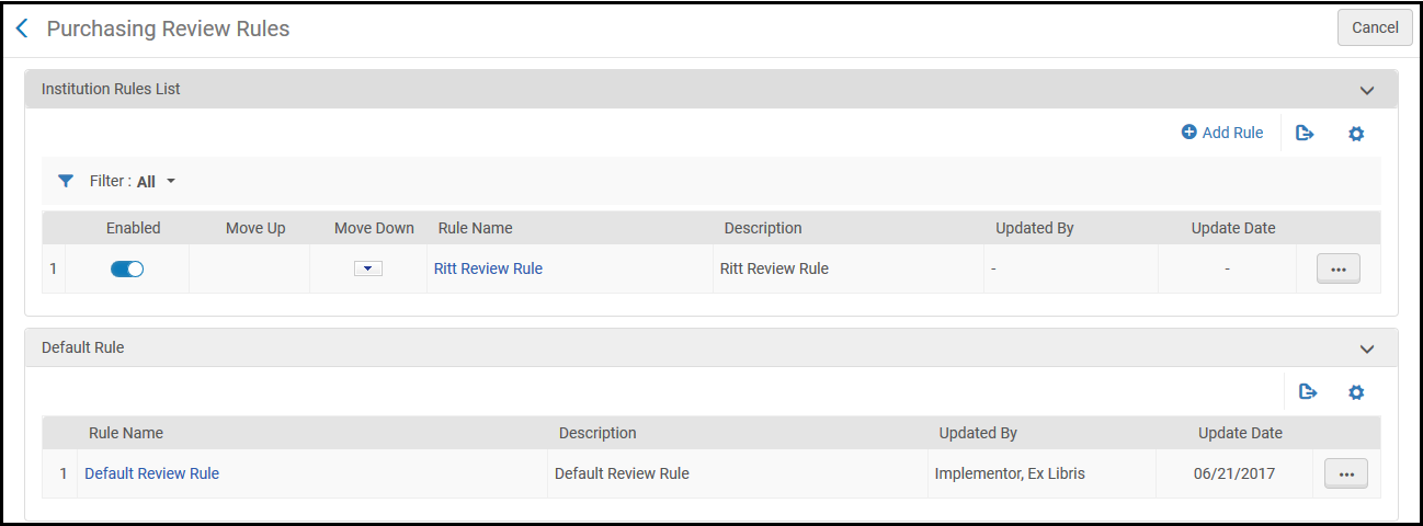
Rules tables are typically available only to administrators. They contain a series of checks that Alma performs automatically during the course of some process. For example, there are rules to determine if an invoice is sent for review or automatically approved, and rules to determine if a purchase request is automatically generated for a citation added to a reading list.
- Each rule has one or more criteria for Alma to check to see if the rule applies to the current object being evaluated.
- When the relevant process occurs in Alma, for example a patron hold request, Alma checks each enabled rule in the relevant rules table, in the order in which they are listed, starting with the first rule in the list. If Alma finds a rule whose criteria matches the object being evaluated, Alma performs the action specified by the rule. Once Alma finds a match, Alma does not check any other rule in the list.
- If none of the enabled rules match the object being evaluated, the default rule is checked, if such exist.
- If none of the enabled rules match the object being evaluated, and the default rule also does not apply (or if there is no default rule), Alma performs the default action. Typically this is "do nothing", but a different default action may apply for a particular process. In some cases, the default action can be specified using a customer parameter.
- See the relevant documentation pages for details or exceptions to the above.
You can perform the following actions on rules tables:
- Add a rule: Select Add Rule in the table actions list. The new rule is added to the end of the list. By default, each new rule is enabled.
- Edit a rule: Select Edit in the row actions list.
- Duplicate a rule: Select Duplicate in the row actions list. Edit the rule as required. The new rule is added to the end of the list. By default, each new rule is enabled.
- Delete a rule: Select Delete in the row actions list.
- Enable/disable the rule: Toggle the slider. A blue slider indicates that the rule is enabled; a gray slider indicates that the rule is disabled.
- Change the rule order: Select the up or down arrows in the Move Up and Move Down columns for the rule that you want to move up or down in the list.
When you add or edit a rule, a page similar to the following one appears:
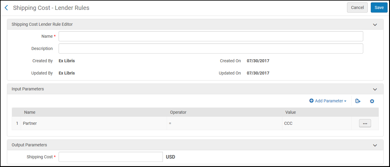
- Each rule requires a name. You can also enter an optional description.
- In the Input Parameters area, you can enter multiple criteria for the rule. On most pages, select Add Parameter to add criteria (in Acquisitions pages, all aspects are already present on the page in their own row). You can edit or delete criteria.
- Each criteria consists of three elements:
- Name- The aspect you want to evaluate (such as the user group of the user who scanned a book or the date a request was made).
- Operator- An evaluation operator, such as =,<,>,Not equals,inList,NotinList,is empty,is not empty, or contains.
- Value- The matching value or values (for inList and NotInList, select all that apply).
- Each input parameter (Name) can be selected only once for each rule.
- In the Output Parameters area, (on some pages this area is called Workflow Setup), enter or select the action to perform, as described on the relevant documentation page. The value may simply be True or False, indicating whether or not Alma performs a certain process. Or there may be several values to enter or select.
- After making any changes, select Save.
In the above example, if this rule is triggered, a 10 USD fee is added to the shipping cost when lending an item to the resource sharing partner East FN. Note that if a lower numbered rule is triggered, the action specified by this rule (add 10 USD to the shipping fee) is not applied, even if the criteria matches the lending request.
List, Table, and Row Actions
A page containing a table or list may present actions that apply to the entire table or list, or to all selected items in the table or list. This list is called the table actions list and it appears at the top of the table. If there are too many actions to display, additional actions are available in the Actions menu to the right of the displayed actions. If any of the actions can apply to selected items only, or if a page-level action (such as Select) can apply to selected items only, each item in the table or list is displayed with a checkbox.

All table actions lists include the Export Menu icon , with options to export all or some of the list to a Microsoft Excel file. See Export to Excel. Another common table action above a table is Add Row; see Adding Lines to Table. Code tables allow you to add lines in bulk; see Importing Code Table Information.
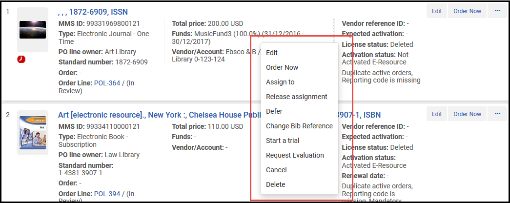
Rows in the table or list contain the row actions list, which are actions that apply to the specific item in the row. You can access the row actions list from the ... menu at the right of the list or by right-clicking the item anywhere in the row as long as you are not right-clicking directly on a link). For some lists, one or two actions may be visible directly in the row.
Adding Lines to Tables
For most tables, you can add a new item by selecting Add Row or Add <X> above the table. A pane to enter the new row's information appears.
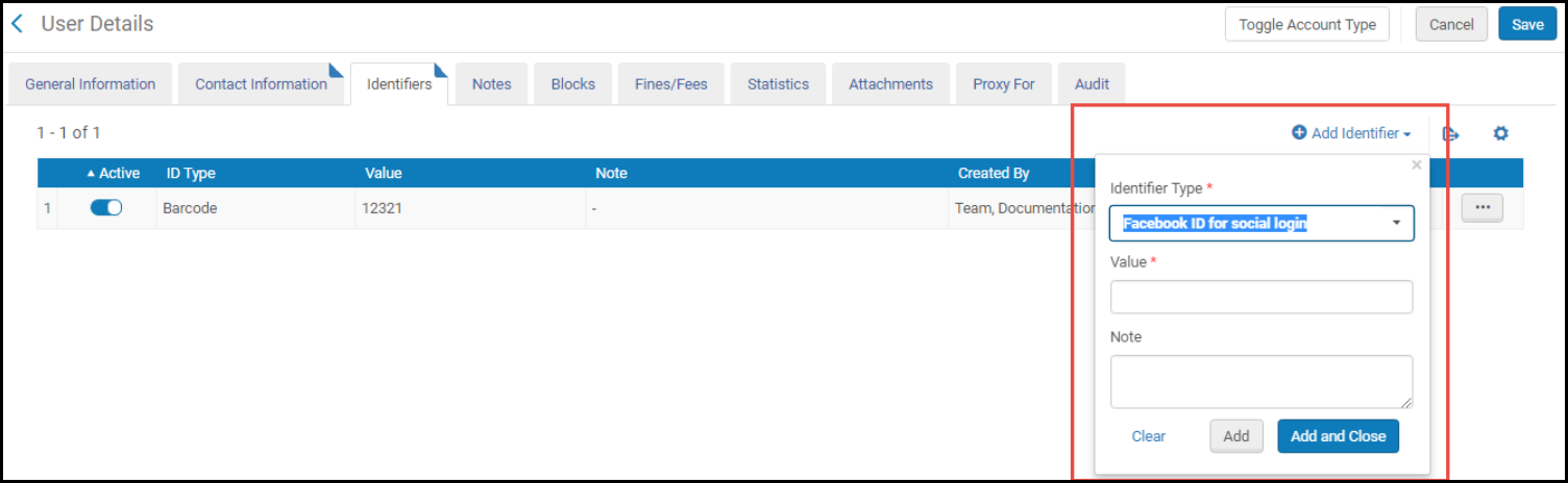
Enter any required or optional information, or select the values from the drop-down lists, and select Add or Add <X>(to add the item without closing the pane) or Add and Close in the pane. All (non-obvious) fields are described on the relevant documentation page in this guide.
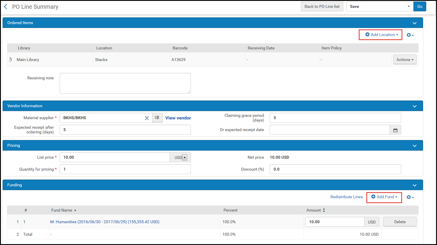
Areas within pages in which you can add multiple lines (such as locations for ordered items) also use Add <X> at the top of the area.
Importing Code and Mapping Table Information
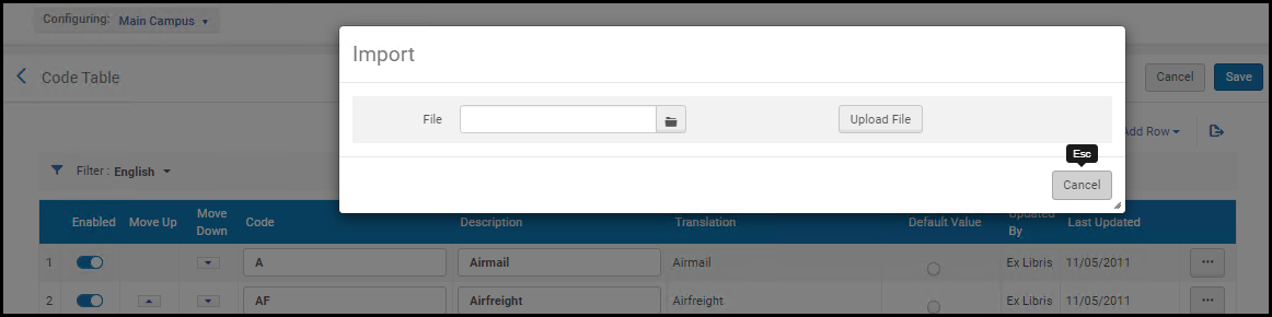
On many code tables and on mapping tables, you can select Import in the table actions list to import data to the table in bulk. Importing information overrides all of the existing entries in the table.
Excel files can be imported in either *.xlsx or *.xsl formats.
For code tables:
- The Excel sheet must be named CodeTable
- The columns must be named Code and Description(case-sensitive) to match to the target, so after exporting a code table, rename the columns to these values.
- For tables in which lines cannot be added/removed manually, lines also cannot be added/removed via the import process.
For mapping tables:
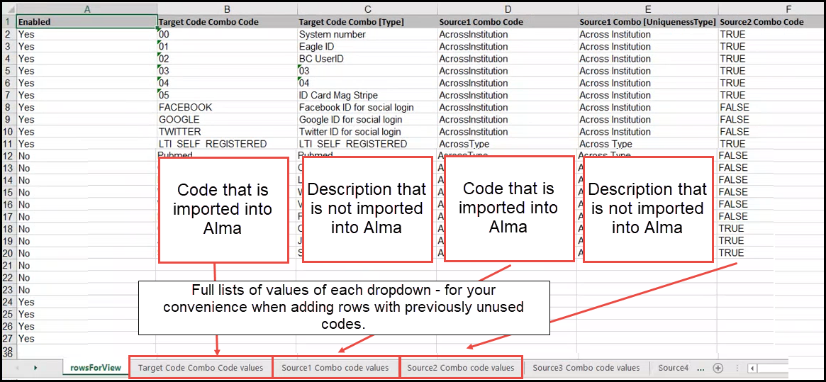
- The Excel sheet must be in a specific structure. It is recommended that you export the existing table to get the existing values and the structure (if relevant), make your changes, and then import the changes back to Alma, as described below.
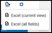
- Export the file using Export > Excel(see Export to Excel).
- Open the Excel file and rename the Excel sheet CodeTable.
- Make your changes and save the file. Note that there should be no duplicate lines in the Excel file.
- Select Import on the relevant page. The Import Tables page appears.
- Select Browse to locate your file.
- Select Import to upload the file. The contents of the file appear on the page.
- Review your changes and select Import to import the changes to Alma.
- The process as is for code tables, but without the need to change or rename the file.
The structure of the Excel file includes the actual codes that are imported back into Alma, in addition to columns of descriptions that help you make sense of the data, but are not imported. The description values can be duplicated. In addition, the Excel file includes additional sheets, which are also not imported back into Alma, that provide you with full lists of codes and values that can be inserted into the Alma dropdowns - you can use these sheets when adding new rows to the Excel file, instead of referring to Alma for these code/value combinations.
There cannot be duplicate lines in the codes that are imported back into Alma.
Export to Excel
On pages that contain lists or tables, you can export the list to Excel (*.xlsx format) by selecting the Export Menu icon and selecting Excel. When exporting a table with hidden columns, you can choose to export only the visible columns or all of the columns, including the hidden ones.
See also Importing Code Table Information.
There is a limit of 100,000 lines that can be exported at one time to Excel. If the amount of information to be exported exceeds the limit, the limit appears in the tooltip when you hover your mouse over the Excel option. Filter the list to be under the limit. Otherwise, note that only the first 100,000 are exported.
During the export, Alma displays a progress bar. Downloads proceed in the foreground. While the download is in progress, you can select Cancel to cancel the download in progress.
Tables that have an Enabled column are exported with the values Yes for enabled or No for disabled.
Table and Row Level Customization Mode
For some code and mapping tables, each row of the table functions as an independent unit and is customized independently, while other tables function as a single unit so all of the rows are customized together. The Customization mode field indicates whether the table is configured at the table level (Entire table needs to be customized) or at the row level (Specific rows can be customized). If you have customized a table whose customization mode is Entire table needs to be customized, new rows added by Ex Libris to this table in future releases will not be added to your table. If you have customized a table whose customization mode is Specific rows can becustomized, new rows added by Ex Libris to this table in the future will be added to your table as well.


When Customization Mode is set to Specific rows can be customized, the informational fields are updated only when system changes are made to the entire table (not when specific rows are updated by staff).
Code Table Label Translation
Multi-language institutions can configure translations of some code table labels. See Configuring Institution Languages. The workflow is different depending on whether the table is one that is configured at the table level or the row level (see Table and Row Level Customization Mode).
- Change the language filter to a language other than English.
- Edit the text in the Translation column.You need to update the column header of the Translation column to be the language name.
- Select Save.
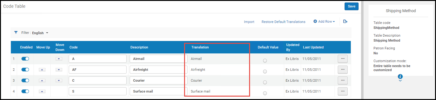
To restore the translation changes in the table, select Restore Default Translations in the table actions list.
- Change the language filter to a language other than English.
- Select Customize in the row actions list to customize a row, or select Customize All in the table actions list to make all of the rows of the table available for customizing.
- Edit the text in the Translation column.You need to update the column header of the Translation column to be the language name.
- Select Save.
Row Level Customization
To restore the translation changes in the table, select Restore Translations in the row actions list of the row that you want to restore or select Restore Default Translations in the table actions list to restore the translations for all of the rows of the table.
Facets, Filters, and Secondary Search
You can filter the items in a list or list table using facets, filters, and the secondary search. Some or all of these appear on a page containing a list.
Facets
Facets on the left of a list match one or more of the fields or columns on the page. Beneath each of these facets is one of the available values for that field, followed by (in parentheses) the number of currently unfiltered items that match that value. Select one of the values to filter the items in the list to only those that match the selected value. The selected value appears above the list with an X. Select the X to remove that value from the filter. In some cases, to the right of the facets appear a search bar (see Secondary Search) and filters (see Filters).
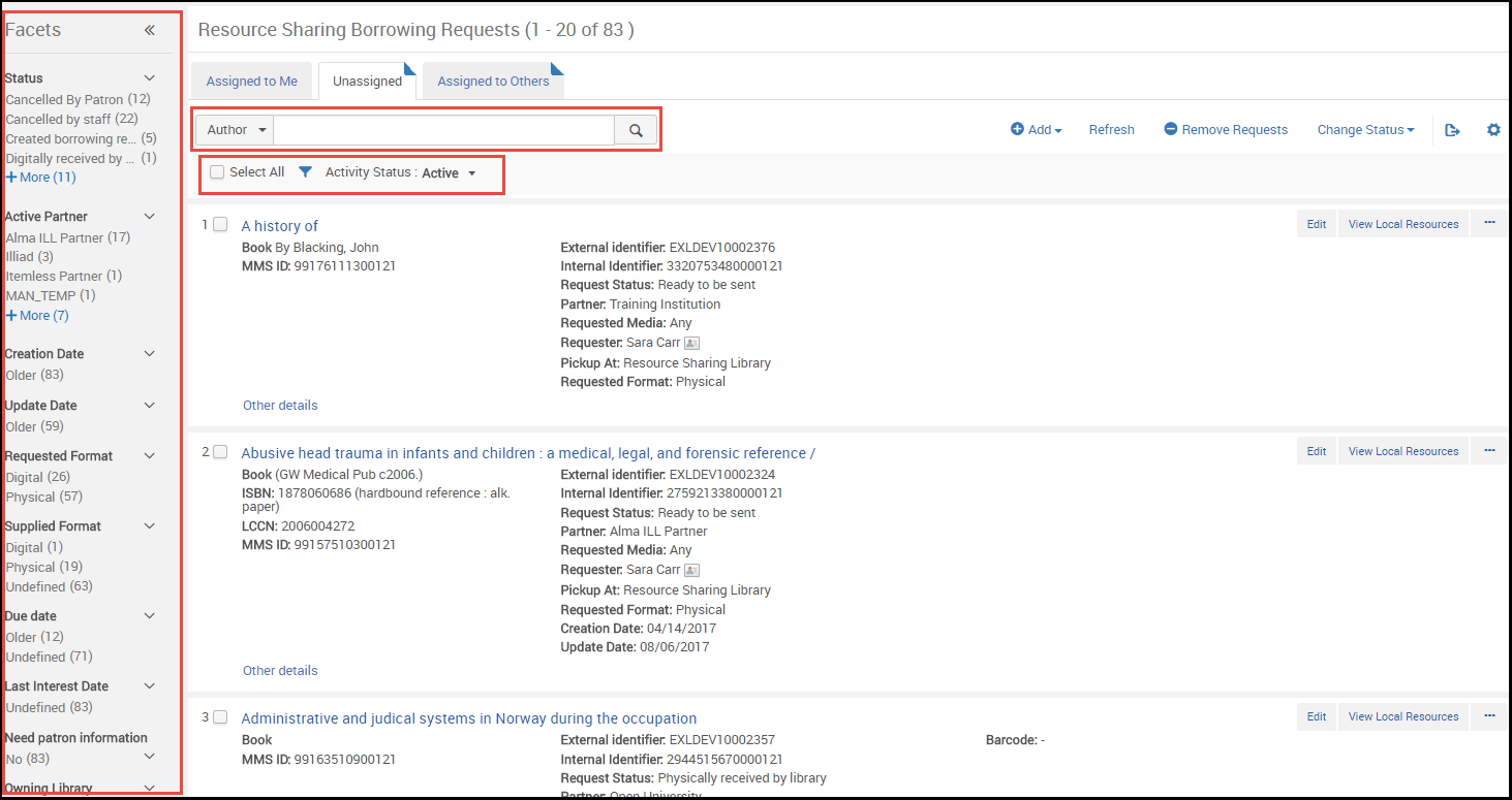
Facets are all single-select: you cannot select multiple values for a particular facet. (In the New Layout of task lists, which was gradually introduced beginning in August 2022, you can select multiple values for individual facets. For additional information, see New Layout 2022.)
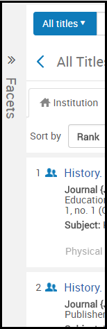
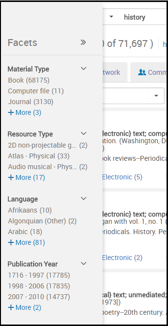
The Facets panel bar can be collapsed to provide more room on the page while still remaining visible. It can be expanded again at any moment.
| Collapsed State | Viewing Facets in Collapsed State | To Restore |
|---|---|---|
|
Minimize the Facets pane by selecting << beside the word Facets. The panel collapses into a small stripe on the left of the screen.
|
You can view the facets by hovering your mouse over the Facets stripe.
|
Select >> to restore the Facets pane. |
Filters
In addition to Facets and Secondary search, some pages also have an option to filter the results.

Some of the filters may have a default value that does not include all the records, for example Active, which includes only the active records. (In the new layout, when a filter has a non-default value, a green dot appears next to the filter icon. For additional information, see New Layout 2022.)
Filters are all single-select: you cannot select multiple values for a particular filter.
You can clear the values for all the filters and reset them to their defaults, by selecting the Clear All button. This button only displays when two or more filters have non-default values selected. (In the new layout, this button is always displayed - see New Layout 2022).
Secondary Search
Some pages include a secondary search to filter the information.

Select a value from the drop-down list of fields, enter text, and select the search icon to filter the list. Note that this search is a "contains" search (except for a code search of the resource sharing partner list, which is a "starts with" search).
You can move the keyboard focus to the secondary search box on a page by pressing the forward slash / on your keyboard.
Library Scope Banner (LS)
For searches relevant to library scope, such as Physical holdings, the Library Scope (LS) banner appears.
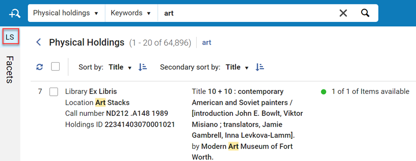
By default all libraries are selected. Select the LS banner to access the list of libraries where you can update the scope.
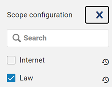
See also Physical Holdings.
Pagination
Some lists and list tables that contain a large amount of elements are paginated. For example:
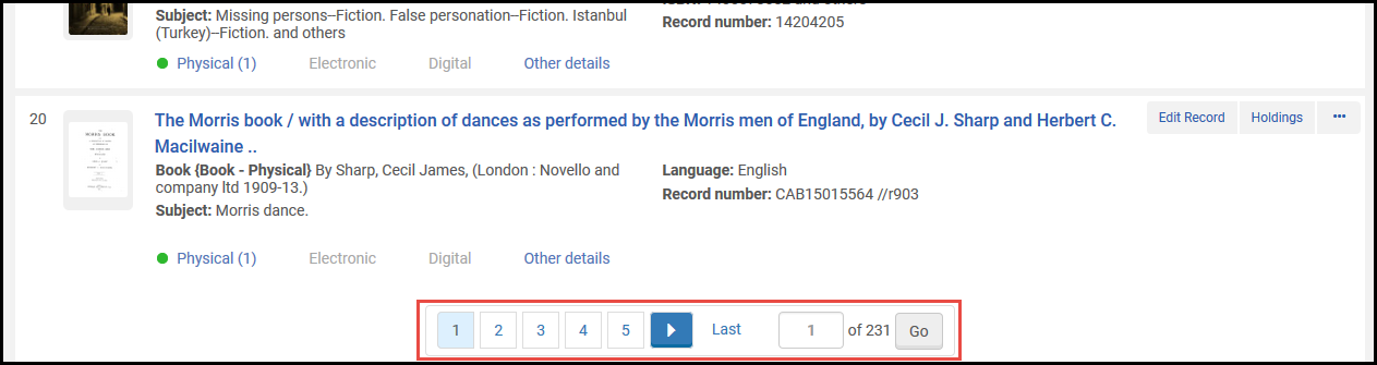
The pagination includes the current page and the total number of pages. Typically, each page displays 10 or 20 records by default. To navigate to other pages:
- Select one of the arrows < or >(or press Alt-, or Alt-.) to display the previous or next page.
- Select a page number to display that page.
- Enter a page number in the small text box and select Go to display that page.
- You can select the number of lines per page. On some pages, the range is between 10 and 50. On other pages it is between 20 and 100.
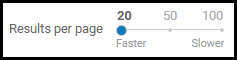
- Alma does not preserve selections that you make as you navigate from page to page (exception: Alma remembers your selection for results per page). All actions on the page apply only to the visible selections you make on that page.
- If the bottom pagination is not visible, a small floating version of the pagination element appears at the bottom of the page. To navigate to a specific page when the floating pagination is visible, select the page number, enter a new page number, and press Enter.
Last Item Edited Indicator
After editing (or viewing) an item in a list or table, and then returning to the list or table, the page automatically scrolls to the item that you were working on and a bar appears next to the item. For example:
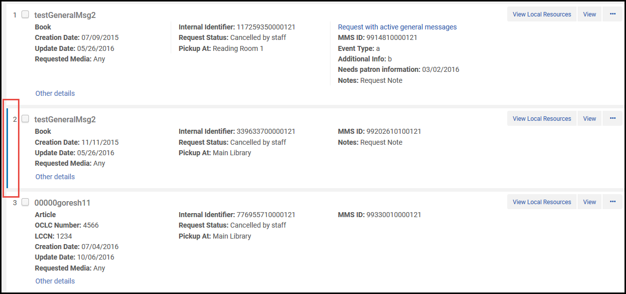
Working with Table Columns
You can customize columns in lists and tables throughout Alma in the following ways:
- For columns that have up/down triangles, you can sort the rows in the table by that column by selecting the column heading. Select the column heading again to toggle between ascending and descending order.Sorting a table changes the order of the lines in the table, and your selected sort is retained when you leave and return to the page. However, the sort has no effect on how items in the table appear in other areas of Alma. For example, if you sort users in descending alphabetical order (Z to A) on the Find and Manage Users page, the relevant list of users still appears in ascending alphabetical order (A to Z) when selecting to assign a task to a user.
- Select between two column headings to change the width of table columns.
- Select and drag a column heading left or right to change the order of table columns.
- Hide and display columns by selecting in the table actions list. To configure record list columns, see Record Lists.
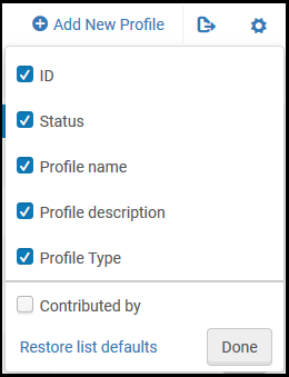
- Clear the checkbox of a column and select Done to hide the column.
- Select the checkbox of a hidden column and select Done to have it appear.
- Select Restore list defaults to restore all columns to their original settings.
- Select the row list action View Hidden to display a pop-up of any hidden fields for that row. For example:
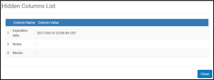
User Interface Settings
- General System Administrator
This section describes how to define Alma Logos, Color Schemes, Privacy Policies, etc. For information on configuring the Leganto logo and color scheme, see Configuring Leganto Branding. For a tech blog article describing this topic see How to enable each user to be able to change his or her Alma color scheme.
On the Branding Management page (Configuration Menu > General > User Interface Settings > Alma Logo and Color Scheme), you can define a header logo, email logo, and/or login page logo for your institution, or define an email logo for specific libraries. You can also change the default primary color in the user interface, and configure the URL of your institution's privacy policy. In addition, you can enable the user to choose their own color theme.
- The Alma login button is always blue. It is not affected by the selected Alma theme.
- It is not currently possible for libraries to customize the Alma favicon (small icon that displays in a browser's favorites) with its logo.
- On the Branding Management page (Configuration Menu > General > User Interface Settings > Alma Logo and Color Scheme), make sure that your institution is selected.
- Under Logo Upload, browse to select the following:The acceptable formats for the logos are PNG, JPG and GIF. Logos in other formats do not display in Alma.
Logo Required Size More Information Header logo (to be displayed in the top-left corner of Alma) 69 pixels (width) x 26 pixels (height) Login page logo 110 pixels (width) x 36 pixels (height) Email logo 400 pixels (width) x 30-70 pixels (height) If an email logo is not uploaded, the header logo is used as the email logo.
You can define other logos for emails that go out from particular libraries. To do that, select the desired library instead of the institution.
When logos are defined on both the institution and the library levels, the logo displayed on the email is determined as follows:
- If the organization unit is Library, and a library logo exists for that library, the library logo is displayed.
- If organization unit is Library and no library logo exists for that library, the institution logo is displayed.
- If organization unit is Institution, the Institution logo is displayed.
- Select Save to save your changes. Note that to see your changes, you must clear your cache, log out, and then log in again.
- On the Branding Management page (Configuration Menu > General > User Interface Settings > Alma Logo and Color Scheme), make sure that your institution is selected.
- In Color Theme, select the desired color theme. A preview of the selected color theme will display below the Choose basic color field.
- Select Save to save your changes. Note that to see your changes, you must clear your cache, log out, and then log in again.
To enable the user to choose their own color scheme:
- On the Branding Management page (Configuration Menu > General > User Interface Settings > Alma Logo and Color Scheme), go to the Color Theme - New U I section.
- For the "Allow users to select a different color theme for their environment:" option, select Yes.
- Select Save to save your changes. Note that to see your changes, you must clear your cache, log out, and then log in again.
- The color scheme appears under the users UI Preferences (see Persistent Menu).
- Select Reset to default to set the color theme back to the institutional settings.
Enter a valid URL in Privacy Policy Link at the bottom of the Branding Management page.

When set to any value, the link Institution Privacy Policy appears at the bottom of every Alma page with the URL set to the value you entered. Alma does not validate that you entered a valid URL, so ensure that you do. If you enter an invalid URL, selecting the link results in an error.
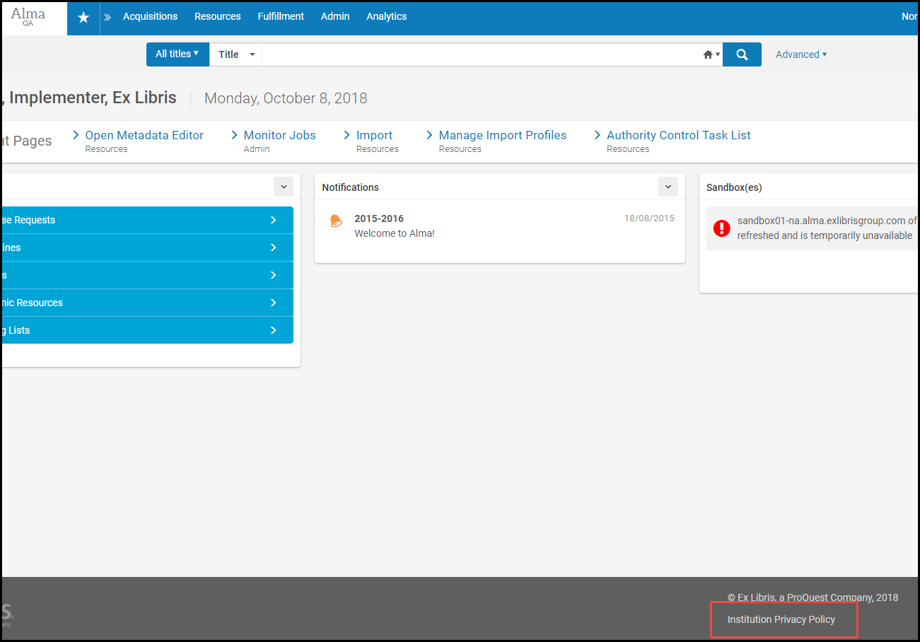
Configuring CSS and Associated Images
- General System Administrator
You can modify the CSS and associated image files that Alma uses for the delivery tabs by uploading a customized CSS. For information, see Branding the Delivery Tabs.
Configuring Policies
Configuring Social Login Labels
- General System Administrator
You can customize the messages used throughout the social authentication process.
You view and configure these labels from the Social Login Messages code table (Configuration Menu > General > User Interface Settings > Social Login Labels). For more information about code tables, see Code Tables.
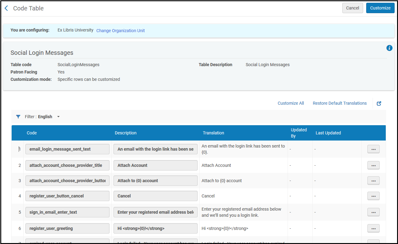
You can edit the labels (descriptions). To enable editing all labels, select Customize All.
For more information on social authentication, see Social and Email Login.
Configuring Identity Service Labels
- General System Administrator
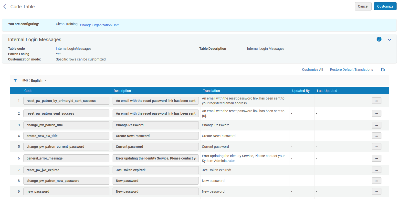
Digital Viewer and Deposit Customization
- General System Administrator
You can customize the Digital Viewer and Deposit user interface from the Digital Viewer and Deposit Customization page (Configuration > General > User Interface Settings > Digital Viewer and Deposit Customization).
For Primo VE, the old viewer cannot be customized. To access the new viewer customizations, go to Configuration > Fulfillment > Discovery Interface Display Logic > Viewer Services > Digital Viewer > Customization.
You can perform the following customizations from this page:
- Customize the Patron Deposit interface and the new Digital Viewer with Primo Studio:
- To customize the Patron Deposit interface, select Customize Deposit.You must have a deposit profile configured to customize the deposit interface with Primo Studio.
- To customize the new Digital Viewer, enter a representation ID, select Generate Viewer Link, and select Customize Digital Viewer.
Create a customization package using Primo studio and upload it to Alma. For more information on using Primo Studio, see Using Primo Studio.
- To customize the Patron Deposit interface, select Customize Deposit.
- Upload a customization package created in Primo Studio
- Upload a logo image file
- Enter a URL that is opened when you select the logo
