Release Date: December 4, 2024
Accessibility Enhancements
These enhancements aim to create a more inclusive and user-friendly experience for all library admin.
-
Target Size Minimum (WCAG 2.5.8): Metrics shown on the Sequences page has increased to 24x24 pixels
-
Bypass Blocks (WCAG 2.4.1): A "skip to main content" link was added before the content on every page in the LX Admin application. This allows users to easily skip over navigation and other page elements with a screen reader or keyboard navigation.
-
Status Messages (WCAG 4.1.3): Status messages that appear throughout the app (ie: error messages) will automatically be announced by screen readers. This includes:
-
Error messages that appear on fields
-
Empty state messages that show if results are empty or page results are empty
-
Loading icons
-
-
Headings and Labels (WCAG 2.4.6): More descript aria-labels were added throughout the app so users with screen readers know the specific purpose of each control. Aria-labels were specifically adjusted for the following:
-
More actions button that shows on uploaded logos in "Brand" settings
-
More actions button on each user listed on the users table in "Users" settings
-
Information icon on the users table next to the "SYSTEM USERS" header in "Users" settings
-
"More Details" button that shows next to each activity on a patron record.
-
"Edit" button on patron records.
-
"X" button on selected filters in the activity log
-
-
Non-text Contrast Ratios (WCAG 1.4.11): Focus indicators throughout the app now have at least a 3 to 1 color contrast ratio with the background and adjacent colors within the element.
-
Resize Text (WCAG 1.4.4): Content on pages throughout the app are readable and functional when the browser zoom is set to 200% it's initial size.
-
Contrast Minimum (WCAG 1.4.3): Buttons, actions, and validation messages throughout the app meet the sufficient color contrast ratio threshold of 4.5:1
-
Focus Order (WCAG 2.4.3): Reading and navigation order is logical and intuitive when using a keyboard or screen reader to navigate the app. Specifically adjusted was the focus order on the Notice Activity Log.
-
Content on Hover or Focus (WCAG 1.4.13): When additional content appears on pointer hover or on keyboard focus, that content can be dismissed via keyboard without moving the mouse or keyboard focus. The content will also stay visible until mouse hover or keyboard focus is moved or dismissed by user. This was applied throughout the app.
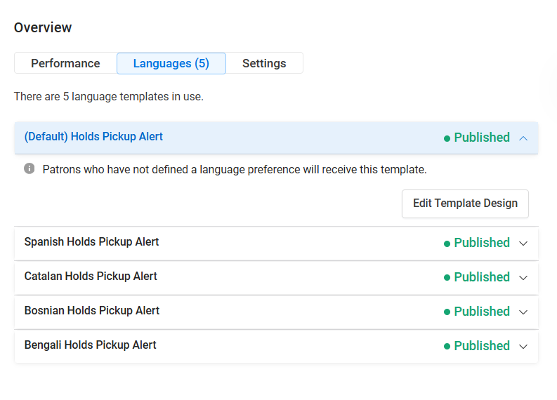
More Language Templates for All Notice Types
Now you can have up to 5 templates (including the default template) per notice type, allowing you to offer email notices in more languages.
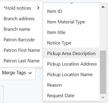
Pickup Area Merge Tag
Polaris libraries on versions 7.5+ will now have a "Pickup Area Description" merge tag to add to their Hold and Final Hold notice types (NOT include in the cancellation request notice type). This merge tag will display the chosen pickup area for the item so patrons know exactly where to go when they pick it up from the library.
Release Date: December 18, 2024
Bug Fixes
Showcase Styling Issues
Showcases are now centered in the block in your email design and the "View All" button displays as expected.
There are still rendering issues in the Outlook client causing items in showcases to display vertically. The fix to this particular issuse is still being worked on and is not part of this release.
Logos Uploading in Brand Settings
A bug is fixed that was preventing logo images uploading in brand settings. This has been resolved and logos can continue to be uploaded and used as expected.