
Creating a New Report
Creating a new analytics report.
- You can create an itemized set directly from an Analytics report. This is particularly useful if you want to globally update a set of records by first retrieving these records in Analytics. For more information, see Creating Itemized Sets.
- All date dimensions include dates up to and including 30 years back and 20 years forward. So, for example, if today is January 7, 2026:
- The earliest loan date that would appear is January 7, 1996.
- The latest due date that would appear is January 7, 2046.
You can create new reports to provide you with information on library activities. The simplest way to create a report is based on one subject area. You can combine data from more than one subject area to create an advanced report; this is a more complex process that requires an understanding of the data dependencies.
Creating a Single Subject Area Report
The simple way to create a report is using one specific subject area. Creating reports using one subject area does not require any deep knowledge of the data structure and relationships of the star scheme.
The following is a basic example of how to create a report. The example is performed in Alma Analytics using an Alma subject area, but the same exact steps apply to any Ex Libris Analytics product (Summon, campusM, Primo, and so forth).
To create a report:
-
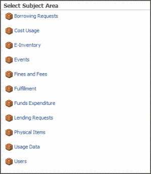
Select Create > Analysis. The Select Subject Area menu appears. For the list of subject areas, see Alma Analytics Subject Areas,campusM Analytics Subject Areas, or Primo Subject Areas.
-
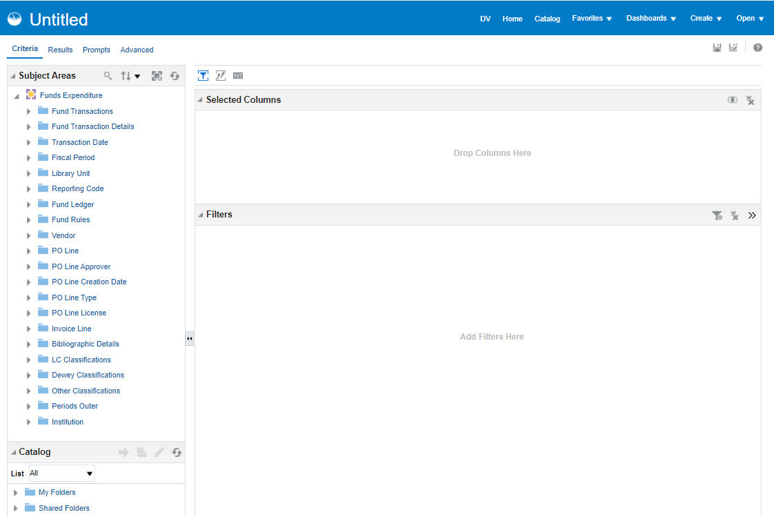
Select a subject area, for example Funds Expenditure, to open the Analysis Editor. The columns of the selected subject area appear as folder icons in the left pane.
-
Expand a column, for example Library Unit, and double-click a dimension, for example Library Name, to add it to the Selected Columns pane.
-
You can add an additional column, for example Vendors > Vendor Name.
-
You can add an additional column, for example Fund Transactions > Transaction Amount.
The selected columns appear as follows.
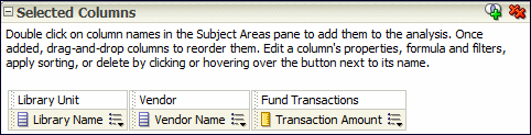
You can drag and drop columns to reorder them.
-
You can apply filters to limit the amount of data displayed in the report. Filters are applied before the report is aggregated. Filters affect the report and the resulting values for measures. Filters can be applied directly to attribute columns and measure columns.
-
Select the More Options icon
 next to the column whose data you want to filter and then select Filter. (Alternatively, select the Filter icon
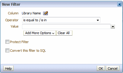
  and then select the appropriate column from the drop-down list.) The New filter dialog Box appears.
-
Select an operator and enter a value. Only items matching the filter will appear in the report.
-
Select OK to save the filter. The filter appears in the Filter pane of the report.
-
The My Folders > Subject Area Contents folder is an out-of-the-box folder that contains ready to use filters for reports. Do not use this folder for storing reports.
-
When filtering by start and end date, dates are inclusive.
-
To sort a column: Select the More Options icon
next to the column whose data you want to sort, select Sort, and select a sort option. -
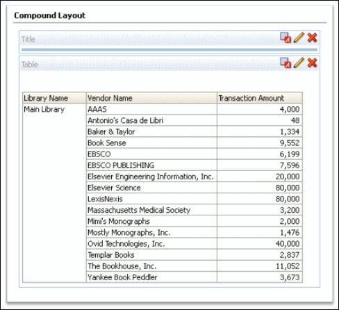
Select the Results tab to see the report results.
-
To save a report: Select the Save icon
 (top right). Note that the name of the report should not contain the following characters: ampersands (&), commas (,) , semicolons (;), colons (:), hashtags (#), pluses (+), quotation marks (") or slashes (/).
You can save the report under Shared Folders/<your institution>. If it is a private report, you can save the report in the My Folders area. (Do not place reports in the Subject Area Contents folder, since this folder is meant to contain filters.) After you save a report, the title appears at the top of the report. To change the title, from the Results tab, select the Edit icon  in the Views pane and enter a new title in the Title field.
Adding a Columb Total to a Report
To display the total of a column:
-
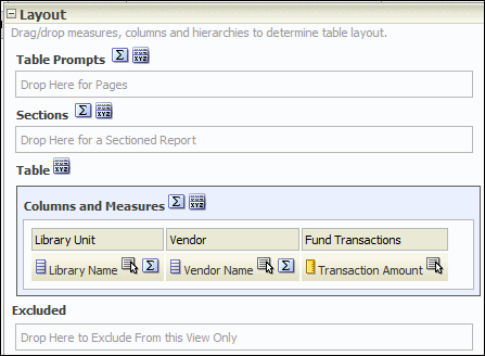
Select the Edit icon
of the report. The Table Editor appears.
-
Select the Totals icon
 next to Columns and Measures and then select After. The green check mark indicates that a grand total has been added to the analysis.
 -
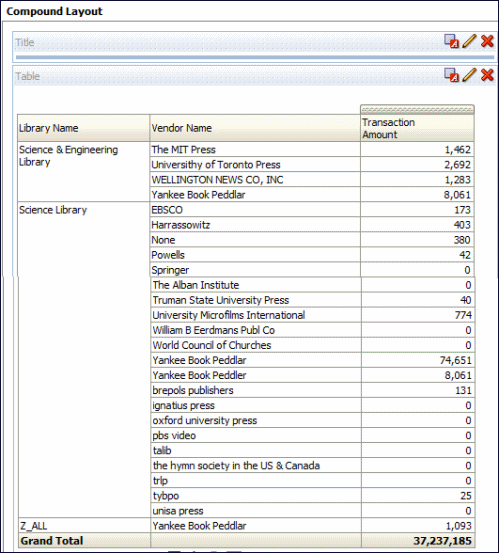
Select Done to apply the change. The report now appears with a grand total.
Formatting a Report
To format a report:
-
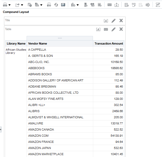
From the Results tab of a report, select the Editicon
. The following appears, for example:
-
From the top toolbar, select the Table View Properties icon
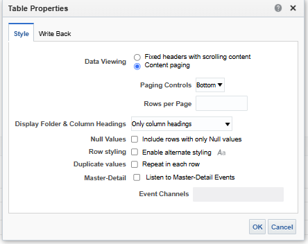
 . The table properties dialog box appears:
-
From the Style tab, select Enable alternate styling.
-
Select Repeat in each row so that the table appears with each full row in a separate color.
-
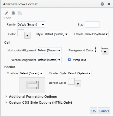
Select the Set alternate format icon
 . The following appears:
-
Select the formatting options you want. For example, select the yellow for the background color.
-
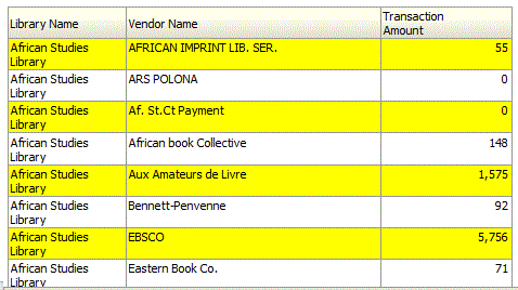
Select OK. If you selected yellow for the background color, for example, the table is now formatted with alternating yellow rows:
Adding a Graph to a Report
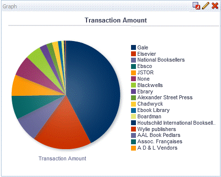
You can add a graph, such as a pie chart, to the report.
To add a graph to the report:
-
From the Results tab, select the New View icon
 and then select Graph > Pie. A pie chart is added to the report.
-
Select the Remove View from Compound Layout icon
 for both Title and Table views. Both views are removed so that only the graph appears.
The Title and Table views are still available for use from the Views pane.
Formatting a Report Graph
You can format a graph. The formatting options available are different depending on the type of graph you are formatting. In this example, we format a pie graph.
To format a graph:
-
From the Results tab, select the Edit View icon
. The Graph Editor appears.
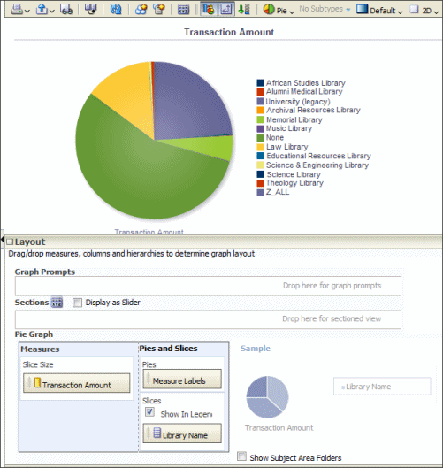
-
Select the Edit Graph Properties icon
 from the top toolbar. The Graph Properties dialog box appears.
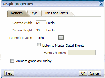
You can change various graph properties from the General, Style, and Titles, and Labels tabs. For example:
-
From the General tab, select Left for Legend Location.
-
From the Style tab:
-
From the Legend section, select gray as the background color and blue as the border color
-
From the Canvas Colors and Borders section, select turquoise and the background color and blue as the background color.
-
Clear the Gradient check box.
-
-
From the Titles and Labels tab:
-
Clear the Use measure name as graph title check box and enter a title such as Transaction Amount Pie Chart.
-
From the Labels section, select the Format Title icon
 next to legend, select Arial from the Family drop-down list, enter 10 in the Size field, and select red as the color.
-
-
Select OK. The graph now appears as follows:
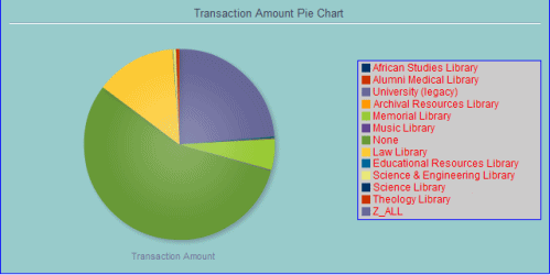
Using Formulas in a Report
You can use formulas in Alma Analytics reports to manipulate data available in Analytics that was not originally formatted in a way that is useful for creating reports. For more information, seeUseful Custom Formulas for Alma Analytics.
Creating a Multi-Subject Area Report
This section describes how to create custom reports from two (or more) subject areas using Data Visualization.
-
In the Analytics menu, select Access Data Visualization (Analytics > Create Analytics > Access Data Visualization).
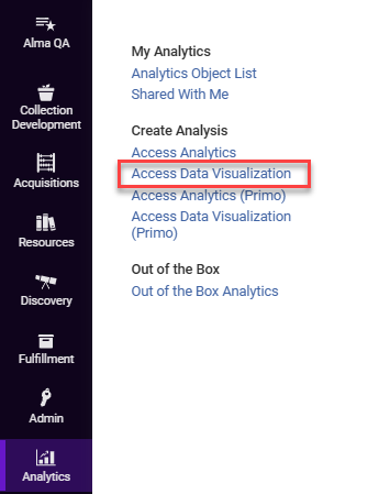
-
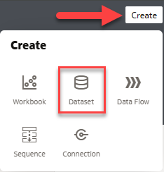
Select Create and then choose Dataset.
-
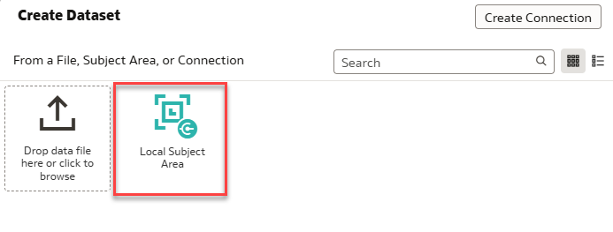
Select Local Subject Area.
-
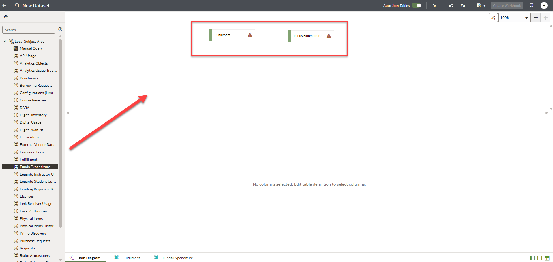
Add the two Subject Areas you wish to join by selecting and dragging them from the left dropdown menu into the right side of the screen.
-
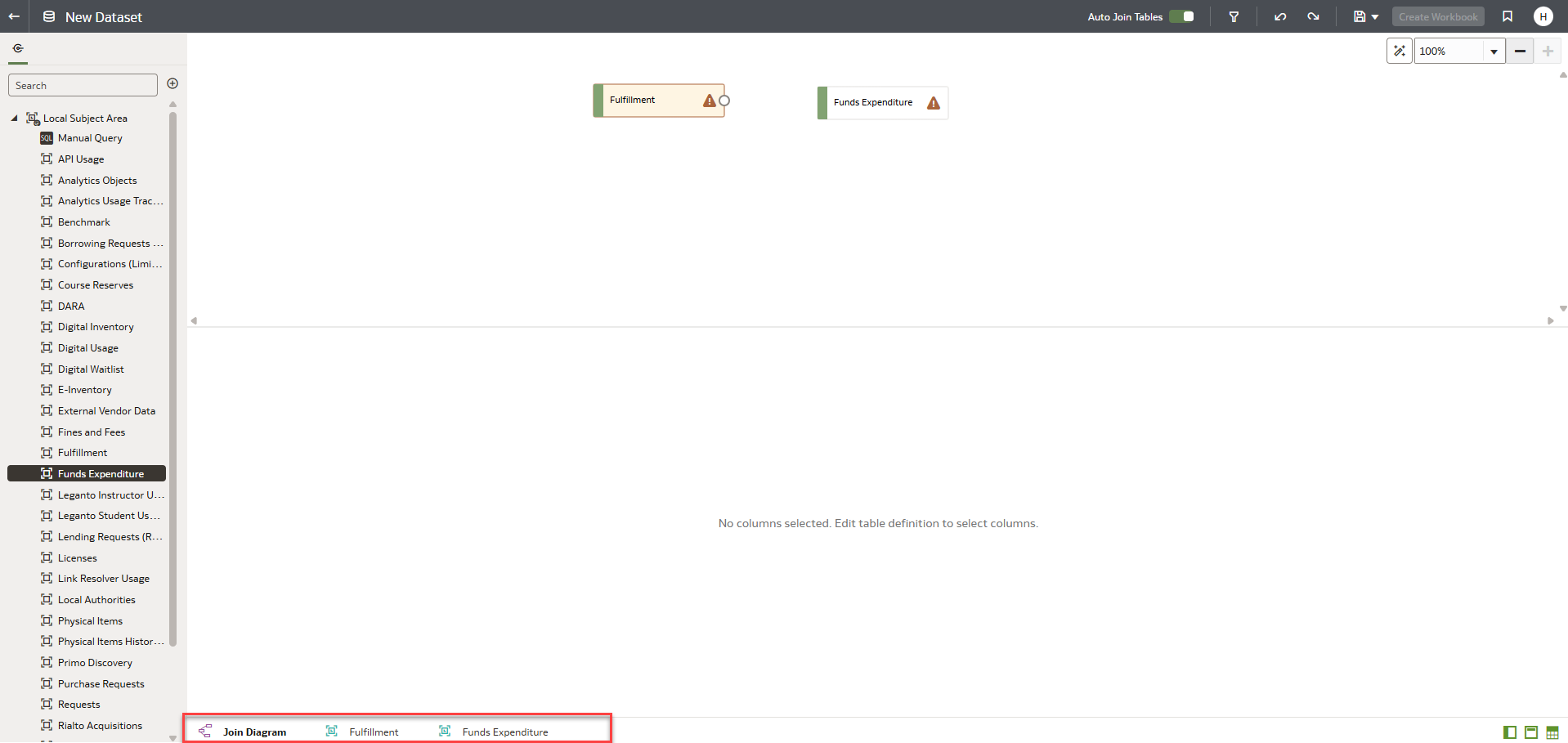
After adding the Subject Areas, tabs appear at the bottom of the screen.
-
Select the tab you wish to edit.
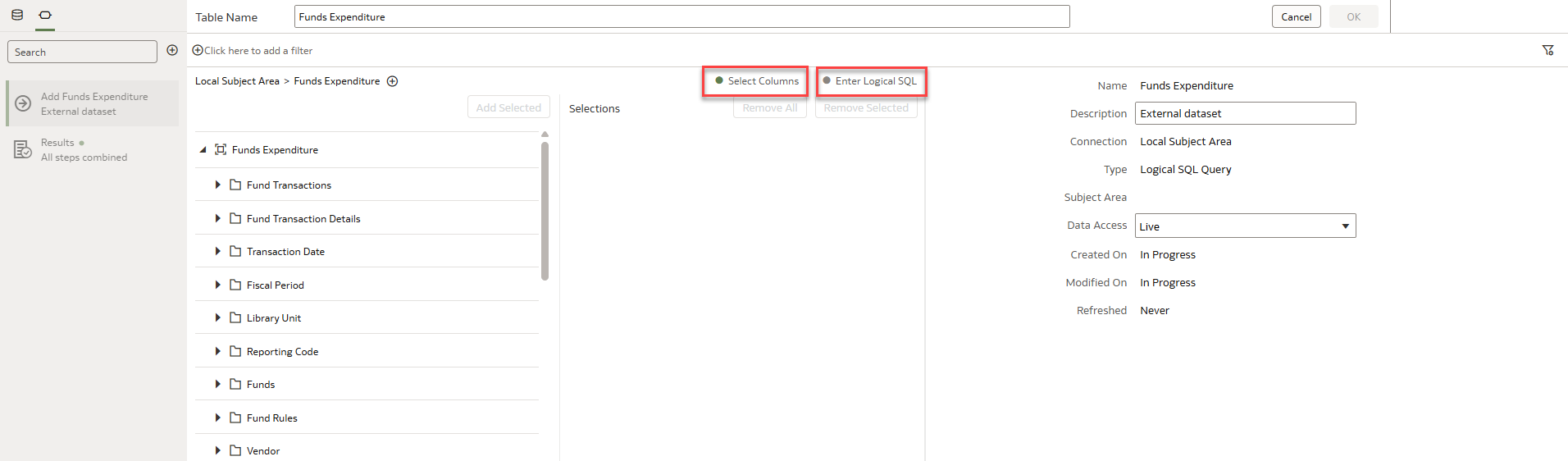
There are two options to create a report. Enter Logical SQL and Select Columns.
-
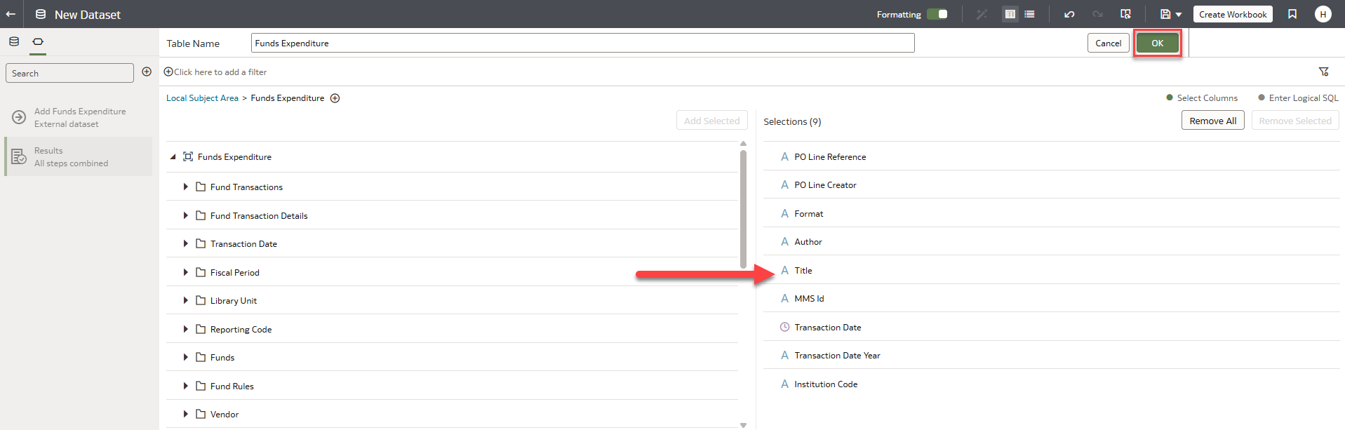
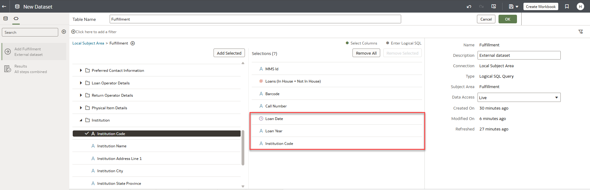
If your preferred method is Select Columns, drag the columns you wish to include into the Selections field.
-
When the selection is complete for both Subject Areas, click OK to save it.
It is recommended to add the Institution Code column to avoid conflicts between different institutions.
-
A new Dataset has been created.
-
Select the Join Diagram tab at the bottom of the screen.
-
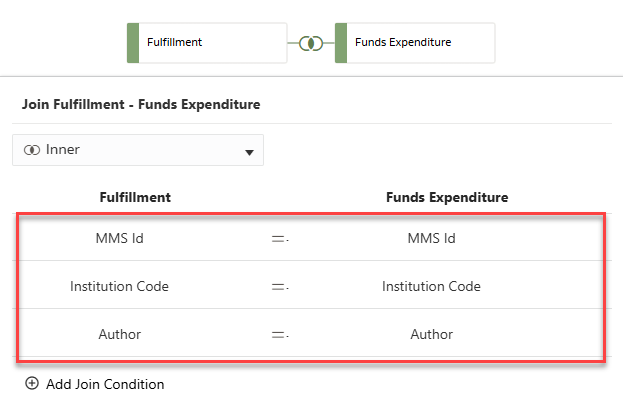
Select and drag the joining symbol from one Subject Area to another to connect them.
-
If you click on the joining symbol, the system automatically displays the joining columns.
-
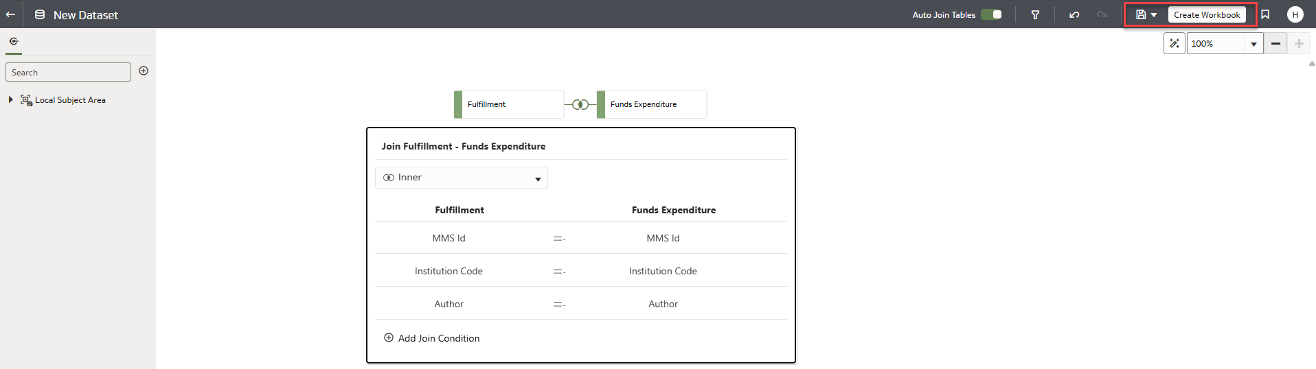
Save the changes to the dataset and name it accordingly.
-
Select Create Workbook.
-
The workbook has been created.
-
Add columns or filters to reduce the data volume in the final report.
-
Additional columns can be added by going back to the subset and selecting Edit Definition.

-
Add the columns to the subsets, then select OK.
-
The columns are added automatically to the workbook.
-
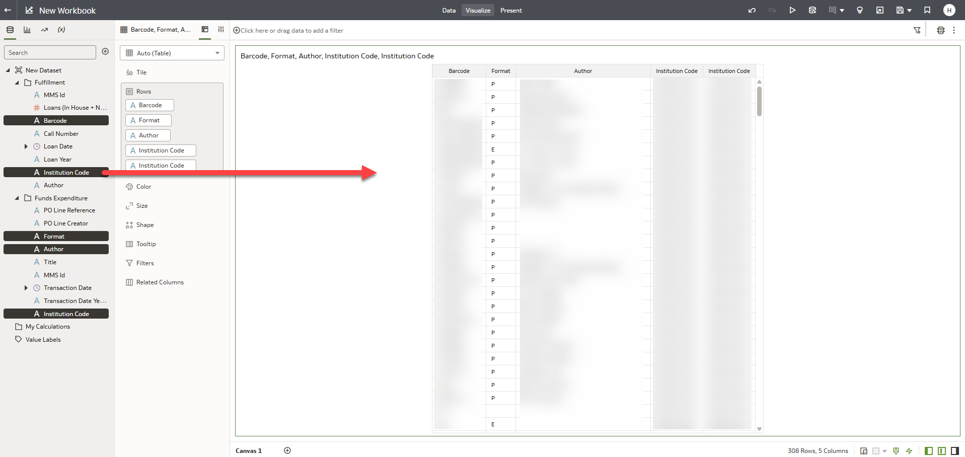
Select the preferred columns from both subsets and drag them to the right side of the screen to get a report from two different Subject Areas.
Page tags: article:topicproduct:almacontent:Documentationlang:english
