Creative Studio
Creative Studio is an alternative tool to help you configure how and when your static services appear in end-user applications. Creative Studio uses a drag-and-drop interface and provides a rich set of intuitive tools, such as a WYSIWYG editor, CSS stylesheets, and out-of-the-box templates, enabling you to create, design, and edit static services for campusM.
- See Working with Static Content and the Content Menu for the old method of configuring static services.
- Before configuring a service, you may want to configure the profile and app default configurations for services. Any service property not defined for a specific service inherits its value from the profile default. Any service property not defined for a profile inherits its value from the app default. See Configuring Default Service Properties and Managing Profile Defaults for Services.
Accessing Creative Studio
You can access Creative Studio from the App Manager homepage (Creative Studio). Additionally, you can access Creative Studio directly at the URL:https://<App Manager URL>/creative-studio.
The Creative Studio User Interface appears.
The Creative Studio User Interface
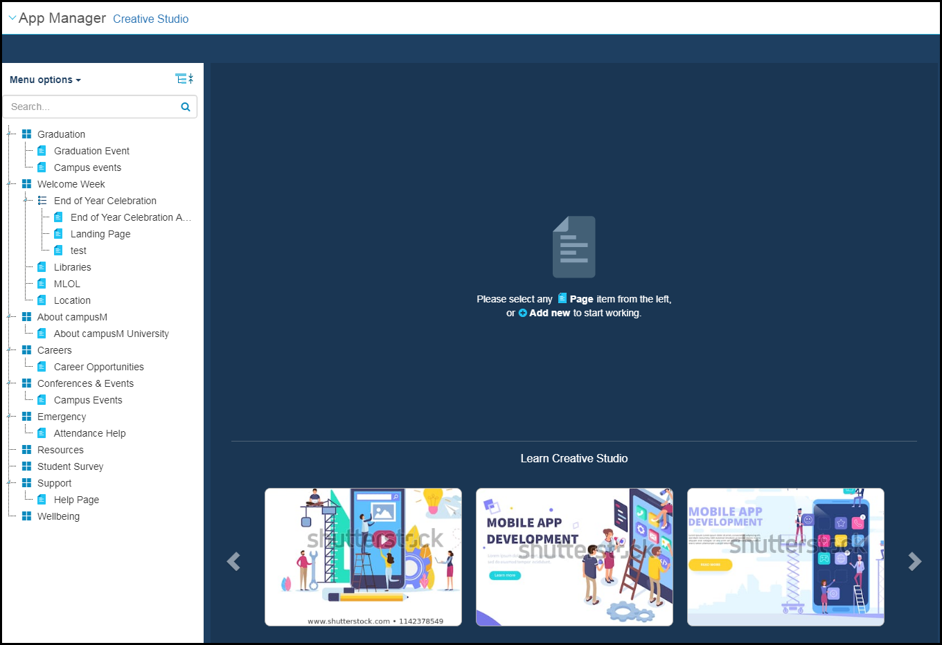
The user interface has three main sections: the content menu (left), the central working area, and the settings and components editing menu that appears on the right when creating or editing a graphical element.
Creative Studio Content Menu
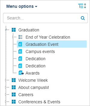
The menu enables you to navigate your existing static services and their pages, as well as create or delete services or pages.
There are four types of nodes in this menu:
- Top menu nodes
 – Static services (also known as pocket guides or menu options). Contain sub-nodes that are either other menu nodes or section nodes.
 - Section nodes
 – Contents and/or information to display to the end-user.
 - Sub-menu nodes
 – Menus to display to the end-user.
 - Redirects
 – When accessed by the end-user, this node opens an app URL: another service or page, another app, or a URL in a web browser (see Working with App URLs).
The menu is divided into three areas.
- Menu Options- Static content services that may appear in the main area of the app. You can add new services using this user interface. Use this interface to design the look and feel of the service's contents when it is opened by the end-user (the end-user selected the service's tile). After you are done, use the App Builder to control how and when the service's tile appears in the app for specific devices and classes of users (see Configuring Services). To delete a service, see Deleting Services.
Top-level nodes in the menu are menu nodes. If there are no sub-nodes, the static content service behaves exactly like a basic service: if a redirect is configured for the service, selecting the static content service tile in the app opens the target link. The same thing happens if there is a single sub-node that is a redirect.
Otherwise, if there is a single sub-node with static content, the app opens the contents that you create on this page. If there is more than one sub-node, selecting the app displays a menu with the sub-nodes as menu options. When the end-user selects a menu option, the app opens the sub-node (either another menu, the content of the node, or the end-user is redirected).
- About- Static content that appears when the end-user selects About(or the device-specific equivalent option) in the app. These nodes are used when configuring a profile. You can add new About pages using this user interface.
Top-level nodes in the About area are either menu nodes or section nodes. The About menu option functions as a menu node (that cannot be deleted, of course).
- Intro to App- Static content used in other areas of the app, such as a splash screen. These nodes are used when configuring a profile.
Top-level nodes in the Intro to App Section area are iPad Intro,iPhone Intro, and Android Intro. These nodes cannot be deleted.
Actions you can perform in the menu include:
- View the Menu Options,About, or Intro to App elements by selecting the area from the drop-down list.
- Search for a menu element matching a string you enter in the search box.
- Expand or collapse menu branches by selecting the expand
 or collapse
 icons.
 - Select an element to work on the element in the central working area.
Central Working Area
When a menu element is selected in the content menu, the central working area presents the following options:
- Select Add New to create a new element under the selected menu element.
- Select Manage Stylesheets
When a section or redirect is selected in the content menu, the central working area displays a representation of the element for you to edit.
Editing Menu
Creating a New Page
Creative Studio allows you to work from a template or you can design your page from scratch. To add a page, select Add New > Page. The following appears:
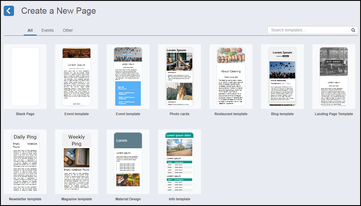
Select a template or select the blank page to create your own page.
Designing a Page
For more information, see Creative Studio: How to Design a Page.
The following tools are available to help you create your page:
- Icons at the top menu enable you to perform various functions. Each has an explanatory tooltip.
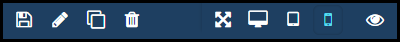 Top menu
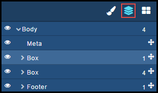
 - Element options are available when you select an element:
 Element options
 - You can add new blocks to your page by dragging and dropping a block from the right side of the page. Select the Blocks icon at the top right to display the Blocks you can add:
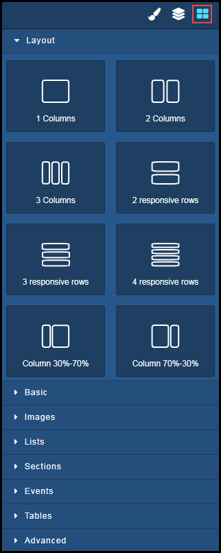 Add blocks
 - Edit element settings by clicking the Settings icon. You can edit settings, such as Title and ID of each element.
 Edit settings
 - Edit the element style by clicking the Style icon. You can use out-of-the-box W3Scools CSS class or your own CSS. Also available, are options for element layout, font, border, and decorations.
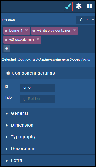 Edit style
Page tags: article:topiccontent:Documentationproduct:campusmlang:englishcommunity:training_materials