Configuring Services
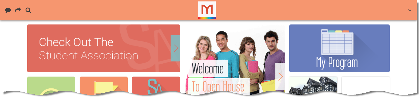
Configuring How Services Appear
You configure service appearance in the App Builder in the service tab that appears in the Configuration Tabs when you select the service (see Working with the App Builder).
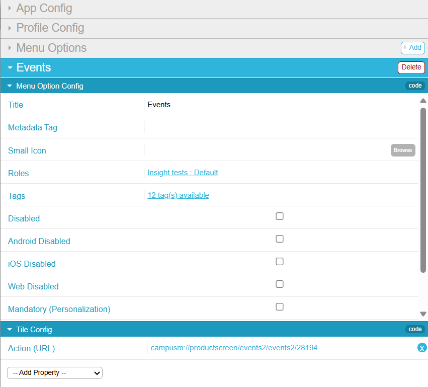
The following configuration options are available. If you change any service properties, select Save & Publish to publish your changes.
Overriding Service Appearance Based on Device Properties
You can configure different service properties for different kinds of devices, based on the device's platform, type, and/or screen sizes.
To configure a service property based on device properties:
- In the App Builder, in the Tile Config area of the service tab, select Add Property > Overrides. An Overrides pane is added to the Tile Config area. If this pane already exists, expand it.
- Select Add Override to add a new device conditions/override property pair.
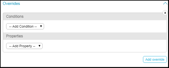
Overrides Pane - Select one or more conditions and select one or more values for the conditions or enter a value for the condition. The possible conditions are:All of the conditions must be true (AND) for the override to take effect. For example, if you select platform iOS and Android, and you select minimum height 100 pixels and minimum width 200 pixels, the override will take effect if the device is iOS or Android and the height is at least 100 pixels and the width is at least 200 pixels:platform = (iOS OR Android) AND height > 100 AND width > 200.
- Platforms - Select one or more: iOS, Android, or Web. The condition applies if the device matches any (OR) of these platforms.
- Device Types - Select one or more: Phone, Desktop, or Tablet. The condition applies if the device matches any (OR) of these types.
- Max/Min Device Area - Enter the maximum or minimum total device area (height x width), in pixels. This setting is not commonly used; the best practice is to specify the max/min device height/width (see the next setting).
- Max/Min Device Height/Width - Enter the maximum or minimum screen height or width, in pixels.
- Select one or more properties to override if the condition matches. For more information, see Configuring Services.
As usual, when you are done, save your changes.
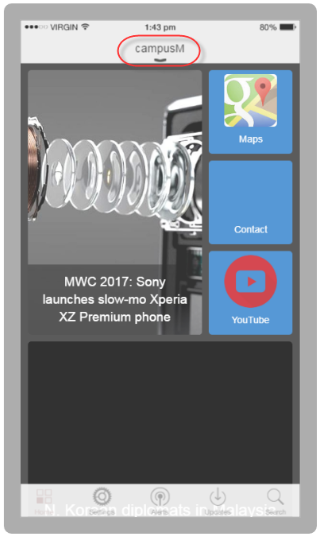
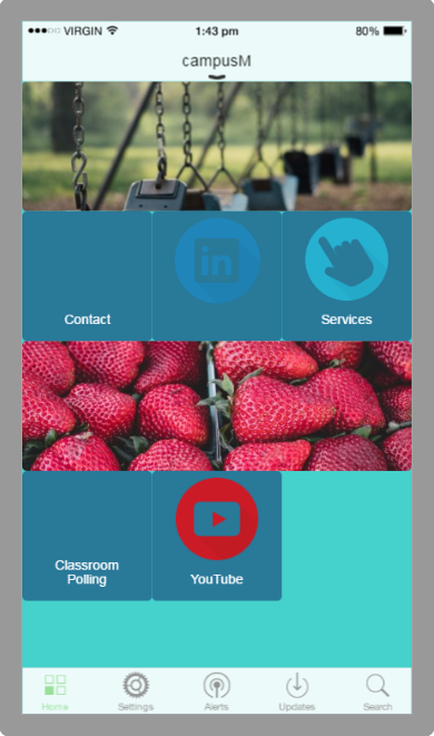
Configuring Default Banner Service Images
For regular banner services, you can associate the entire service to specific app roles, enabling you to display or hide the entire service for these roles. The default banner service enables you to associate app roles with each image in the banner, which means that you can display or hide each image for specific app roles. Similarly, the default banner service enables you to configure different URLs for each image.
The default banner service appears if you add a banner service and do not define any images for the service. See Creating Services and Configuring Services.
You add, edit, and delete default banner service images on the Select home page banner to change pages (App Settings > News/Events/Comms > Home Page Banners). This page presents a list of image entries; for information about working with lists, see Working with Lists. You can reorder the entries on this page using the up and down arrows.
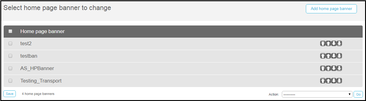
For each entry, configure:
Rearranging Services in the App
In the App Builder, you can drag and drop services in the Device Display Pane (see Working with the App Builder) to change the location of the service in the app's window.
To view how the app appears on various devices and screen orientations (vertical or horizontal), select the device type and/or orientation in the Device Selection Menus.
Moving a service changes its location for all device types and for all orientations.
Managing Profile Defaults for Services
You can define the default service properties for all services in a profile. When configuring services (see Configuring How Services Appear), any service property not configured for a service inherits its value from the profile.
You configure profile defaults for services in the App Builder on the Profile Config tab (App Builder > Profile Config). Most configurations follow the same process as the ones defined for configuring the service; for more information, see Configuring How Services Appear. This section presents configurations not mentioned in the other section.
| Field | Description | Values |
|---|---|---|
| Config | ||
| Portal Style | Configure Portal View to display with or without a sidebar. For more information, see Configuring Portal View. | |
| Background Color | The background color of the app. This color appears between the tiles as the app background. | Select the color icon and select a color or enter a hexadecimal color in the text field to the right of the color icon. |
| Columns (min)
Columns (max) |
Minimum / maximum number of columns in which to display tiles on the device's home screen. | Enter a numerical value. Default minimum is 1. Default maximum is 5000. |
| Header Background Color (web) | Relevant only for the web app.
The background color of the app header.
 |
Select the color icon and select a color or enter a hexadecimal color in the text field to the right of the color icon. |
| Header Foreground Color (web) | Relevant only for the web app.
The text color of the app header.
|
Select the color icon and select a color or enter a hexadecimal color in the text field to the right of the color icon. |
| Header Image (web) | The small image that appears in the app header. | Select Browse to select a file from the Assets Manager; see Uploading Files. |
| Tile Size (max)
Tile Size (min) |
Maximum / minimum tile size, in pixels. A 1 x 1 tile will have a maximum / minimum height and width as defined by these properties. A 1 x 2 tile will have a maximum / minimum height and 2 x width as defined by these properties. | Enter a numerical value, in pixels. Default minimum is 95 pixels. Default maximum is 180 pixels. |
| Tile Spacing | Space between tiles, in pixels. By default, tile spacing is set to 0.
|
Enter a numerical value, in pixels. |
| Overrides | See Overriding Service Appearance Based on Device Properties. | |
| Tile Style - See Tile Config in Configuring How Services Appear | ||
| iOS Config - Properties specific to an iPhone or iPad. | ||
| iOS Color | The color for the toolbar icons.
 |
Select the color icon and select a color or enter a hexadecimal color in the text field to the right of the color icon. |
| iOS Header Text | The text on the header bar. By default, the header text is the name of the app.
 |
Enter the header text in the text field. |
| iPad Header (landscape) | A header image for an iPad in landscape mode. This image is used in place of the header text (above). | Select Browse to select a file from the Assets Manager; see Uploading Files. |
| iPad Header (portrait) | A header image for an iPad in portrait mode. This image is used in place of the header text (above). | Select Browse to select a file from the Assets Manager; see Uploading Files. |
| iPhone Header Image | A header image for an iPhone. This image is used in place of the header text (above). | Select Browse to select a file from the Assets Manager; see Uploading Files. |
| Recents Indicator Image | The default icon that appears in the app's Recents menu for a service; see Configuring How Services Appear.
The icon should be 120x120 pixels and a maximum size of 50k. |
Select Browse to select a file from the Assets Manager; see Uploading Files. |
| Portal Config | ||
| Right Side Gutter % of Screen | The percentage of the page that is a gutter to the right of the main page to simulate a mobile device | |
| Collapsible Sidebar | Enable the left-hand side side-bar to collapse by clicking to provide more screen space for pages. | |
| Text Transform | Select Capitalize to have the first letter capitalized or Uppercase to have all the letters capitalized. | |
| Text Align | Alignment of the text in the side-bar. | |
| Font Size (px) | The size of font of the text in side-bar | |
| Font Weight | The weight of font of the text in the side-bar. Select None, Bold, or Bolder. | |
| Hover Font Weight | The weight of font of the text in the side-bar when you hover over it. Select None, Bold, or Bolder. | |
| Text Color | The color of text in the side-bar. | |
| Item Hover Text Color | The color of the text in the side-bar when you hover over it. | |
| Item Spacing (px) | The spacing between items in the sidebar. | |
| Item Side Padding (px) | The spacing between the side margin and the text in the side-bar. | |
| Top Padding (px) | The spacing between the top margin and the text in the side-bar. | |
| Background Color | The background color of the side-bar. | |
| Item Hover Background Color | The background color of the side-bar when you hover over it. | |
| Sidebar Footer Content | The footer text in side-bar. | |
Page tags: article:topiccontent:Documentationproduct:campusmlang:englishcommunity:training_materialsproduct:alma_specto