
Arrow tabs display a list of links that show the relationship between different sections without adding unnecessary complexity to the app home screen. They provide patrons with a simple way to navigate to related content.
Arrow tabs often contain links to external content, although links do not have to be external. You can also display an icon next to each link to make the available options easier to identify.
For a balanced and organized layout, use an even number of links.
Customize the Arrow tab
The following example shows how you can customize an Arrow tab. You can customize the layout, text, icons, and content to suit your library's content and the experience you want to provide to patrons.
In this example, the Library Resources Arrow Tab contains four sections that link to different types of library resources:
-
Local History
-
Adult Learning
-
Children & Families
-
Health & Wellbeing
Each section highlights a specific category of content available to patrons.
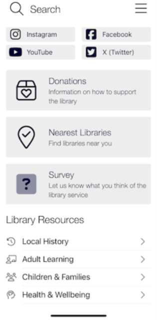
You can follow the example in the further text to create the same configuration, or use different text and icons for your own Arrow tab.
To customize the Arrow tab:
-
In the Content Management System (CMS), select Mobile Apps from the left navigation menu, and then select the mobile app or template where you want to create the Arrow tab.
-
In the Tab Manager, locate the list of existing tabs.
Home Screen typically appears as the root tab.To expand or collapse the tabs, select the + or - next to a tab name.
-
Select where you want to create the new tab:
-
Select Home Screen to create the new tab as a main tab on the app home screen. This option should be selected in this example.
-
Select an existing tab to create the new tab as a nested tab within it.
-
-
At the top of the Tab Manager, select Create.
This option is represented by a folder with a yellow star.
-
In the New Tab window, enter a name for the new tab, then select Create.
For this example, enter Library Resources.
-
Create the nested tabs that are displayed within the Arrow tab.
Select the new Library Resources tab, and then select Create at the top of the Tab Manager.
To follow this example, create the following four nested tabs under Library Resources:
-
Local History
-
Adult Learning
-
Children & Families
-
Health & Wellbeing
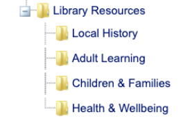
The following screenshot shows how the nested tabs appear under the Library Resources root tab.
-
-
Select the root Library Resources tab, and then select Edit Tab: (Library Resources).
The Edit Tab page is displayed.
-
In the Title field, enter a title for the root tab.
For this example, enter Library Resources. -
(Optional) To use a title color that differs from the color defined in your UI settings, turn on Custom Colour and select a color in the Web Palette window. You can select one of the available colors on the Web Palette tab or specify a hexadecimal color value on the HSV tab. Select Apply to save the color.
-
(Optional) If your library supports multiple languages in the app, you can provide language-specific versions of the title.
-
Select the flag icon next to an editable text field in the CMS and provide the appropriate text for each available language.
The languages available depend on the languages enabled for your app. When patrons switch the app to one of these languages, the corresponding version of the text is displayed.
-
-
In the Subtitle field, enter a subtitle that describes the purpose of the root tab.
For this example, enter A variety of library resources available 24/7.
The subtitle isn't displayed in the app, but it provides information for patrons who use screen readers.
-
Skip the icon setting for the root tab.
Due to the Arrow tab design, an icon configured for the root tab isn't displayed on the app home screen.
-
Set the visibility of the root Library Resources tab:
-
Always: Displays the tab on the app home screen regardless of whether the patron is signed in or not.
-
Pre-Login: Displays the tab on the app home screen before the patron signs in and hides it after the patron signs in.
-
Post-Login: Displays the tab on the app home screen after the patron signs in and hides it after the patron signs out.
-
Staff Only: Displays the tab on the app home screen when a staff user is signed in.
-
Never: Hides the tab from the app home screen for all users.
-
-
To keep the tab at the top of the tabs on the app home screen, turn on Pinned Notification.
For example, you can pin a tab containing an important announcement, such as an unexpected library closure, so that it appears first when patrons open the app.
If you pin multiple tabs, they are displayed in the order in which they appear in the Tab Manager.
Patrons can't change the position of a pinned tab in their app preferences.
-
In the Tab Type section, select Tab Group from the first drop-down list.
-
From the drop-down list below Tab Group, select Arrow.
-
To prevent the title configured in the previous steps from appearing in the app, enable Hide Title.
-
You can leave Background: Back Colour and Background: Text Colour unchanged.
These settings don't affect the appearance of an Arrow tab.
-
Select Save at the bottom of the page.
Configure the nested tabs
After configuring the root Arrow tab, configure each nested tab. The following steps use the Local History tab from the example.
-
On the Edit Mobile App page, expand the Library Resources tab in the Tab Manager, and then select Local History.
-
Select Edit Tab: (Local History).
The Edit Tab page is displayed.
-
In the Title field, enter Local History.
The title is displayed in the app.
-
To use a color that differs from the color defined in your UI settings, turn on Custom Colour and select a color in the Web Palette dialog.
You can select one of the available colors on the Web Palette tab or specify a hexadecimal color value on the HSV tab. Select Apply to save the color.
-
In the Subtitle field, enter a description of the purpose of the tab.
For this example, enter: Explore your library's local history collection that highlights the rich heritage of your community.
The subtitle isn't displayed in the app, but it provides information for patrons who use screen readers.
-
Set the visibility of the nested Local History tab.
For consistent behavior, use the same visibility setting as the root Library Resources tab.
For example, if Library Resources is set to Always, set Local History to Always.
-
In the Button section, select an icon for the nested tab.
Due to scaling limitations, you can't upload a custom image for a nested tab. Instead, select an icon from the built-in icon picker:
-
Turn on Icon.
-
Select the square icon box.
-
Search for an icon by keyword.
-
Select the icon you want to use.
-
Select Apply.
The selected icon appears in the square box in the Button section.
-
-
(Optional) To apply a custom color to the icon, turn on Custom Color and select a color in the Web Palette window.
You can select one of the available colors on the Web Palette tab or specify a hexadecimal color value on the HSV tab. If you don't select a color, the icon is black.
Custom color applies only to icons selected from the built-in icon picker.
-
(Optional) Set the icon and text alignment.
Icons configured for nested tabs are displayed in the app. If you don't select an icon, the app shifts the text to the left so that no empty space remains.Adding icons can provide consistent alignment across the nested tabs.
-
In this example, the Local History tab opens a URL in the in-app browser through an existing content item. If you're replicating this setup, go to the Tab Type section, and select Content Item from the first drop-down list.
-
From the list below Content Item, select the content item that you want to associate with the tab.
For information about creating content items, see Creating and Scheduling Content Items.
-
Select Save.
-
Repeat steps 3-12 for the other nested tabs:
-
Adult Learning
-
Children & Families
-
Health & Wellbeing
In this example, each of these tabs uses a previously created Content Item.
-
-
After you configure all tabs, select Save at the bottom of the Edit Mobile App page.
-
If the app is already open, reload it to view your changes:
-
Open the hamburger menu in the upper-right corner, and select Preferences.
-
Select Reload.
After the app reloads, the customized Arrow tab is displayed.
-
| Tab type | Style | Description | Visual |
|---|---|---|---|
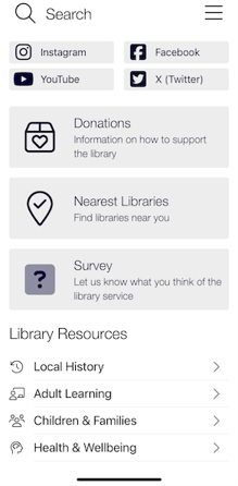
| Arrow | With title | Shows the title of the root tab within the app. |
|
| Tab type | Style | Description | Visual |
|---|---|---|---|
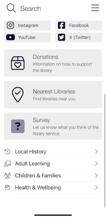
| Arrow | Without title | Hides the title of the root tab from the app. |
|
