
Use a Book Showcase tab to control where and how showcase content is displayed on the app home screen. You can use a Book Showcase tab alongside the Classic Showcase or instead of the Classic Showcase.
The showcase content itself is configured in a feed on the Home Screen tab. You then connect the Book Showcase tab to that feed.
You can choose where the showcase appears and how its content is displayed, including a variety of layout styles. This makes the Book Showcase tab a flexible option for highlighting New Releases, Staff Picks, curated collections, or other featured content throughout your app's home screen.
How Book Showcase tabs work
A Book Showcase tab requires two components:
-
Showcase content: Configure the appropriate URL, RSS feed, or ID in a feed on the home screen tab.
The feed provides the content for the showcase.
-
Book Showcase tab: Create a Book Showcase tab and connect it to the feed that contains the URL, RSS feed, or ID.
The tab displays the showcase content on the home screen.
Configuring a URL, RSS feed, or ID in a Home screen feed doesn't display the showcase content by itself. You must connect the feed to a Book Showcase tab.
You can keep the Classic Showcase enabled while adding one or more Book Showcase tabs in other locations on the home screen.
Configure a Book Showcase tab
The following example shows how to create a Recommended Reads Book Showcase tab positioned midway down the home screen. The example uses the Showcase Display / Standard - Slider: 1 Large, 4 Small style.
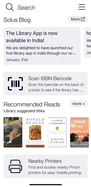
This is one possible configuration. You can follow the example or use different content, text, and display styles for your library.
To configure the Showcase feed:
Configure the URL, RSS feed, or ID that provides the content for the Book Showcase tab.
-
In the CMS, select Mobile Apps from the left navigation menu, and then select the mobile app or template that you want to configure.
-
In the Tab Manager, select the root Home Screen tab, and then select Edit - Home Screen.
The Edit Home Screen tab opens.
-
Scroll to the Feed 1 (also used on the home screen) section.
-
Determine which feed to use:
-
If you're not using the Classic Showcase:
You can use Feed 1 for your Book Showcase tab.In this example, you aren't using the Classic Showcase, so Feed 1 can be used to populate the Showcase displayed on the Home Screen.
-
If you're using the Classic Showcase:
Feed 1 must be used for the Classic Showcase, as it is reserved for the Showcase that appears at the top of the home screen.Enter the showcase content information for your Book Showcase tab in the Feed 2 section.
-
-
In the Title field, enter a name for the showcase.
For this example, enter Recommended Reads.
-
From the Type list, select how the showcase content is populated.
Depending on your system configuration, different options will be available to you. You have the following options:-
Bibliographic ID: Standard option
-
ISBN: Standard option
-
Record Set ID: Polaris only
-
Search URL: AIT only
-
List ID: AIT only
-
Enterprise RSS: Enterprise Search Provider only
-
Arena Portlet URL: Axiell only
-
Search / RSS URL: Spydus only
-
Koha RSS: Koha only
-
ESS LMC RSS: ESS only
-
LSpac RSS: TLC only
-
New Items Collection: Libero only
-
User-defined List: Libero only
-
Search Object Advanced: Libero only
-
-
In the Items field, enter a comma-separated list or a URL, depending on the selected type.
For URL options, make sure to provide just one URL to avoid display issues.
-
Note the number of the feed that you configured.
You'll need this number when you create the Book Showcase tab in the next procedure.
The content won't appear in the app until the feed is connected to a Book Showcase tab.
-
Select Save at the bottom of the page.
Move on to the procedure below to create a Book Showcase tab.
To create the Book Showcase tab and connect it to the previously configured feed:
-
In the Content Management System, select Mobile Apps from the left navigation menu, and then select the mobile app or template where you want to create the Book Showcase tab.
-
In the Tab Manager, locate the list of existing tabs.
Home Screen appears as the root tab.
To expand or collapse the tabs, select the + or - next to a tab name.
-
Select the Home Screen tab, and then select Create at the top of the Tab Manager.
This option is represented by a folder with a yellow star.
-
In the New Tab window, enter a name for the new tab.
For this example, enter Recommended Reads.
-
Select Create.
-
Select the new Recommended Reads tab, and then select Edit Tab: Recommended Reads.
The Edit Tab page is displayed.
-
In the Title field, enter a title for the tab.
For this example, enter Recommended Reads.
-
(Optional) To use a title color that differs from the color defined in your UI settings, turn on Custom Colour and select a color in the Web Palette window.
You can select one of the available colors on the Web Palette tab or specify a hexadecimal color value on the HSV tab.
Select Apply to save the color.
For Book Showcase tabs, the custom color applies to the Title, Subtitle, and More > button.
-
(Optional) If your library supports multiple languages in the app, you can provide language-specific versions of the title. To do so, select the flag icon next to an editable text field and provide the appropriate text for each available language.
The languages available depend on the languages enabled for your app. When patrons switch the app to one of these languages, the corresponding version of the text is displayed.
-
In the Subtitle field, enter additional information about the showcase.
For this example, enter Library suggested titles.
The subtitle provides additional information about the Showcase, including information for patrons who use screen readers.
-
Skip the settings in the Button section.
Icons configured for Book Showcase tabs don't appear on the home screen.
-
Set the visibility of the Recommended Reads tab:
-
Always: Displays the tab on your app home screen whether or not the patron is signed in.
-
Pre-Login: Displays the tab on your app home screen before the patron signs in and hides it after the patron signs in.
-
Post-Login: Displays the tab on your app home screen after the patron signs in and hides it after the patron signs out.
-
Staff Only: Displays the tab on your app home screen when a staff user is signed in.
This option might not be compatible with all ILS/LMS systems because some systems don't differentiate between staff and patron accounts.
-
Never: Hides the tab on your app home screen for all users.
-
-
In the Tab Type section, select Showcase Display from the first drop-down list.
-
From the list below Showcase Display, select Standard.
-
From the Style drop-down list, select how you want the book showcase to appear.
For this example, select Slider: 1 Large, 4 Small.
The following styles are available:
-
Slider: 1 Row: Displays a single row of showcase items that patrons can scroll horizontally.
-
Slider: 2 Row: Displays two rows of showcase items that patrons can scroll horizontally.
-
Slider: 1 Large, 4 Small: Displays the first item in a larger format followed by four smaller items.
The pattern repeats, with every sixth item appearing larger.
-
Slider: Huge: Displays showcase items in a larger format.
-
List: Displays showcase items in a list format, initially showing the first four items.
-
Button: 3 Items: Displays the first three showcase items in a button layout.
-
Button: 3 Items with Step: Displays the first three items in a stepped or staggered button layout.
-
Button: 6 Items: Displays the first six items in a staggered button layout.
-
Button: 6 Items (Angled): Displays the first six items in an angled button layout.
-
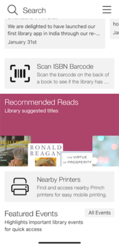
Large Button: Displays the first four items in a larger button format at the bottom of the tab.
-
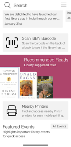
Large Button: Left: Displays the first three items in a larger button format aligned to the left.
-
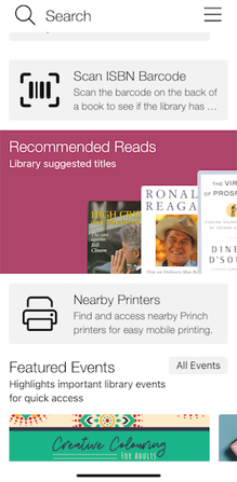
Large Button: Right: Displays the first three items in a larger button format aligned to the right.
-
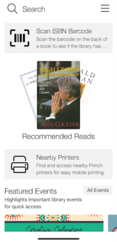
Large Button: Fan: Displays the first three items in a fan-style layout.
If you don't specify a Feed ID for any of these styles, the first showcase configured on the Home Screen tab is used by default.
-
-
In Feed ID, enter the number of the feed that you configured in the previous procedure.
This connects the Book Showcase tab to the appropriate showcase content.
For example, if you configured the content in Feed 3, enter 3.
-
Select Save at the bottom of the page.
-
If the app is already open, reload it to view your changes:
-
Open the hamburger menu in the upper-right corner.
-
Select Preferences.
-
Select Reload.
After the app reloads, the configured Book Showcase tab is displayed.
-
Configuration options
| Tab Type | Style | Description | Visual |
|---|---|---|---|
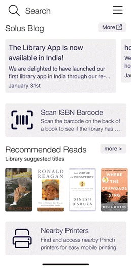
| Showcase Display / Standard | Slider: 1 Row | Displays your selected Showcase in a single horizontal row for patrons to scroll through. |
|
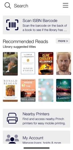
| Showcase Display / Standard | Slider: 2 Rows | Displays your selected Showcase in two horizontal rows for patrons to scroll through. |
|
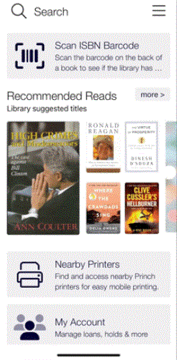
| Showcase Display / Standard | Slider: 1 Large, 4 Small | Displays the Showcase with the first item larger, followed by four smaller items; this pattern repeats every six items. |
|
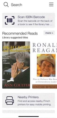
| Showcase Display / Standard | Slider: Huge | Displays the Showcase items in a large format. |
|
| Showcase Display / Standard | List | Displays the first four items from the Showcase feed in a list format. The More button appears below the listed items. |

|
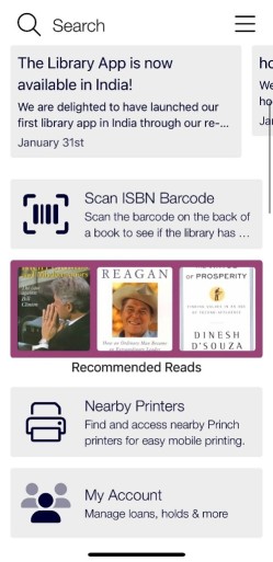
| Showcase Display / Standard | Button: 3 Items | Shows the first three Showcase items as buttons. A colored background (set via the Background color picker) visually separates the Showcase. |
|
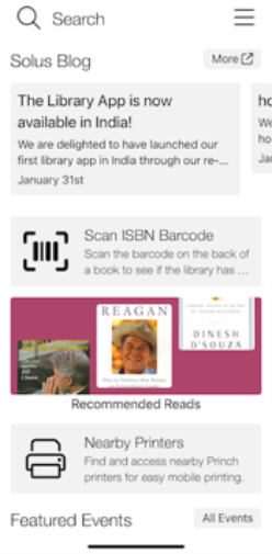
| Showcase Display / Standard | Button: 3 Items with Step | Displays the first three items in a stepped/staggered button layout. A colored background (set via the Background color picker) visually separates the Showcase. |
|
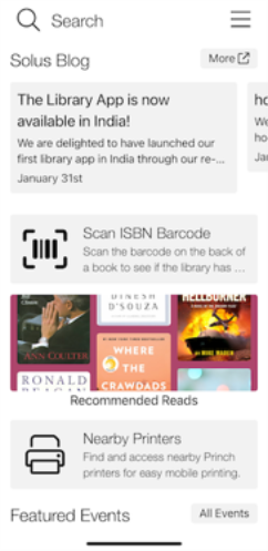
| Showcase Display / Standard | Button: 6 Items | Displays the first six items in a staggered button layout. A colored background (set via the Background color picker) visually separates the Showcase. |
|
| Showcase Display / Standard | Button: 6 Items (Angled) | Displays the first six items in an angled button layout. A colored background (set via the Background color picker) visually separates the Showcase. | |
| Showcase Display / Standard | Large Button | Displays the first four items in a staggered layout at the bottom of the tab. Title and Subtitle text colors are set to white via the Custom Colour toggle for better contrast against the purple background. |
|
| Showcase Display / Standard | Large Button: Left | Displays the first three items in a staggered layout aligned to the left of the tab. Title and Subtitle text colors are set to white via the Custom Colour toggle for better contrast against the purple background. |
|
| Showcase Display / Standard | Large Button: Right | Displays the first three items in a staggered layout aligned to the right of the tab. Title and Subtitle text colors are set to white via the Custom Colour toggle for better contrast against the purple background. |
|
| Showcase Display / Standard | Large Button: Fan | Displays the first three items in a fan-style staggered layout. |
|
