
Use the Default Colors settings in the Content Management System (CMS) to configure the default color scheme for your Vega Mobile app. You can customize the home screen, tabs, buttons, and other interface elements to align with your library's branding.
When selecting colors, make sure there's sufficient contrast between text and backgrounds so that content remains readable for patrons, including patrons with visual impairments or color vision differences.
To configure the default colors:
-
In the CMS, select Mobile Apps from the left navigation menu.
-
Select the app or template that you want to edit.
-
Scroll to the Default Colors section.
-
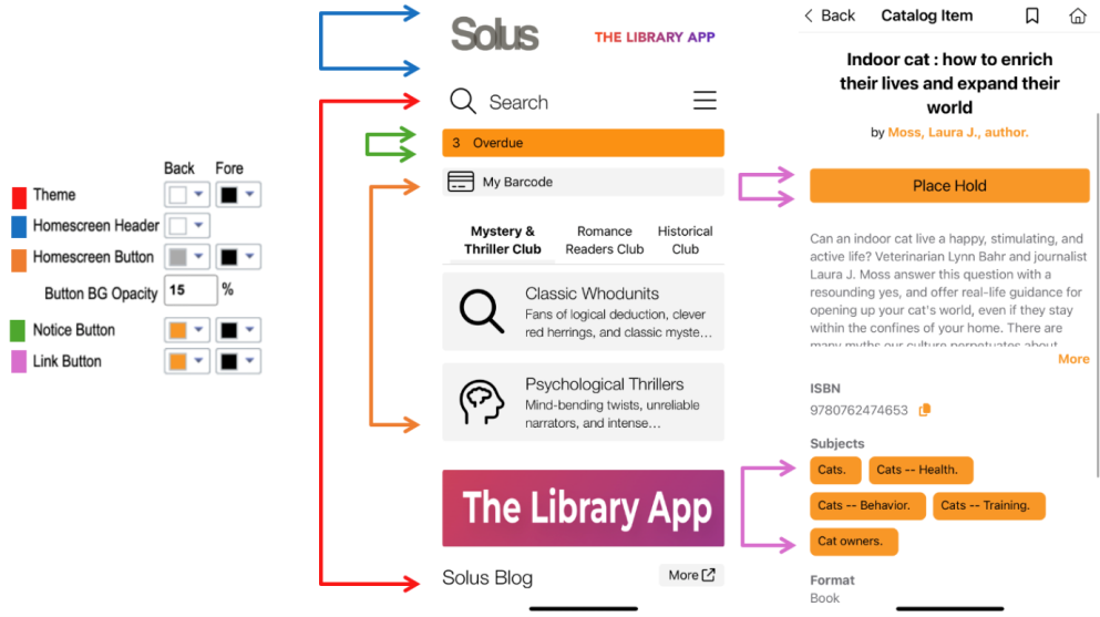
Configure the colors for your app using the following settings:
-
Theme: Controls the primary colors used on the app home screen.
-
Back: Sets the background color of the home screen, excluding the color defined for Homescreen Header.
-
Fore: Sets the text color on the home screen, including the text color for Search and My Account in the hamburger menu.
-
-
Homescreen Header: Sets the color of the home screen header.
-
Home Screen Button: Controls the colors of tabs and some home screen highlights, including My Barcode, For Pickup, Due Soon, and Self-Check.
-
Back: Sets the background color of the home screen highlights and the outlines of tabs.
-
Fore: Sets the text color of the home screen highlights and tabs.
-
-
Button Background Opacity: Sets the transparency of the tab backgrounds and home screen highlights controlled by Home Screen Button.
-
Notice Button: Controls the colors of the Overdue home screen highlight.
-
Back: Sets the background color of the Overdue highlight.
-
Fore: Sets the text color of the Overdue highlight.
-
-
Link Button: Controls the colors of link buttons and linked elements throughout the app, including Place Hold, related subjects, and author names on the Item Details Display.
-
Back: Sets the background color of the button.
-
Fore: Sets the text color.
-
-
Plain Covers: Configures the color used for cover images when cover art isn't available or can't be displayed in the app.
This setting isn't currently connected to the app interface and becomes available in a future update.
-
eContent button colors
When an eContent integration such as Hoopla or OverDrive is configured, available items display a green Borrow or Download button. If an item isn't available, the Place Hold button appears instead and uses the color configured for Link Button.
