
Nuggets tabs display related content in multiple sections on the app home screen. Each section is configured as a nested tab, allowing patrons to access different content or destinations from a single root tab.
For a balanced, full-width layout, use an even number of nested tabs. Nuggets tabs are particularly useful for content that benefits from a compact, tile-based presentation, such as social media links.
Configure the Nuggets tab
The following example shows how to create a Social Media Nuggets tab organized into four sections to highlight different social media links:
-
Instagram
-
Facebook
-
YouTube
-
X (Twitter)
This is one possible configuration. You can use different nested tabs, text, icons, and content to suit your library's needs.
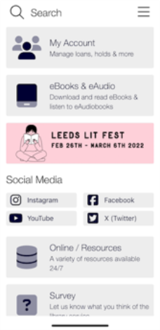
To create the Nuggets tab:
-
In the Content Management System (CMS), select Mobile Apps from the left navigation menu, and then select the mobile app or template where you want to create the Nuggets tab.
-
In the Tab Manager, locate the list of existing tabs.
Home Screen typically appears as the root tab.
To expand or collapse the tabs, select the + or - next to a tab name.
-
Select where you want to create the new tab:
-
Select Home Screen to create the new tab as a main tab on the app home screen. For this example, select Home Screen.
-
Select an existing tab to create the new tab as a nested tab within it.
-
-
Select Create at the top of the Tab Manager.
This option is represented by a folder with a yellow star.
-
Provide a Name for your new tab in the New Tab pop-up window.
In this example, the tab is named Social Media.
-
Select Create to generate your new tab.
-
Select the Social Media tab, and then select Create at the top of the Tab Manager.
This is the option on the left that has a folder with a yellow star at the top.
If you are following the example provided, you will need to create four nested tabs that are titled Instagram, Facebook, YouTube, and X (Twitter).
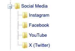
-
Once all the tabs have been created, select the root Social Media tab, and then select Edit Tab: Social Media.
The Edit Tab page is displayed
-
Provide a Title for the tab in the corresponding field.
If you are following along with the provided example, provide the Social Media title.
-
(Optional) If you'd like the Title text to be a different color than what's defined in your UI colors, toggle Custom Colour and choose your preferred color in the Web Palette pop-up.
You can select from provided colors in the Web Palette tab or provide your own hexadecimal in the HSV tab.
Make sure to click Apply to save your preferred color choice.
-
(Optional) If your library supports multiple languages in the app, you can customize the translation of the Title.
To do so, select the flag icon next to any editable text field in the CMS to provide language-specific versions.
The options you can provide text for will depend on what languages you have enabled.
-
Skip the Subtitle setting.
Subtitles aren't displayed for the root Nuggets tab or when the app is in simplified mode.
-
Skip the icon and image settings for the root tab.
Icons and images aren't displayed for the root Nuggets tab or in simplified mode.
-
Set the visibility of the root Social Media tab:
-
Always: Displays the tab on the app home screen whether or not the patron is signed in.
-
Pre-Login: Displays the tab before the patron signs in and hides it after the patron signs in.
-
Post-Login: Displays the tab after the patron signs in and hides it after the patron signs out.
-
Staff Only: Displays the tab when a staff user is signed in. This option might not be compatible with all ILS/LMS systems because some systems don't differentiate between staff and patron accounts.
-
Never: Hides the tab for all users.
-
-
(Optional) Specify if you want the tab to always stay at the top of the tabs on your app home screen by toggling the Pinned Notification option.
If this is enabled, patrons can't change the order of the tab within the app's preferences. This is useful if you need to announce something important, like a sudden library closure, and want your patrons to see it first thing when they open the app.
If you pin multiple tabs, they're displayed in the order in which they appear in the Tab Manager.
-
In the Tab Type section, select Tab Group in the first drop-down list.
-
In the drop-down list below Tab Group, select Nuggets.
-
(Optional) To hide the root-tab title from the app, turn on Hide Title.
-
Select Save at the bottom of the page to update the tab.
-
Back on the Edit Mobile App page, navigate to the Tab Manager and expand the Social Media tab.
-
Select the first nested tab in the list.
In this example, this will be Instagram.
-
Select Edit Tab: Instagram.
The Edit Tab page is displayed.
-
Provide a Title for the tab in the corresponding field.
If you are following along with the provided example, the tab title should be Instagram.
-
(Optional) If you'd like the Title text to be a different color than what's defined in your UI colors, toggle Custom Color and choose your preferred color in the Web Palette pop-up window.
You can select from provided colors in the Web Palette tab or provide your own hexadecimal in the HSV tab.
Make sure to click Apply to save your preferred color choice.
-
Skip the Subtitle setting.
Subtitles aren't displayed for nested tabs within a Nuggets tab or when the app is in simplified mode. -
Select a graphic to use as the tab icon in the Button section.
Due to scaling limitations, custom image uploads are not supported for nested tabs. You must select an icon from the built-in icon picker.
To select from an icon palette:
-
Toggle Icon.
-
Select the square icon box.
-
Search for an icon by keyword.
-
Select the icon that you want to use.
-
Select Apply.
Once selected, the icon is displayed in the square box to the right of the Button section.
-
-
Set the visibility of the nested Instagram tab. For consistent behavior, align the visibility settings with those specified in step 14.
Example: If you set the root Social Media tab to Always, ensure this tab is also set to Always.
In the example provided, the Instagram tab is configured to open Instagram via a URL in the in-app browser.
-
Select Save at the bottom of the page to apply your updates.
-
Repeat the steps 21-28 for the remaining three tabs: Facebook, YouTube, and X (Twitter).
In the provided example, the Tab Contents of these tabs are all set to a previously created Content Item.
-
Once all tabs have been updated, select Save at the bottom of the Edit Mobile App page.
-
If you have your app open, you need to refresh it to see the latest changes.
To refresh your app:
-
Navigate to the hamburger menu in the top right corner.
-
Select Preferences.
-
Select Reload.
Once reloaded, the Nuggets tab is loaded with your customizations.
-
Why Nuggets tabs might stack
In some cases, the Nuggets tab may display in a single-column layout instead of the usual multi-column format. This often happens on smaller screens, when accessibility settings like large text or display scaling are enabled, or when the Nugget text is especially long.
The Vega Mobile app uses a responsive design, so the layout automatically adjusts based on screen size and content. A single-column view helps maintain readability and prevents text from being cut off.
Configuration options
| Tab Type | Style | Description | Visual |
|---|---|---|---|
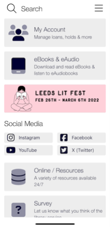
| Nuggets | With title | Shows the title of the root tab within the app. |
|
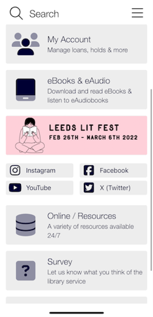
| Nuggets | Without title | Hides the title of root tab from the app. |
|
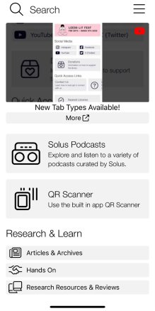
| Nuggets | Stacked Layout | Switches to a single-column layout when one of the tab's text is long. This behavior is not configurable in the Content Management System, and is how the app automatically handles the UI to maintain readability. |
|
