Primo
The Primo product integration provides students with access to their library account and to search functionality. Currently Alma and Voyager are being implemented as the ILS.
Overview
The Primo product integration provides students with access to their library account and search functionality. Currently,Alma,Voyager, and Aleph are being implemented as the ILS.
For more information, watch Library Integration - Primo(8:09 min).
User Experience
The following section describes information relating to the user experience for the Primo product integration.
User Activities
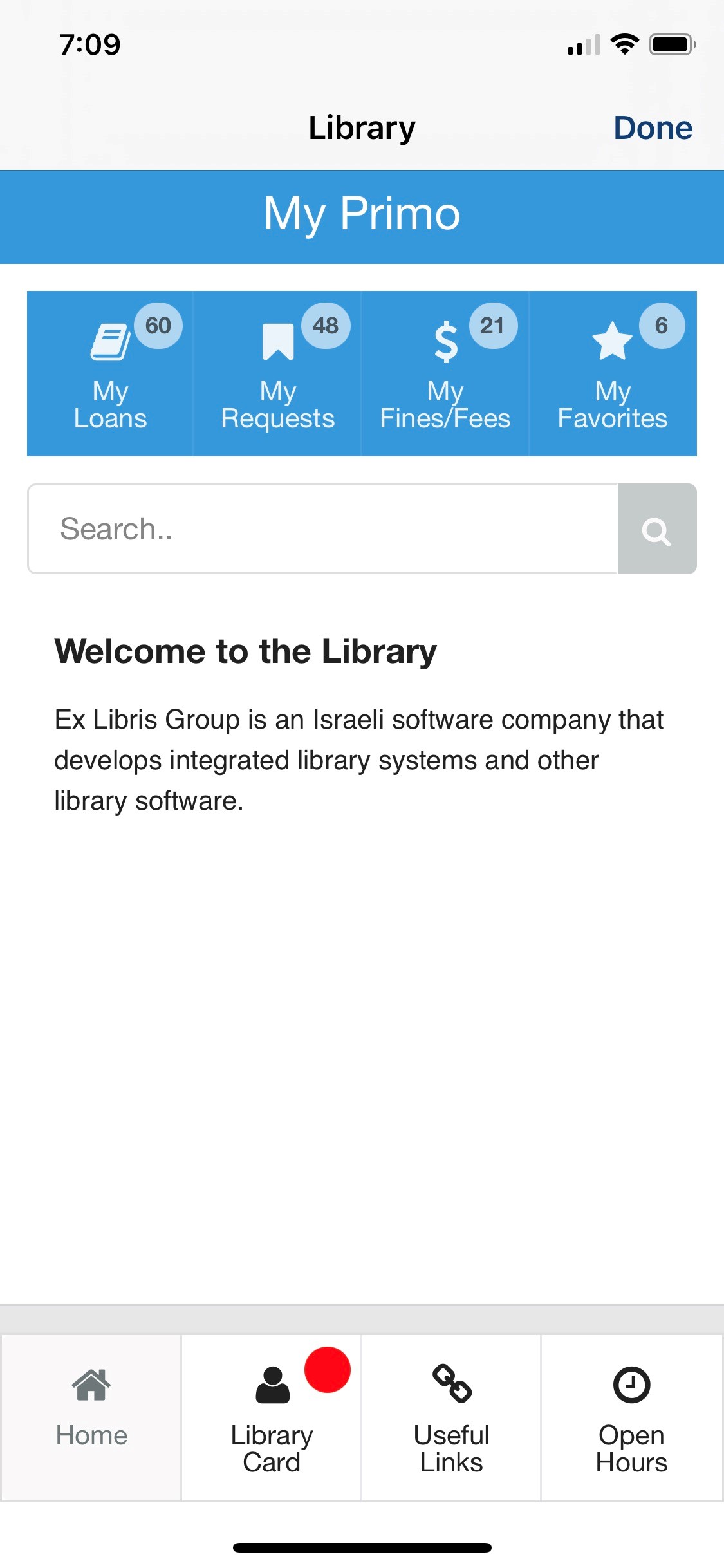
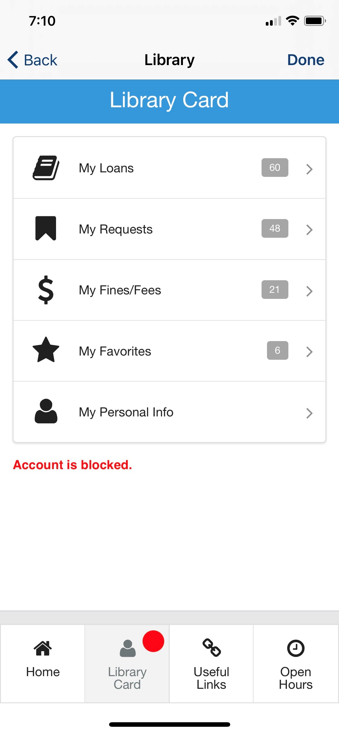
Students can check and manage various activities associated with their library account, such as loans (including renewing), requests (including canceling), saved items (favorites), fines and fees (including linking to payment options, if configured), and personal information.
Personal information is not supported by the Aleph ILS vendor.
The user has access to the discovery system search page, making it possible to search the library catalog by either using the embedded search from the App or by linking out to the Primo search page.
The user can save items to a list of favorites from the search pages.
Favorites are not supported by the Aleph ILS vendor.
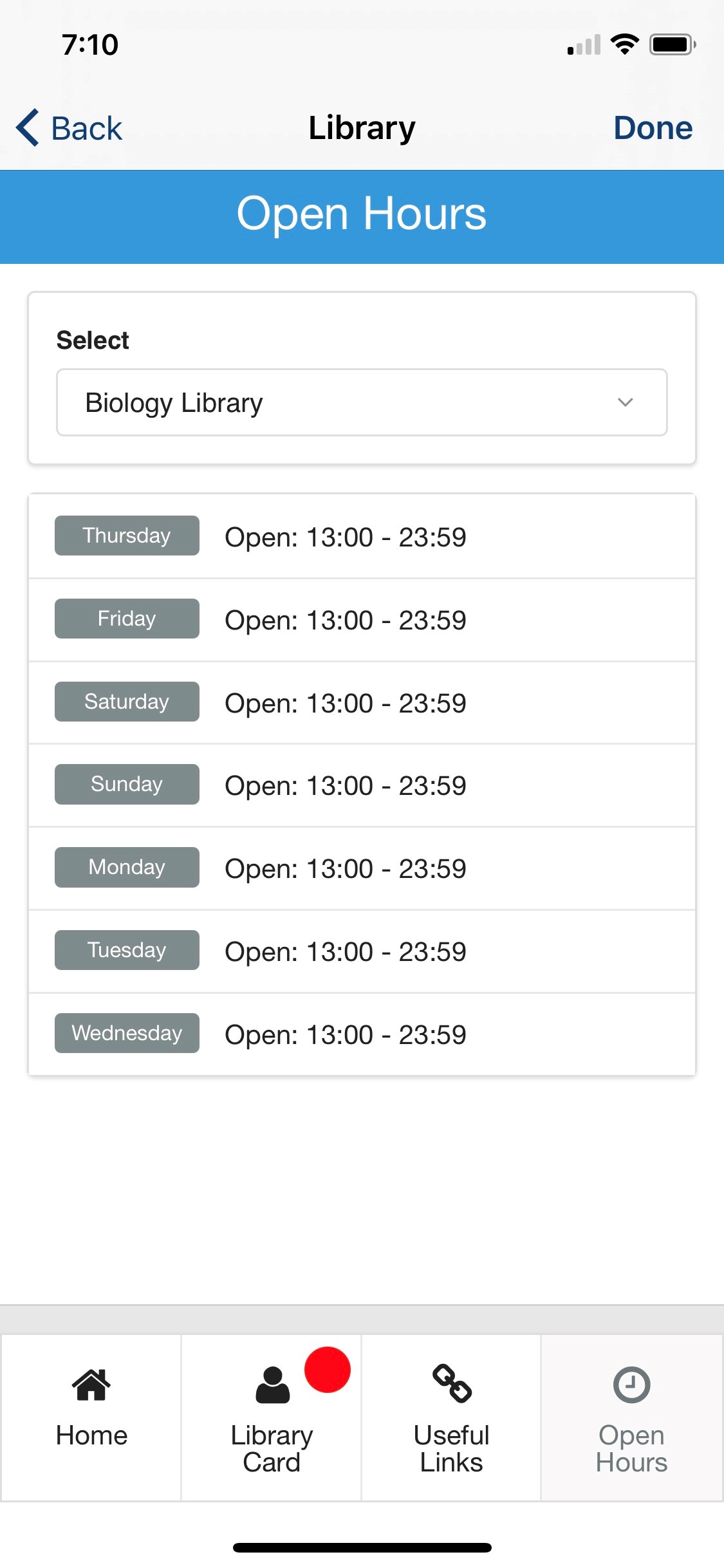
In addition, information about library opening hours as well as a page with useful links are available, as configured by the administrator.
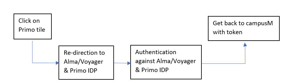
Authentication
The Primo product integration requires the user's identifier from the vendor's system. This is obtained with token-based authentication attributes.
The connection to Alma is handled as part of the generic API Configuration under the Alma section. The first part of the API Configuration details the URL to which to connect and any parameters that are required. The second part relates to the API Authentication for the URL.
Authentication against Alma and Primo is made by the API key, which is to be provided when configuring the integration instance.
Authentication against Voyager is based on the VXWS and the XML over HTTP Web Service protocol. The connection is handled via the API Configuration under the Voyager section, where the User Input Identifier parameters are entered.
Offline Support
Library Card data is cached on the user ’s device.
Screenshots
The following are examples of screenshots of the Primo product integration user interface for a reference when configuring it:
| Home Page - Search | Library Card | Open Hours |
|
|
|
| Useful Links | Record Details | Search Results |
|
|
|
| Primo Legacy Live Tile | Primo Live Tile Example of 3 x 2 Dimensions |
|
|
Live Tile
For the live tile legacy UI, we recommend using the following dimensions for an optimized experience:
- 1 width x 2 height
- Up to 4 widgets
The new Primo live tile UI is designed to work with the following sizes. The tile will attempt to display as many elements as possible regardless of the dimensions set, but we cannot guarantee the intended experience if you do not adhere to the following dimensions. The tile dimensions are set in the App Builder, while the widgets per row (and other details) are set in the Configuration page for this product integration.
- 1 wide x 1 high
- This is a special case. The tile only displays one widget (the highest prioritized, enabled widget).
- 2 wide x 1 high
- We recommend using 1 - 2 widget rows and using 1 - 3 widgets per row.
- 2 wide x 2 high
- We recommend using 2 - 3 widget rows and using 1 - 3 widgets per row.
- 3 wide x 1 high
- We recommend using 1 - 2 widget rows and using 2 - 4 widgets per row.
- 3 wide x 2 high
- We recommend using 2 - 3 widget rows and using 2 - 4 widgets per row.
We also recommend keeping the header text and widget labels for the live tile short.
Technical Overview
The following section describes technical information for the Primo product integration.
Prerequisites
The following prerequisites are required for the Primo product integration:
- The IDP returns the ILS ID attribute for the specific vendor (Alma, Voyager, or Aleph). The ILS ID attribute is a unique ID controlled by the customer that is defined per student and staff member in the chosen ILS. If you are using CMAuth, this attribute can have any name in the IDP attributes response (from SAML/OAuth/LDAP) but needs to be mapped in the Additional Mapping section of the CMAuth integration profile. If you are not using CMAuth, the ILS ID attribute must be returned in the LDAP attributes response. The attribute is configured in the User Input Identifier field in either the Alma, Voyager, or Aleph API Configuration section of the App Manager configuration.
- Any new mapping of the authentication token requires users to log out and log in to the app.
- For examples of API requests and responses, see the Developer's Network.
-
For more information concerning Voyager APIs, see the Voyager APIs section of the Developer's Network.
-
The Primo and Alma API keys require read-write access.
- For Aleph, the Aleph host server must be configured to enable access from campusM-specific IPs. See campusM Allowed List for more information.
Configuration
To configure the Primo product integration, select Add Product Integration from the Product Integrations main menu option.
Select Primo.
The following table describes the configuration options available on this page.
|
Configuration Option
|
Description
|
Mandatory
|
Data Type
|
Default
|
Example
|
|---|---|---|---|---|---|
|
Manage Integration
|
|||||
|
Enable Product Integration
|
Select to enable the product integration on the user's app.
|
No
|
Checkbox
|
Unselected
|
|
|
Product Integration Description
|
A description of the product integration for internal use.
|
Yes
|
String
|
||
|
Screen Title
|
The title that appears in the top header of the service.
|
No
|
String
|
Library
|
My Primo
|
|
Vendor – This section defines the structure of the APIs used in this product integration.
|
|||||
|
Discovery System
|
Select Discovery System.
|
Yes
|
String
|
Primo
|
Primo
|
|
Primo API Configuration
|
|||||
|
URL to retrieve the information
|
The URL to Primo API Gateway.
|
Yes
|
String
|
||
|
View ID
|
The View ID of your Primo.
|
Yes
|
String
|
||
|
API Key
|
API key to connect with your Primo instance.
|
Yes
|
String
|
||
|
Tab Name
|
Required for search functionality.
|
Yes
|
String
|
default_tab
|
|
|
Scope Name
|
Required for search functionality.
|
Yes
|
String
|
default_scope
|
|
|
Language Code
|
The language code of your Primo instance.
|
Yes
|
String
|
en
|
|
|
Select ILS
|
Select an ILS (Alma or Voyager).
|
Yes
|
String
|
Alma
|
|
|
Alma API Configuration
|
|||||
|
Base URL to retrieve the information
|
The URL to Alma Gateway.
|
Yes
|
String
|
||
|
User Input Identifier
|
|||||
|
Parameter Input Option
|
Select a parameter input option. Available options:
|
Yes
|
String
|
Token Property
|
|
|
Token Property
|
Enter the property name to be retrieved from the token ({ USERNAME, MAIL, GIVEN_NAME, SURNAME, FULL_NAME} or as named in the integration profile).
|
Yes
|
String
|
||
|
API Key
|
API key to connect with your Alma instance.
|
No
|
String
|
||
|
Voyager API Configuration
|
|||||
|
URL to retrieve the information
|
The base URL of your Voyager instance:http://server:port/vxws
|
Yes
|
String
|
||
|
User Input Identifier - AuthFactor
|
|||||
|
AuthFactor Type
|
Select AuthFactor type:
|
Yes
|
String
|
Barcode
|
|
|
Parameter Input Option
|
Available Options:
|
Yes
|
String
|
Token Property
|
|
|
Token Property Name
|
Enter the property name to be retrieved from the token ({ USERNAME, MAIL, GIVEN_NAME, SURNAME, FULL_NAME} or as named in the integration profile).
|
Yes
|
String
|
||
|
User Input Identifier - Last Name
|
|||||
|
Parameter Input Option
|
Select a parameter input option that matches your needs.
Available Options:
If Username is selected, it is not possible to use the Test API Configuration function.
|
Yes
|
String
|
Token Property
|
|
|
Token Property Name
|
Enter the property name to be retrieved from the token ({ USERNAME, MAIL, GIVEN_NAME, SURNAME, FULL_NAME} or as named in the integration profile).
|
Yes
|
String
|
||
|
Display Pin Option
|
Additional optional identification parameter, carrying the patron ’s pin value.
|
No
|
Checkbox
|
False
|
|
|
User Input Identifier - Pin
|
|||||
|
Parameter Input Option
|
Select a parameter input option that matches your needs.
Available Options:
|
Yes (if Display Pin Option is set to True)
|
String
|
||
|
Aleph API Configuration
|
|||||
|
Base URL to retrieve the information
|
This needs to be your Aleph host server domain and port (if any). For example,http://serverName.com:port
|
Yes
|
URI
|
||
|
User Input Identifier
|
|||||
|
Parameter Input Option
|
Select a parameter input option.
Available Options:
|
Yes
|
String
|
Token Property
|
|
|
Token Property
|
Enter the property name to be retrieved from the token ({USERNAME, MAIL, GIVEN_NAME, SURNAME, FULL_NAME} or as named in the integration profile).
|
Yes
|
String
|
||
|
General
|
|||||
|
General Parameters
|
|||||
|
Date Format
|
The format to display any dates in, throughout the integration.
|
No
|
Date/Time
|
DD MMM YYYY
|
|
|
Currency Display
|
Prefixed to any currency values displayed in this product instance, unless explicitly shown otherwise.
|
No
|
String
|
Dollar
|
|
|
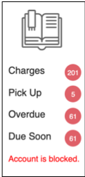
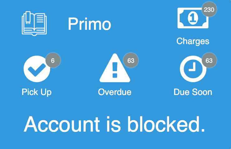
Blocked User Message
|
Appears on the Live Tile and the Library Card screen.
|
No
|
String
|
Account is blocked.
|
|
|
General Error Message
|
General error message if the page fails to load.
|
No
|
String
|
Please, try again later
|
|
|
Empty Results List Message
|
Empty Results List message is displayed when the request retrieves no results for Loans, Requests, Fines and Fees, Favorites or Search.
|
No
|
String
|
No Results
|
|
|
'Sort by' Dropdown List Label
|
Label that appears above the drop-down list on the Loans, Requests, Fines and Fees, Favorites and Search results pages.
|
No
|
String
|
Sort by
|
|
|
'Sort by' Dropdown List Placeholder
|
The value displayed before the sorting option is selected on the Loans, Requests, Fines and Fees, Favorites, and Search results pages.
|
No
|
String
|
Select Sort Option
|
|
|
Primo URL
|
URL for the Primo search page. It should contain only the Base URL.
|
No
|
String
|
||
|
Pages
|
|||||
|
Home Page
|
|||||
|
Page Title
|
Appears at the top of the page.
|
No
|
String
|
My Primo
|
|
|
Display User Library Card Information Bar
|
Select to display the User Library Card information summary on the Home page.
|
No
|
Checkbox
|
Yes
|
|
|
Place User Library Card Information Bar
|
Select an option to place the bar on the top or bottom of the page. This option appears if Display User Library Card Information Bar is set to Yes.
|
No
|
Drop-down Menu
|
Top
|
|
|
Display User Loans Tab
|
Appears if Display User Library Card Information Bar is set to Yes.
|
No
|
Checkbox
|
Yes
|
|
|
User Library Card Information Bar Loans Label
|
Appears if the Display User Loans Tab is set to Yes.
|
No
|
String
|
My Loans
|
|
|
User Library Card Information Bar Loans Icon
|
Enter the icon URL to retrieve the icon for ‘Loans ’ to change the default value
|
No
|
String
|
Book Icon
|
|
|
Display User Requests Tab
|
Appears if Display User Library Card Information Bar is set to Yes.
|
No
|
Checkbox
|
Yes
|
|
|
User Library Card Information Bar Requests Label
|
Appears if Display User Requests Tab is set to Yes.
|
No
|
String
|
My Requests
|
|
|
User Library Card Information Bar Requests Icon
|
Enter the icon URL to retrieve the icon for Requests to change the default value.
|
No
|
String
|
Bookmark Icon
|
|
|
Display User Fines and Fees Tab
|
Appears if Display User Library Card Information Bar is set to Yes.
|
No
|
Checkbox
|
Yes
|
|
|
User Library Card Information Bar Fines and Fees Label
|
Appears if Display User Fines and Fees Tab is set to Yes.
|
No
|
String
|
My Fines/Fees
|
|
|
User Library Card Information Bar Fines and Fees Icon
|
Enter the icon URL to retrieve the icon for Fines and Fees to change the default value.
|
No
|
String
|
Dollar Icon
|
|
|
Display User Favorites Tab
|
Appears if Display User Library Card Information Bar is set to Yes.
|
No
|
Checkbox
|
Yes
|
|
|
User Library Card Information Bar Favorites Label
|
Appears if Display User Favorites Tab is set to Yes.
|
No
|
String
|
My Favorites
|
|
|
User Library Card Information Bar Favorites Icon
|
Enter the icon URL to retrieve the icon for Favorites to change the default value.
|
No
|
String
|
Star Icon
|
|
|
Select Library Search Option
|
Select either Embedded Search(search from the App) or Link out(link to the Primo page).
|
No
|
String
|
Link out
|
|
|
Primo Search Page Link Button Text
|
Text that appears on the Link Button to the Primo Search Page; appears if Select Library Search Option is set to Link out.
|
No
|
String
|
Go to Primo Search
|
|
| Content Title | |||||
|
Display Static Content
|
Select to display the static content on the Home Page.
|
No
|
Checkbox
|
Yes
|
|
|
Static Content Title
|
Appears if Display Static Content is set to Yes.
|
No
|
String
|
||
|
Static Content Type
|
Appears if Display Static Content is set to Yes.
|
No
|
String
|
Text
|
|
|
Image URL
|
Appears if Static Content Type is set to Image,Image (above) and Text,Text (above) and Image.
|
No
|
String
|
||
|
Text
|
Appears if Static Content Type is set toText,Image (above) and Text,Text (above) and Image.
|
No
|
String
|
||
|
Main Menu Bar
|
|||||
|
Main Menu Bar Home Page Label
|
Label for the Home Page tab on the Main Menu Bar.
|
No
|
String
|
Home
|
|
|
Main Menu Bar Library Card Label
|
Label for the Library Card tab on the Main Menu Bar.
|
No
|
String
|
Library Card
|
|
|
Display Useful Links Tab
|
Select to display the Useful Links tab on the Main Menu Bar.
|
No
|
Checkbox
|
Yes
|
|
|
Main Menu Bar Useful Links Label
|
Label for the Useful Links tab on the Main Menu Bar.
|
No
|
String
|
Useful Links
|
|
|
Display Open Hours Tab
|
Select to display the library Open Hours tab on the Main Menu Bar.
|
No
|
Checkbox
|
Yes
|
|
| Show Resource Sharing Library | Appears if Display Open Hours Tab is checked. | No | Checkbox | Yes | |
|
Main Menu Bar Open Hours Label
|
Label for the Open Hours tab on the Main Menu Bar.
|
No
|
String
|
Open hours
|
|
|
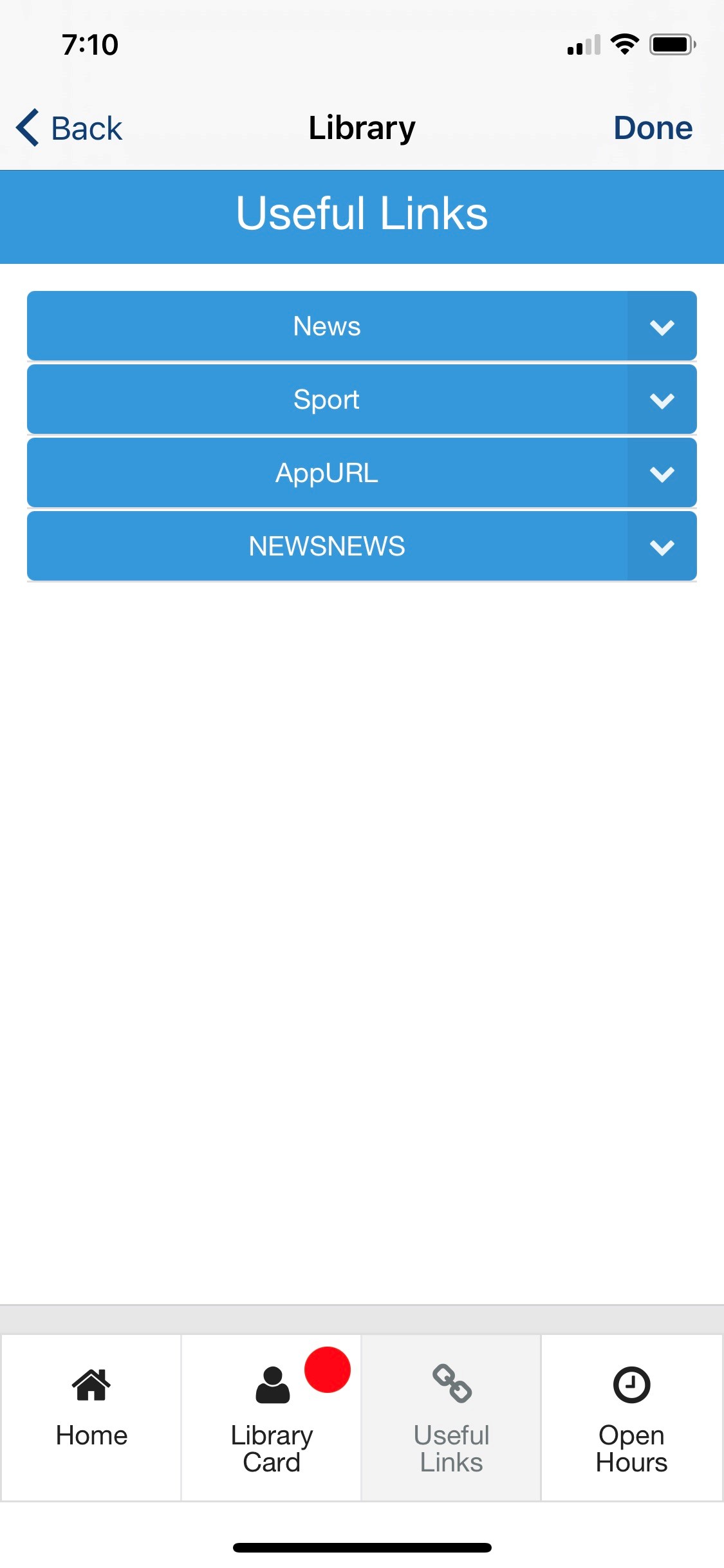
Useful Links(Appears if Display Useful Links Tab is set to Yes.)
|
|||||
|
Page Title
|
Appears at the top of the page.
|
No
|
String
|
Useful Links
|
|
|
Links Group Title
|
Enter the title for the links group.
|
No
|
String
|
||
|
Link Title
|
Enter the link title.
|
No
|
String
|
||
|
Link URL
|
Enter the link URL.
|
No
|
String
|
||
|
Open Hours(Appears if Display Open Hours Tab is set to Yes.)
|
|||||
|
Page Title
|
Appears at the top of the page.
|
No
|
String
|
Open Hours
|
|
|
Link URL |
For Voyager only:Open Hours page URL is required. No other options are used, except Page Title.
|
No
|
String
|
||
|
Message to be displayed if no information is found
|
Message to be displayed when no information about open hours for a specific day is found.
|
No
|
String
|
No info
|
|
| Text - "Select" | Name of the library selection widget. | No | String | Select | |
| Text - "Select library" | Placeholder text for the library selection widget. | No | String | Select library | |
|
|
Enables day of the week label customization.
|
No
|
Checkbox
|
No
|
|
|
Text - "Monday" |
These are also used as defaults if no descriptions are provided by the API, regardless of whether Enable Custom Day Of The Week Labels is enabled or not. | No | String | Monday | |
|
Text - "Tuesday" |
No | String | Tuesday | ||
|
Text - "Wednesday" |
No | String | Wednesday | ||
|
Text - "Thursday" |
No | String | Thursday | ||
|
Text - "Friday" |
No | String | Friday | ||
|
Text - "Saturday" |
No | String | Saturday | ||
|
Text - "Sunday" |
No | String | Sunday | ||
| Use 12-hour format | Sets the hours to display as per a 12-hour clock, instead of the 24-hour default. | No | Checkbox | No | |
|
Library Card
|
|||||
|
Page Title
|
Appears at the top of the page.
|
No
|
String
|
Library Card
|
|
|
Display User Loans
|
Select to display user ’s loans.
|
No
|
Checkbox
|
Yes
|
|
|
User Loans Label
|
Appears if Display User Loans is set to Yes.
|
No
|
String
|
My Loans
|
|
|
Display User Requests
|
Select to display user ’s requests.
|
No
|
Checkbox
|
Yes
|
|
|
User Requests Label
|
Appears if Display User Requests is set to Yes.
|
No
|
String
|
My Requests
|
|
|
Display User Fines and Fees
|
Select to display user ’s fines and fees.
|
No
|
Checkbox
|
Yes
|
|
|
User Fines and Fees Label
|
Appears if Display User Fines and Fees is set to Yes.
|
No
|
String
|
My Fines/Fees
|
|
|
Display User Favorites
|
Select to display user ’s favorites (Primo saved items).
|
No
|
Checkbox
|
Yes
|
|
|
User Favorites Label
|
Appears if Display User Favorites is set to Yes.
|
No
|
String
|
My Favorites
|
|
|
Display User Personal Info
|
Select to display user ’s personal info.
|
No
|
Checkbox
|
Yes
|
|
|
User Personal Info Label
|
Appears if Display User Personal Info is set to Yes.
|
No
|
String
|
My Personal Info
|
|
|
User Loans
|
|||||
|
Page Title
|
Appears at the top of the page.
|
No
|
String
|
My Loans
|
|
|
Items Per Page
|
Value from 1 to 10.
|
No
|
Number
|
5
|
|
|
Display Sort Options
|
Select to display the sorting options drop-down menu for the user.
|
No
|
Checkbox
|
Yes
|
|
|
‘Sort ’ Button Text
|
Enter the text for the Sort button.
|
No
|
String
|
Sort by
|
|
|
Sort Loans List
|
Available options:
|
No
|
Checkbox options
|
All unchecked
|
|
|
Sort Option 'Date' Text
|
Drop-down menu text to display for the Date option.
|
No
|
String
|
Date
|
|
|
Sort Option 'Title-ASC' Text
|
Drop-down menu text to display for the Title - ASC option.
|
No
|
String
|
Title - ASC
|
|
|
Sort Option 'Title-DESC' Text
|
Drop-down menu text to display for the Title - DESC option.
|
No
|
String
|
Title - DESC
|
|
|
'Renew' Button Text
|
Enter the text for the Renew button.
|
No
|
String
|
Renew
|
|
|
'Renew All' Button Text
|
Enter the text for the Renew All button.
|
No
|
String
|
Renew All
|
|
|
Renew Success Message
|
Message to be displayed when items are successfully renewed.
|
No
|
String
|
Items are renewed
|
|
|
Renew Failed Message
|
Message to be displayed when one or more items were not renewed; the message is followed by the list of failed loans.
|
No
|
String
|
Renewing failed for the loans:
|
|
|
User Loan Details
|
|||||
|
Page Title
|
Appears at the top of the page.
|
No
|
String
|
My Loan
|
|
|
User Requests
|
|||||
|
Page Title
|
Appears at the top of the page.
|
No
|
String
|
My Requests
|
|
|
Items Per Page
|
Value from 1 to 10.
|
No
|
Number
|
5
|
|
|
Display Sort Options
|
Select to display the sorting options drop-down menu for the user.
|
No
|
Checkbox
|
Yes
|
|
|
‘Sort ’ Button Text
|
Enter the text for the Sort button.
|
No
|
String
|
Sort by
|
|
|
Sort Loans List
|
Available options:
|
No
|
Checkbox options
|
All unchecked
|
|
|
Sort Option 'Date' Text
|
Drop-down menu text to display for the ‘Date ’ option.
|
No
|
String
|
Date
|
|
|
Sort Option 'Title-ASC' Text
|
Drop-down menu text to display for the Title - ASC option.
|
No
|
String
|
Title - ASC
|
|
|
Sort Option 'Title-DESC' Text
|
Drop-down menu text to display for the Title - DESC option.
|
No
|
String
|
Title - DESC
|
|
|
'Cancel' Button Text
|
Enter the text for the Cancel button.
|
No
|
String
|
Cancel
|
|
|
'Cancel All' Button Text
|
Enter the text for the Cancel All button.
|
No
|
String
|
Cancel All
|
|
|
Cancel Success Message
|
Message to be displayed when requests are successfully canceled.
|
No
|
String
|
Requests are canceled
|
|
|
Cancel Failed Message
|
Message to be displayed when one or more requests were not canceled; the message is followed by the list of failed requests.
|
No
|
String
|
Canceling failed for the requests:
|
|
|
User Request Details
|
|||||
|
Page Title
|
Appears at the top of the page.
|
No
|
String
|
My Request
|
|
| Text - "Request Type" | No | String | Request Type | ||
| Text - "Request ID" | No | String | Request ID | ||
| Text - "Title" | No | String | Title | ||
| Text - "Author" | No | String | Author | ||
| Text - "Barcode" | No | String | Barcode | ||
| Text - "Request Date" | No | String | Request Date | ||
| Text - "Place In Queue" | No | String | Place In Queue | ||
| Text - "Status" | No | String | Status | ||
| Text - "PickUP Location" | No | String | PickUP Location | ||
| Text - "mmsId" | No | String | mmsId | ||
|
User Fines and Fees
|
|||||
|
Page Title
|
Appears at the top of the page.
|
No
|
String
|
My Fines and Fees
|
|
|
Items Per Page
|
Value from 1 to 10.
|
No
|
Number
|
5
|
|
|
Display Sort Options
|
Select to display the sorting options drop-down menu for the user.
|
No
|
Checkbox
|
Yes
|
|
|
‘Sort ’ Button Text
|
Enter the text for the Sort button.
|
No
|
String
|
Sort by
|
|
|
Sort Fines and Fees List
|
Available options:
|
No
|
Checkbox options
|
All unchecked
|
|
|
Sort Option 'Date' Text
|
Drop-down menu text to display for the Date option.
|
No
|
String
|
Date
|
|
|
Sort Option 'Type ’ Text
|
Drop-down menu text to display for the Type option.
|
No
|
String
|
Type
|
|
|
Sort Option ‘Amount ’ Text
|
Drop-down menu text to display for the Amount option.
|
No
|
String
|
Amount
|
|
|
Display ‘Pay ’ Button
|
Select if you want to configure paying fines option (link out). When selected, the button appears on both User Fines and Fees and Fine/Fee Details pages.
|
No
|
Checkbox
|
No
|
|
|
'Pay' Button Text
|
Appears if Display Pay Button is set to Yes.
|
No
|
String
|
Pay
|
|
|
Link URL
|
Appears if Display Pay Button is set to Yes. |
No
|
String
|
||
|
User Fine/Fee Details
|
|||||
|
Page Title
|
Appears at the top of the page.
|
No
|
String
|
My Fines/Fees
|
|
|
User Personal Info
|
|||||
|
Page Title
|
Appears at the top of the page.
|
No
|
String
|
My Personal Info
|
|
|
Display Name (Last, First, Middle)
|
Appears at the top of the page.
|
No
|
Checkbox
|
Yes
|
|
| Text - "Name" | No | String | Name | ||
|
Display Status
|
Select to display user ’s name.
|
No
|
Checkbox
|
Yes
|
|
| Text - "Status" | No | String | Status | ||
|
|
Select to display user ’s job category | No | Checkbox | Yes | |
| Text - "Job Category" | No | String | Job Category | ||
|
|
Select to display user ’s user group | No | Checkbox | Yes | |
|
Text - "User Group" |
No | String | User Group | ||
|
|
Select to display user ’s status | No | Checkbox | Yes | |
| Text - "Email" | No | String | |||
| Text - "Phone" | No | String | Phone | ||
| Display Expiry Date | Select to display user ’s expiration date | No | Checkbox | Yes | |
| Text - "Expiry Date" | No | String | Expiry Date | ||
|
User Favorites
|
|||||
|
Page Title
|
Appears at the top of the page.
|
No
|
String
|
My Favorites
|
|
|
Items Per Page
|
Value from 1 to 10.
|
No
|
Number
|
5
|
|
|
Display Sort Options
|
Select to display the sorting options drop-down menu for the user.
|
No
|
Checkbox
|
Yes
|
|
|
‘Sort ’ Button Text
|
Enter the text for the Sort button.
|
No
|
String
|
Sort by
|
|
|
Sort Favorites List
|
Available options:
|
No
|
Checkbox options
|
All unchecked
|
|
|
Sort Option 'Date Added' Text
|
Drop-down menu text to display for the Date Added option.
|
No
|
String
|
Date
|
|
|
Sort Option 'Title' Text
|
Drop-down menu text to display for the Title option.
|
No
|
String
|
Title
|
|
|
Sort Option 'Author' Text
|
Drop-down menu text to display for the Author option.
|
No
|
String
|
Author
|
|
|
Remove Item from the List Button Text
|
Text that appears on the button to remove item from the Favorites list.
|
No
|
String
|
Remove
|
|
|
Search Results
|
|||||
|
Page Title
|
Appears at the top of the page.
|
No
|
String
|
Search Results
|
|
|
Initial Load
|
Number of the initially loaded records; the value should be between 2 and 10.
|
No
|
String
|
10
|
|
|
Load More Results
|
Number of the records loaded when selecting Load More Results; the value should be between 2 and 5.
|
No
|
String
|
5
|
|
|
‘Load More Results ’ Button Text
|
Text for the Load More Results button.
|
No
|
String
|
Load More
|
|
|
‘Scope Not Defined ’ Error Message
|
Error Message the end-user gets if the Tab/Scope are not defined or defined incorrectly (see Vendor > Primo > Primo API Configuration section).
|
No
|
String
|
Search Scope is not defined
|
|
|
Display Availability
|
Select to display the availability of the records.
|
No
|
Checkbox
|
Yes
|
|
| Format Available Holds | In the search results, either join all available request options inline, or each request on a new line. | No | Drop-down List | Comma-separated | |
|
Display Availability for Electronic Items Text
|
Availability statement that appears for the electronic records.
|
No
|
String
|
Available Online
|
|
|
Link Availability Statement to Primo Home Page (link out) for Physical Items
|
Select to enable the click on the availability statement for physical items is clickable; NB: clicking the availability statement will result in the Primo home page, as defined in the General > General Parameters section.
|
No
|
Checkbox
|
Yes
|
|
|
Display Sort Options
|
Select to display the sorting options drop-down menu for the user.
|
No
|
Checkbox
|
Yes
|
|
|
Sort Option 'Rank' Text
|
Drop-down menu text to display for the Rank option.
|
No
|
String
|
Rank
|
|
|
Sort Option 'Author' Text
|
Drop-down menu text to display for the Author option.
|
No
|
String
|
Author
|
|
|
Sort Option 'Title' Text
|
Drop-down menu text to display for the Title option.
|
No
|
String
|
Title
|
|
|
Sort Option 'Date-Newest' Text
|
Drop-down menu text to display for the Date – Newest option.
|
No
|
String
|
Date - Newest
|
|
|
Sort Option 'Date-Oldest' Text
|
Drop-down menu text to display for the Date – Oldest option.
|
No
|
String
|
Date - Oldest
|
|
|
Item in Search
|
|||||
|
Page Title
|
Appears at the top of the page.
|
No
|
String
|
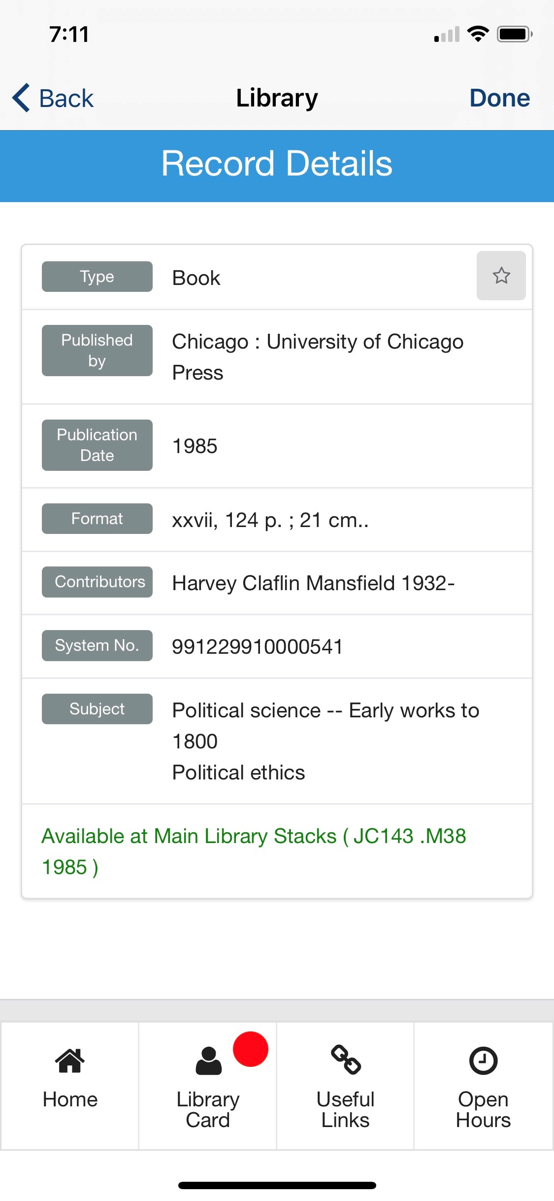
Record Details
|
|
|
Display Record Material Type
|
Select to display the material type of the record.
|
No
|
Checkbox
|
Yes
|
Display Record Material Type
|
|
Material Type Label
|
Label for the record material type.
|
No
|
String
|
Type
|
|
|
Display Record Title
|
Select to display the title of the record.
|
No
|
Checkbox
|
Yes
|
|
|
Title Label
|
Label for the record title.
|
No
|
String
|
Title
|
|
|
Display Record Author
|
Select to display the author of the record.
|
No
|
Checkbox
|
Yes
|
|
|
Author Label
|
Label for the record author.
|
No
|
String
|
Author
|
|
|
Display Record Publisher
|
Select to display the publisher of the record.
|
No
|
Checkbox
|
Yes
|
|
|
Publisher Label
|
Label for the record publisher.
|
No
|
String
|
Published by
|
|
|
Display Record Publication Date
|
Select to display the publication date of the record.
|
No
|
Checkbox
|
Yes
|
|
|
Publication Date Label
|
Label for the record publication date.
|
No
|
String
|
Publication Date
|
|
|
Display Record Language
|
Select to display the language of the record.
|
No
|
Checkbox
|
Yes
|
|
|
Language Label
|
Label for the record language.
|
No
|
String
|
Language
|
|
| Display Record Series | Select to display the series of the record | No | Checkbox | Yes | |
| Series Label | Label for the series | No | String | Series | |
|
Display Record System Number
|
Select to display the system number of the record.
|
No
|
Checkbox
|
Yes
|
|
|
System Number Label
|
Label for the record system number.
|
No
|
String
|
System no.
|
|
|
Display Record Format
|
Select to display the format of the record.
|
No
|
Checkbox
|
Yes
|
|
|
Format Label
|
Label for the record format.
|
No
|
String
|
Format
|
|
|
Display Record Contributors
|
Select to display the contributors of the record.
|
No
|
Checkbox
|
Yes
|
|
|
Contributors Label
|
Label for the record contributors.
|
No
|
String
|
Contributors
|
|
|
Display Record Subjects
|
Select to display the subjects of the record.
|
No
|
Checkbox
|
Yes
|
|
|
Subjects Label
|
Label for the record subjects.
|
No
|
String
|
Subjects
|
|
|
Display Record Description and Table of Content
|
Select to display the description and table of content of the record.
|
No
|
Checkbox
|
Yes
|
|
|
Description and Table of Content Label
|
Label for the record description and table of content.
|
No
|
String
|
Description
|
|
|
Display Record ISBN/ISSN
|
Select to display the ISBN/ISSN of the record.
|
No
|
Checkbox
|
Yes
|
|
|
ISBN/ISSN Label
|
Label for the record ISBN/ISSN.
|
No
|
String
|
ISBN/ISSN
|
|
|
Display Record Availability
|
Select to display the availability statement of the record.
|
No
|
Checkbox
|
Yes
|
|
|
Availability Statement Label
|
Label for the record availability statement.
|
No
|
String
|
Availability
|
|
|
Live Tile
|
|||||
|
Enabled
|
Select to enable Live Tile.
|
No
|
Checkbox
|
Yes
|
|
|
Design
|
Select the UI design (new or legacy).
|
No
|
Dropdown
|
Enable Latest Live Tile Design
|
|
|
General
|
|||||
|
Refresh Rate
|
The live tile refresh rate in minutes; must be between 60 and 360.
|
No
|
Number
|
60
|
|
|
Loading Label
|
The text that is displayed while loading the Live Tile.
|
No
|
String
|
Loading…
|
|
|
Please Login Text
|
The text that is displayed when the user is not logged in.
|
No
|
String
|
You are not logged into Primo
|
Authentication failed; Proceed to Primo Search Page?
|
|
Live Tile Look and Feel
|
|||||
|
Badge Color
|
Select a color for the badge.
|
No
|
Color Code
|
#cd5c5c
|
|
|
Displayed Items
The Live Tile labels are limited to 20 characters. In some cases, however, such as in Web app with a relatively large number of tiles, when the library tile size is 1x1 or 1X2 (recommended size), a long label text can overlap a badge with numbers; therefore, we recommend that the labels do not exceed 8-12 characters for a label.
|
|||||
|
Header
|
|||||
|
Header Text Enabled
|
Not available in the legacy design. Select to display the header on the live tile. If cleared, the text does not appear in the header. If both the header text and the header logo are disabled, the header does not appear.
|
No
|
Boolean
|
True
|
|
|
Header Text
|
Not available in the legacy design. Set the header text.
|
No
|
String
|
Primo
|
|
|
Header Icon Enabled
|
Not available in the legacy design. Select to display the logo on the live tile. If disabled, the logo does not appear in the header. If both the logo and the header text are disabled, the header does not appear.
|
No
|
Boolean
|
False
|
|
|
URL for Header Icon
|
Not available in the legacy design. The URL of the image to be used as the logo in the header.
|
No
|
String
|
||
|
Customise Live Tile Header Padding
|
Not available in the legacy design. If enabled, enables you to customize the blank space around the header block. All values have a minimum of 0.
|
No
|
Checkbox
|
No
|
|
|
The First Widget(s) Should Display on the Same Row As the Header
|
Not available in the legacy design. If disabled, the first widget row will start below the header.
|
No
|
Checkbox
|
Yes
|
|
|
Widgets Per Row
|
This sets the number of widgets to display per row. There is a minimum of 1 and a maximum of 5.
|
No
|
Integer
|
3
|
|
|
Charges
|
|||||
|
Enable
|
Select to display charges.
|
No
|
Checkbox
|
Yes
|
|
|
Charges Display
|
Choose between displaying the total sum of all active fines (charges), and the number of active fines (charges) the user has.
|
No
|
Dropdown List
|
Total Sum
|
|
| Display In Decimal | Charges are rounded-up to the nearest whole unit, to fit on the tile. Enable this to force decimal values, to two decimal places. | No | Checkbox | No | |
|
Label
|
Label for charges.
|
No
|
String
|
Charges
|
|
|
On Hold Shelf
|
|||||
|
Enable
|
Select to display the on hold shelf items.
|
No
|
Checkbox
|
Yes
|
|
|
Label Text
|
Label for the on hold shelf items.
|
No
|
String
|
On Hold Shelf
|
|
|
Overdue Loans
|
|||||
|
Enable
|
Select to display the overdue loans.
|
No
|
Checkbox
|
Yes
|
|
|
Label Text
|
Label for the overdue loans.
|
No
|
String
|
Overdue
|
|
|
Items Due Back Soon
|
|||||
|
Enable
|
Select to display the due back soon items.
|
No
|
Checkbox
|
Yes
|
|
|
Label Text
|
Label for the due back soon items.
|
No
|
String
|
Due soon
|
|
|
Days before Due Date
|
The maximum number of days before the due date to be considered an Item Due Back Soon.
|
No
|
Number
|
3
|
|
|
Always Display Widget Count
|
If enabled, all widgets display the count even if the count is 0.
|
No
|
Checkbox
|
Yes
|
|
|
Prioritize Live Tile Items
|
|||||
|
Priority
|
This ordered list prioritizes the items that appear on the live tile. The item at the top of the list appears first, while the last item appears last.
|
No
|
Ordered List
|
|
|
|
Icons
|
|||||
|
Use Custom Icons
|
Select to use custom icons instead of the default live tile icons.
|
No
|
Boolean
|
False
|
|
|
URL
|
Enter the URLs of custom images for the icons of the various widgets.
|
No
|
String
|
||
|
Look and Feel
|
|||||
|
Primary Theme Color
|
Select a color for the main elements on the page.
|
No
|
Color Code
|
#444444
|
|
|
Secondary Theme Color
|
Select a color for the secondary elements on the page.
|
No
|
Color Code
|
#6f8ea4
|
|
Page tags: article:topiccontent:Documentationproduct:campusmlang:english